ColorKit™ Case Study: Light Spring Sam
Not only does Sam get the Most Spectacular Beard Award for 2025, he is an excellent example of the holistic nature of color analysis, and how the ColorKit™ experience will get to the bottom of your true season by working a series of targeted tests and observations.
First, meet Sam! Sam is a professional musician who came to us to learn which colors suit him best, so he can market himself with confidence, show up boldly on stage, and align his image with his message.
Sam was so kind as to allow me to showcase him in this case study. Moment of appreciation for this pastel-clad rocker dude with an epic beard and nose ring! Talk about standing out in a crowd:
When we begin every color analysis, our first order of business is to determine whether you have COOL or WARM undertones.
The skin color we can see on the surface is your overtone, not your undertone. This is the layer of your skin that contains the type of melanin that adapts to sun exposure.
The type of melanin that determines undertone lies below the surface, and does not adapt to sun exposure. It is invisible to the naked eye, and remains constant for your entire life.
Your undertone's temperature shows itself in subtle ways only when observed in close proximity to varying colors in quick succession. A single color in a single instance isn't enough to observe undertones, especially when fabric finish and lighting are ignored.
The solution is to create a controlled environment with natural lighting, precise colors in a consistent texture, and targeted comparisons that isolate specific criteria: TEMPERATURE, VALUE, and CHROMA.
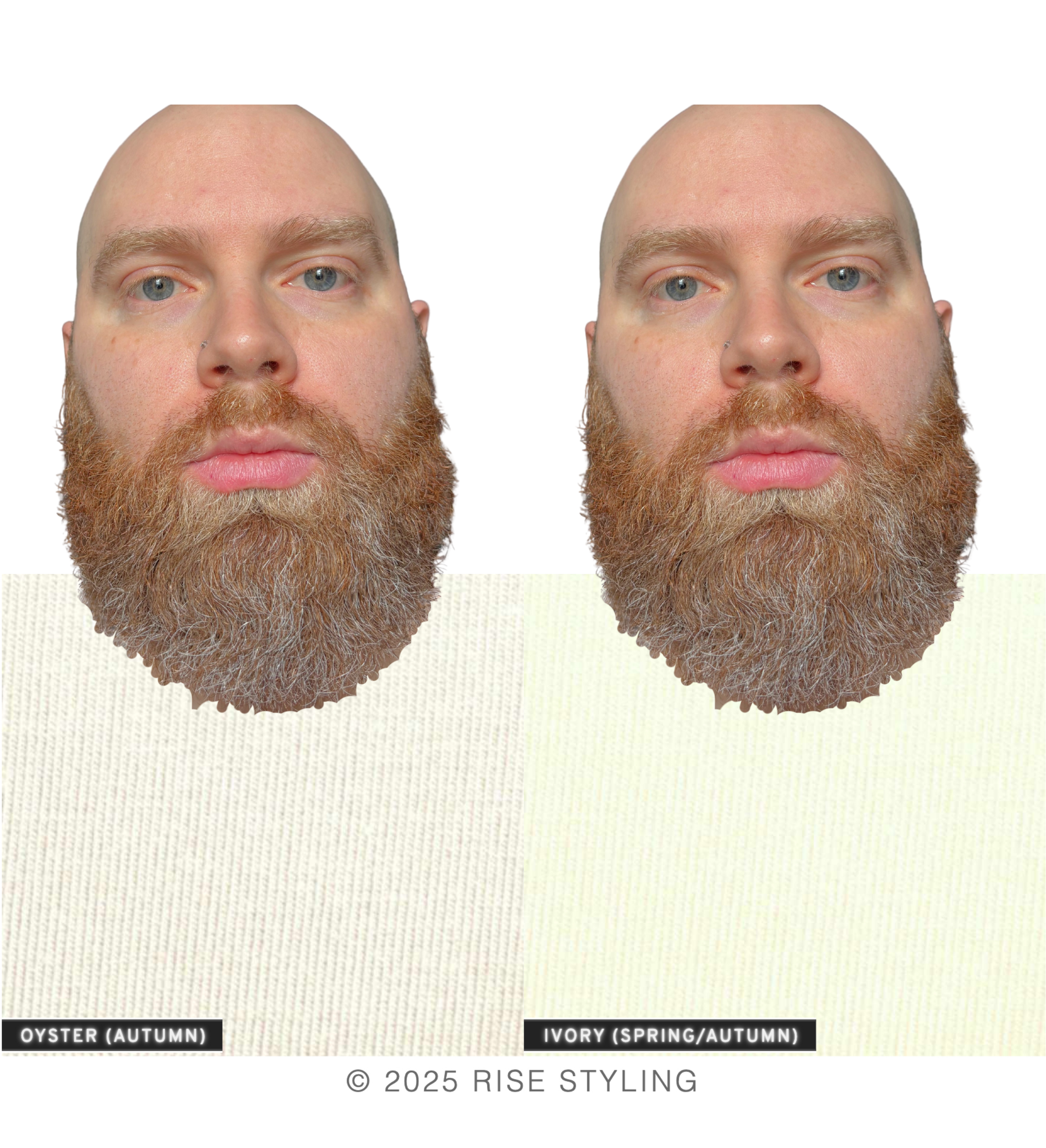
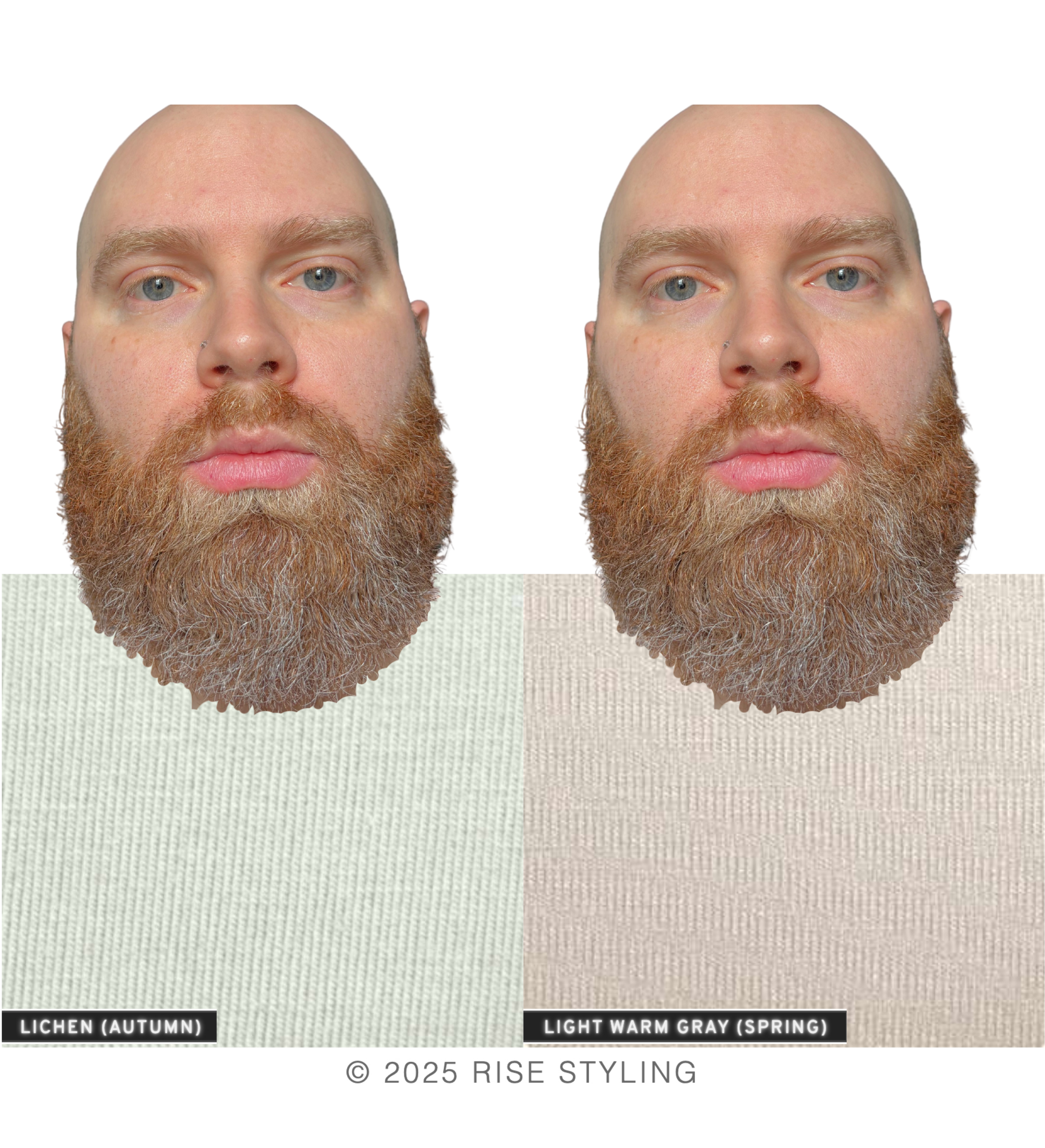
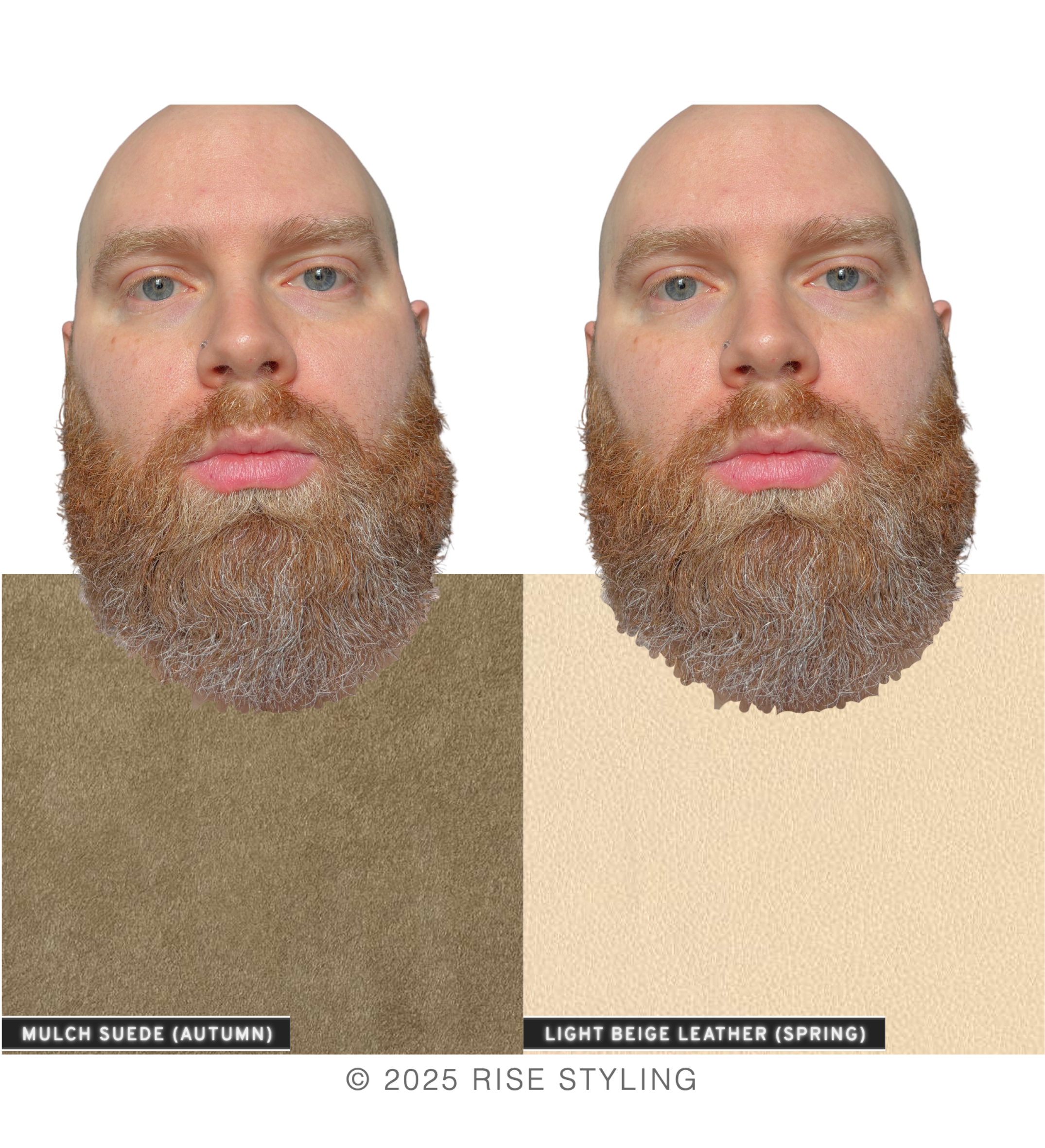
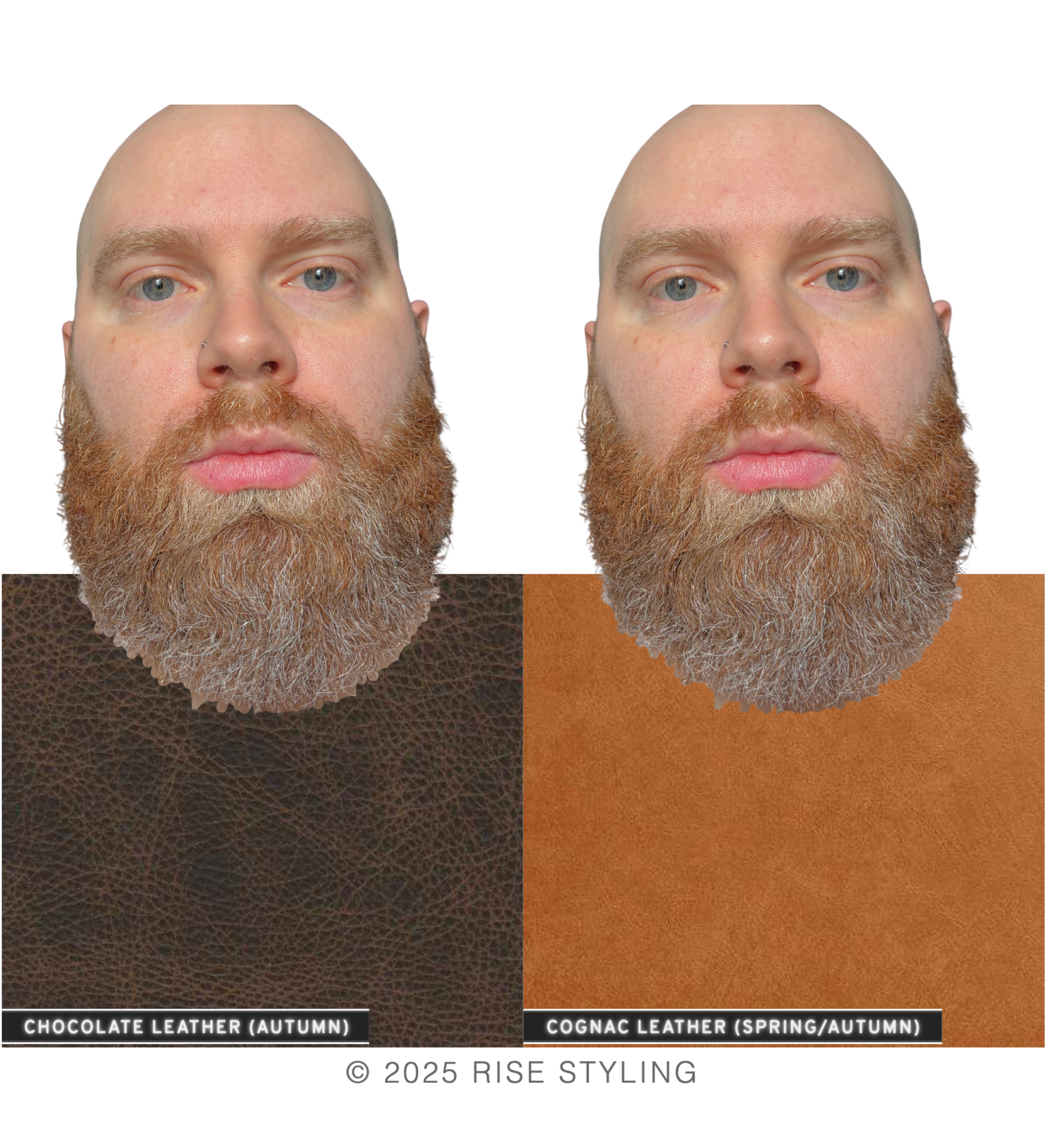
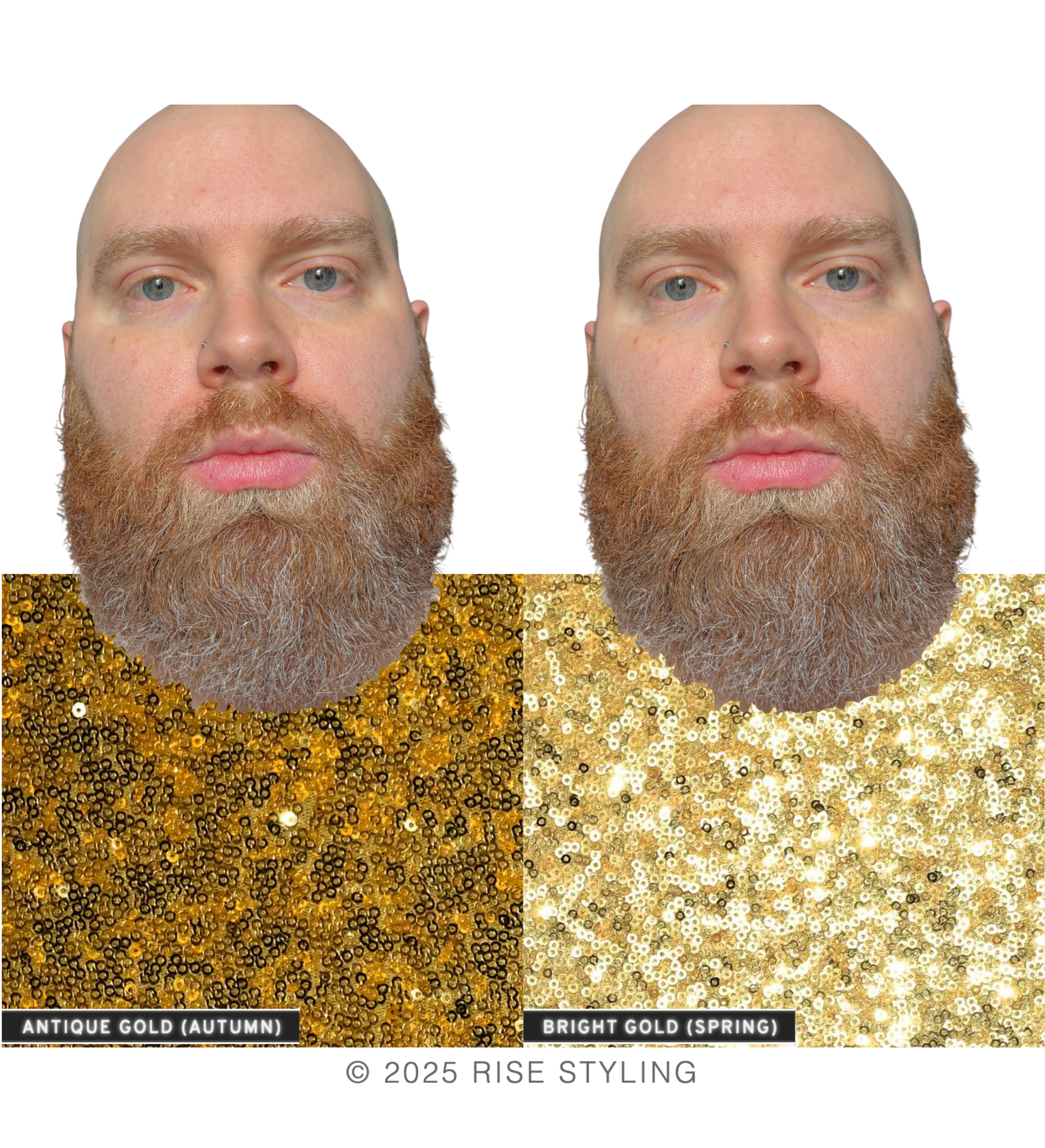
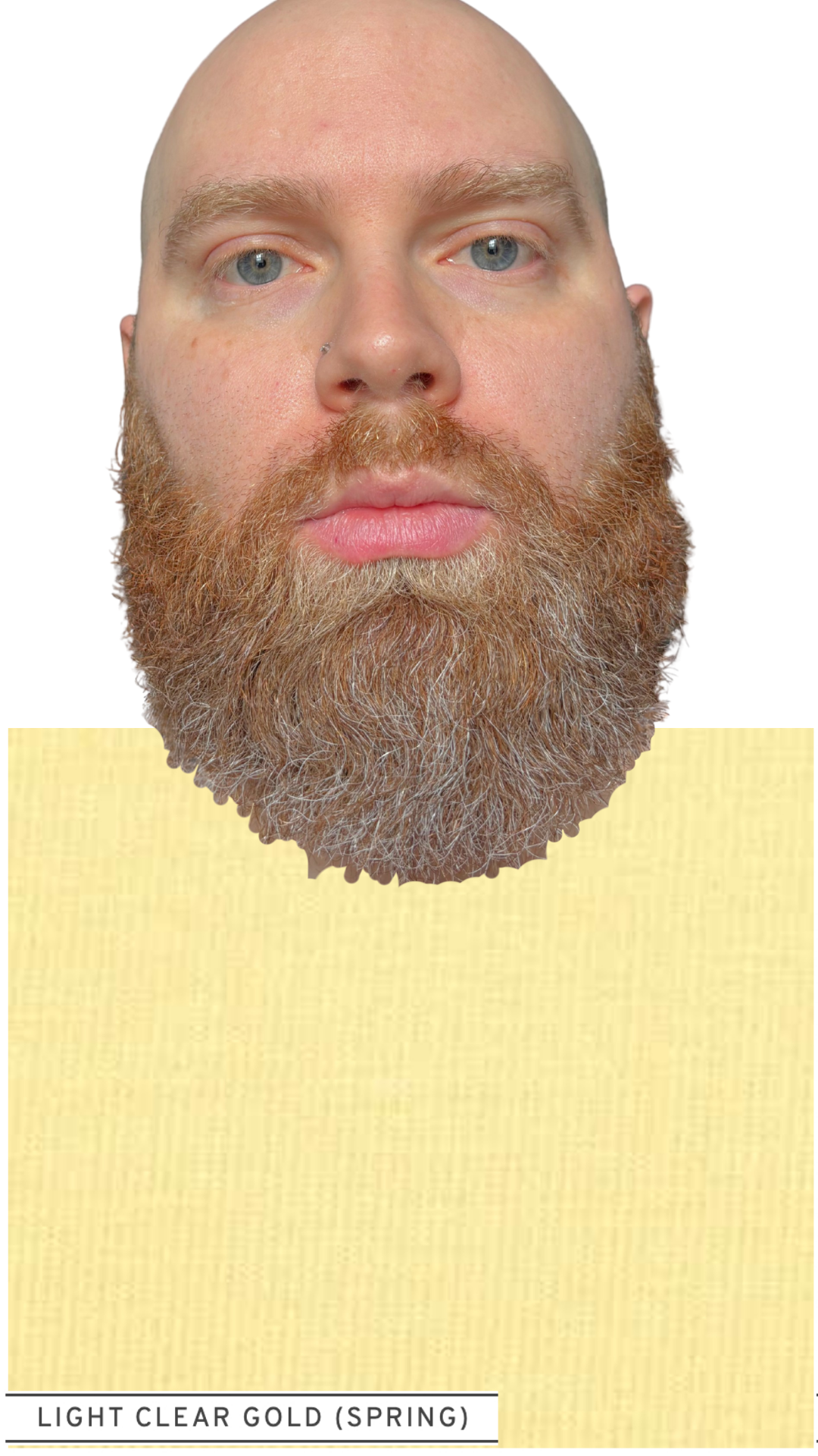
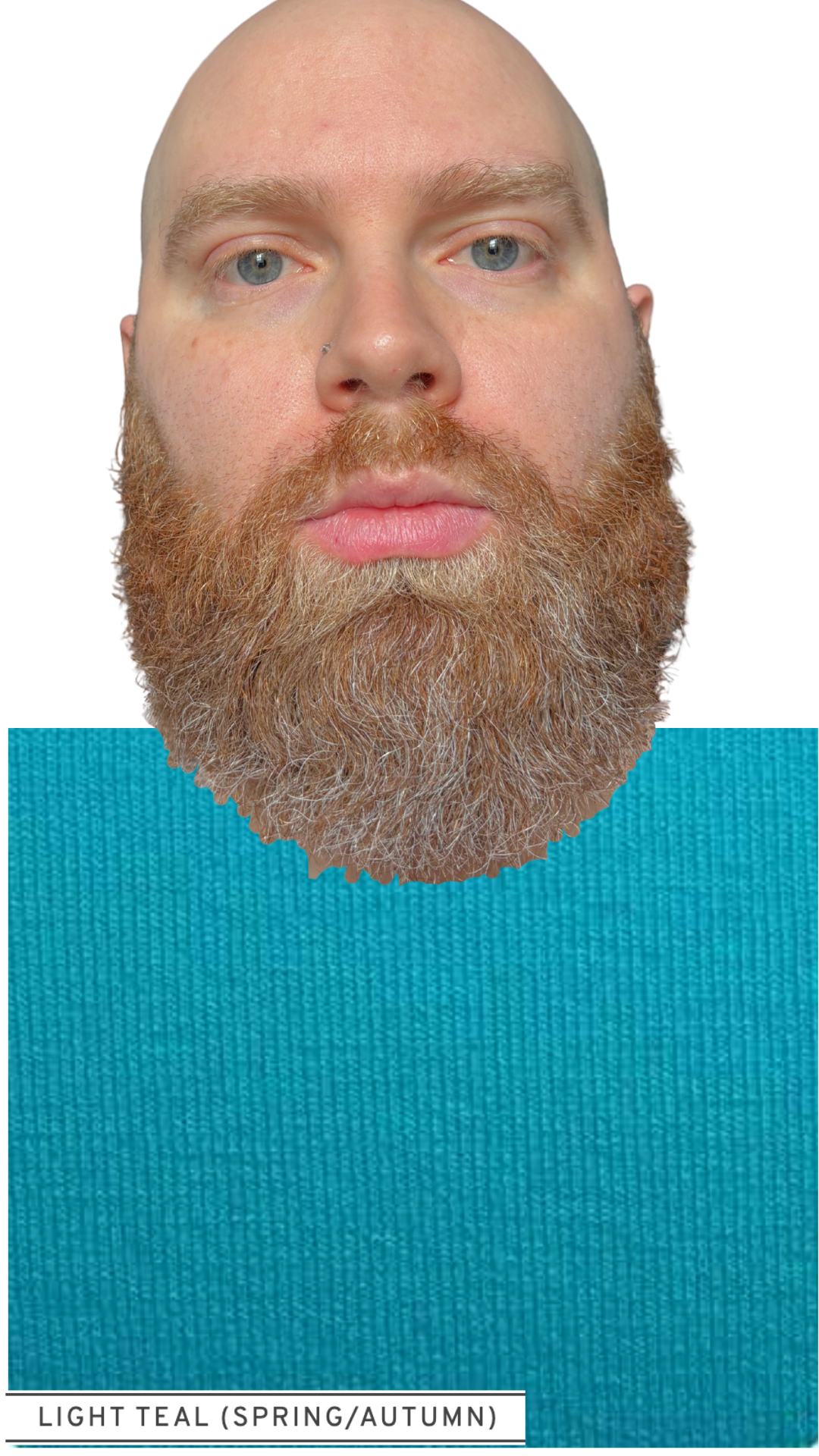
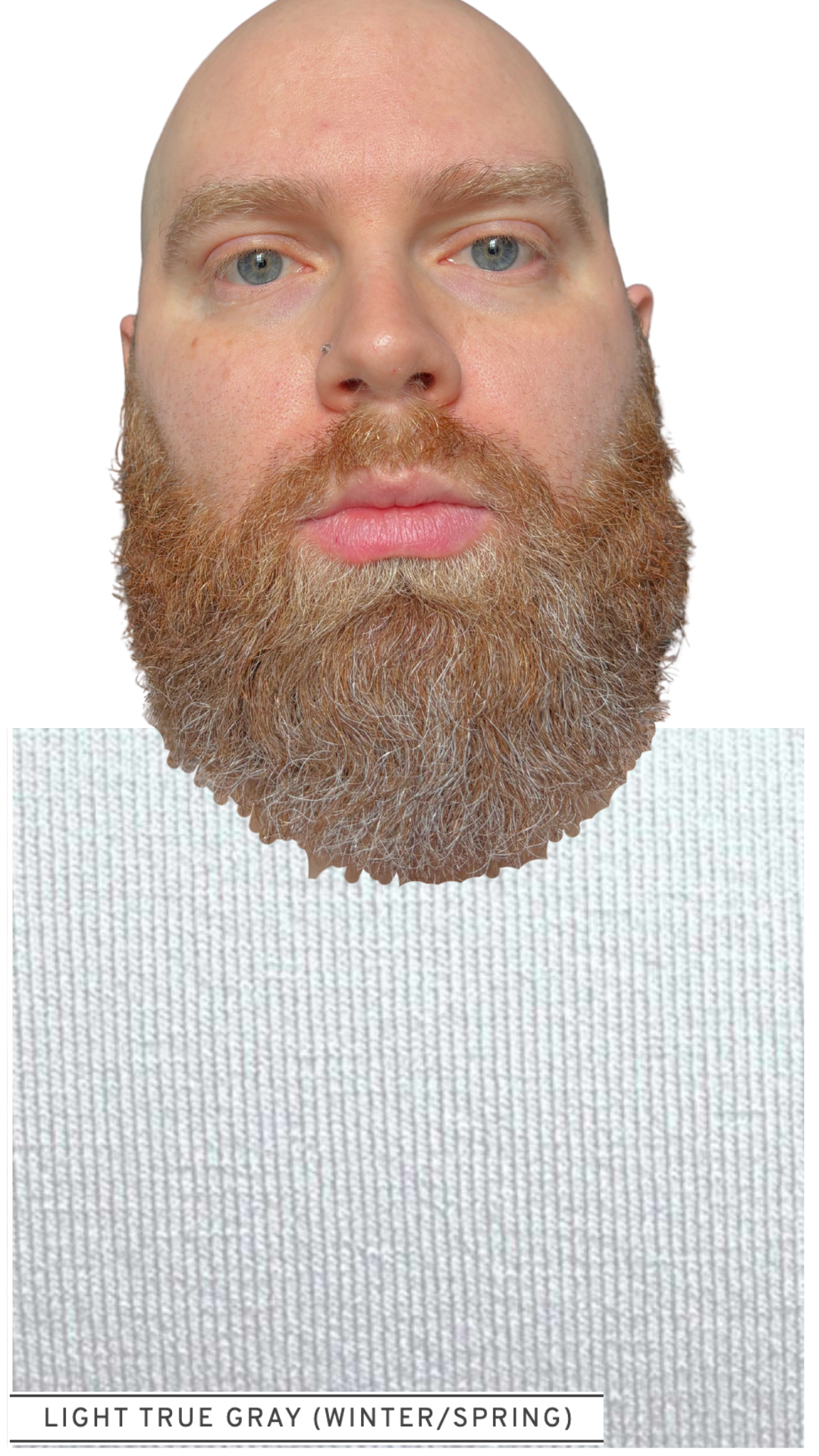
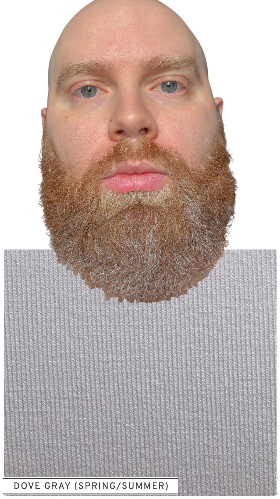
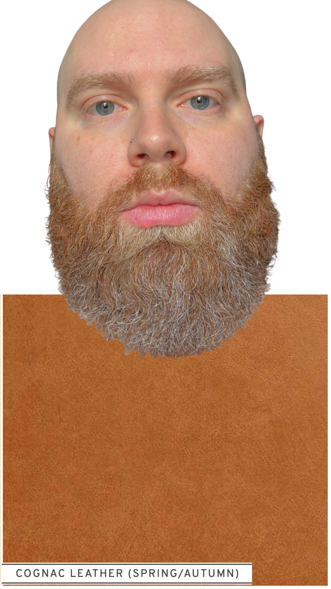
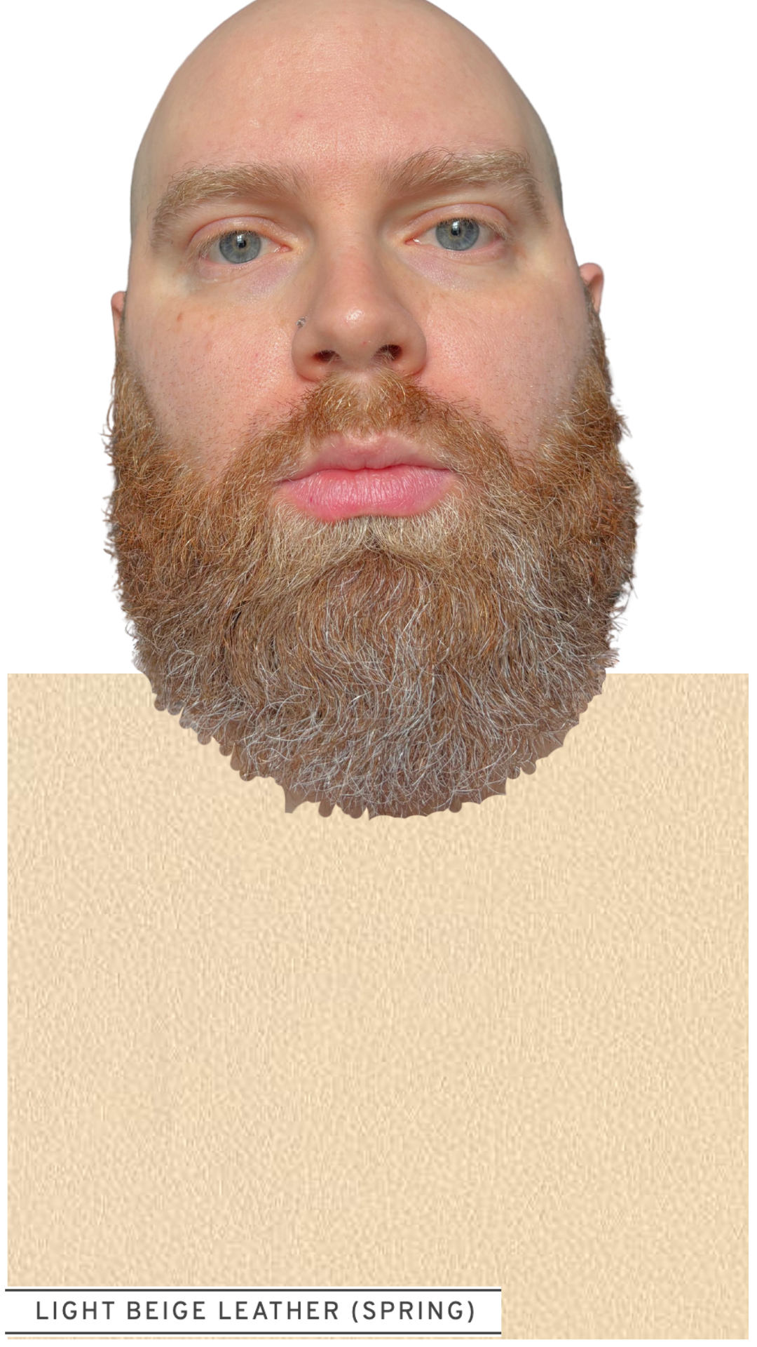
In this section of your ColorKit™ results report, we are isolating TEMPERATURE, so that your undertones can makes themselves known.
Let’s see this in action on ColorKit™ client Sam.
Slide through the images below to view Sam alternating between wearing cool colors (left) and warm colors (right):
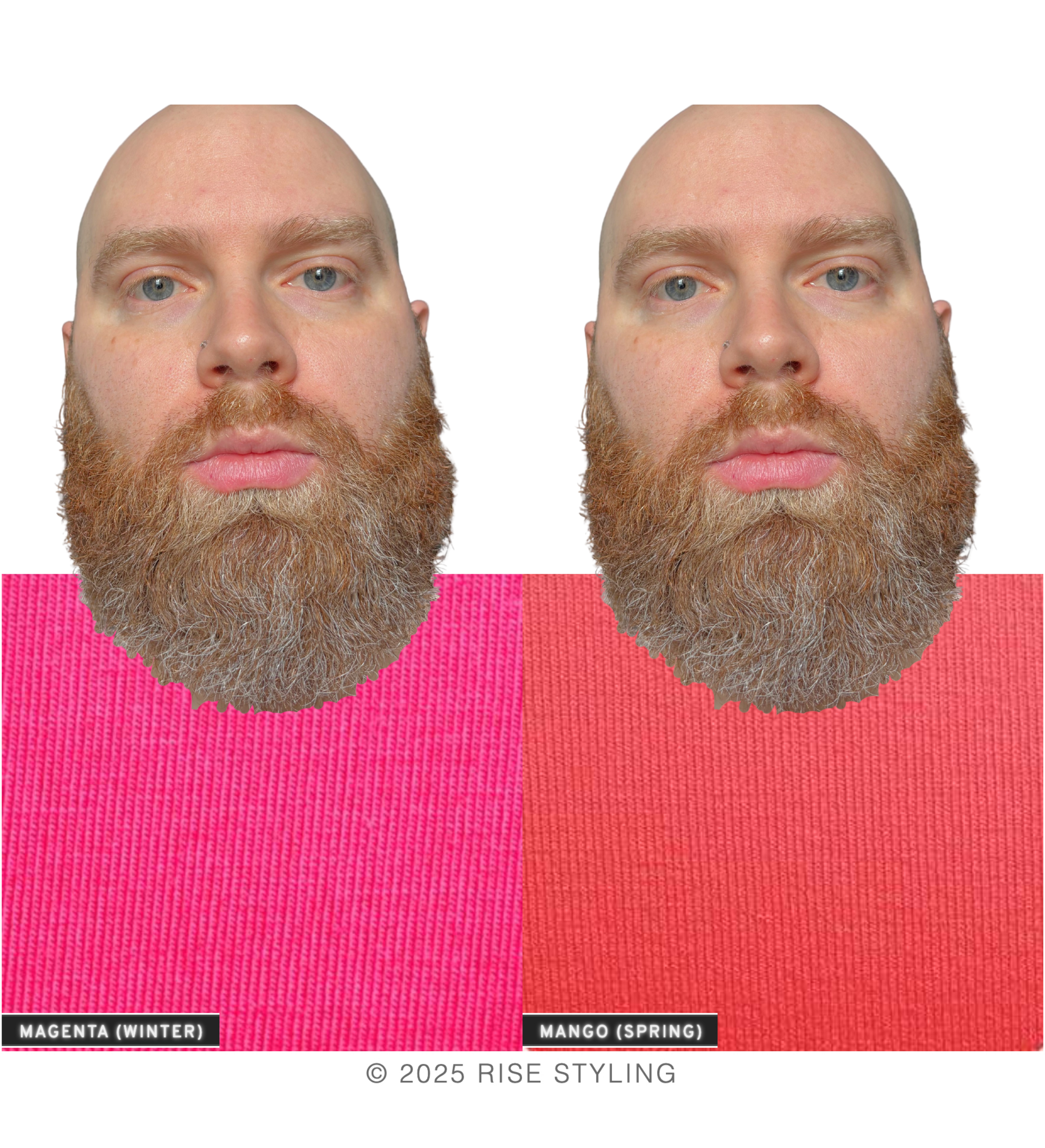
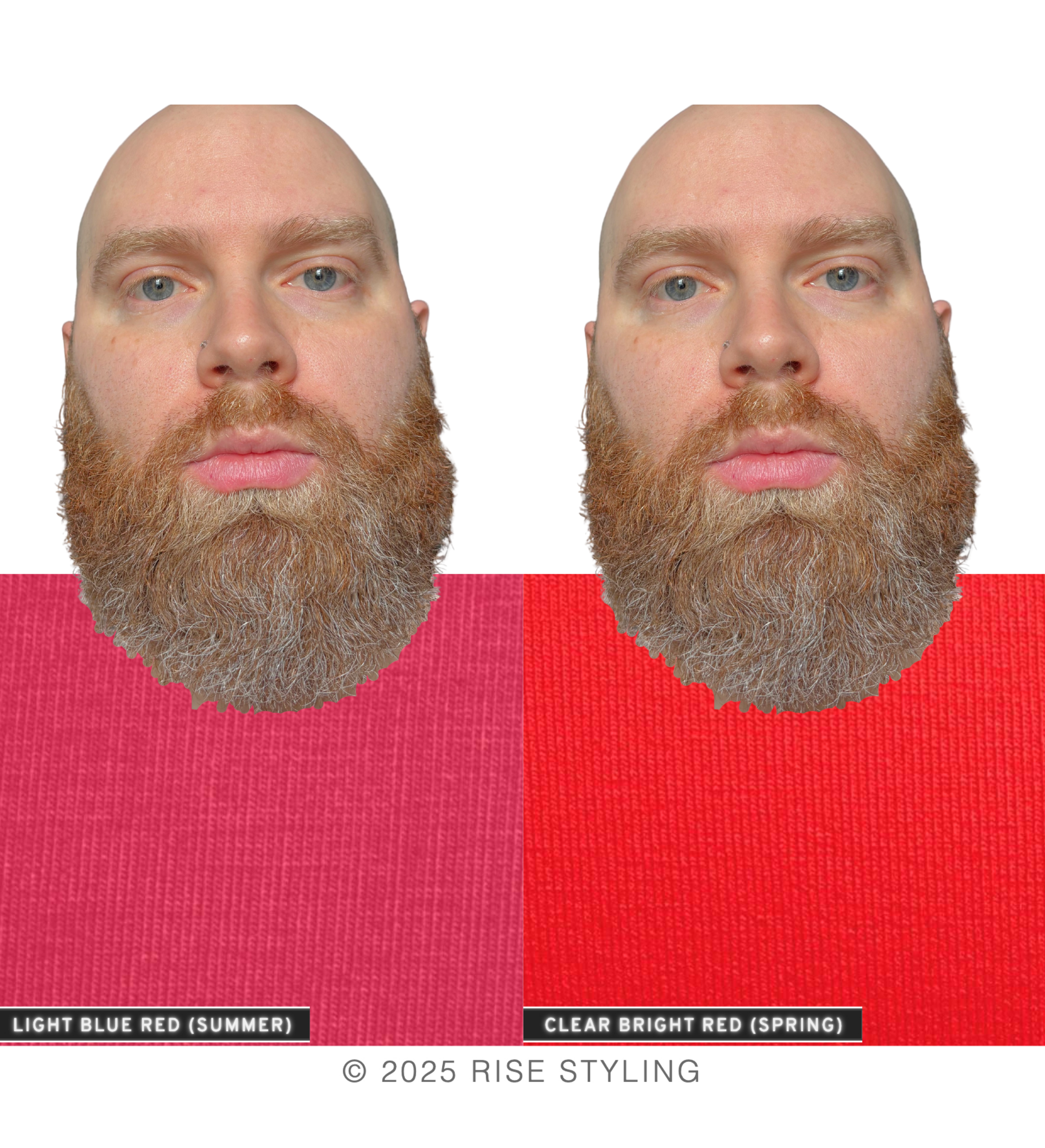
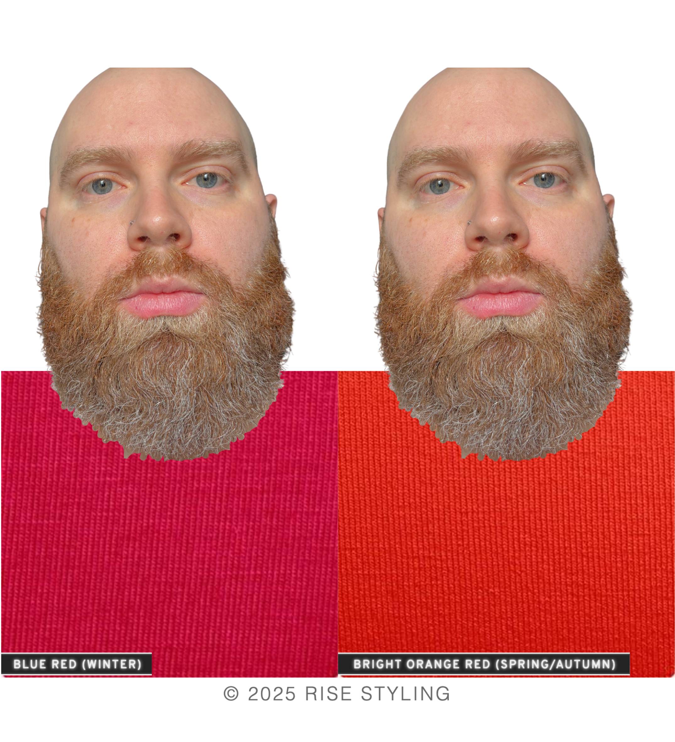
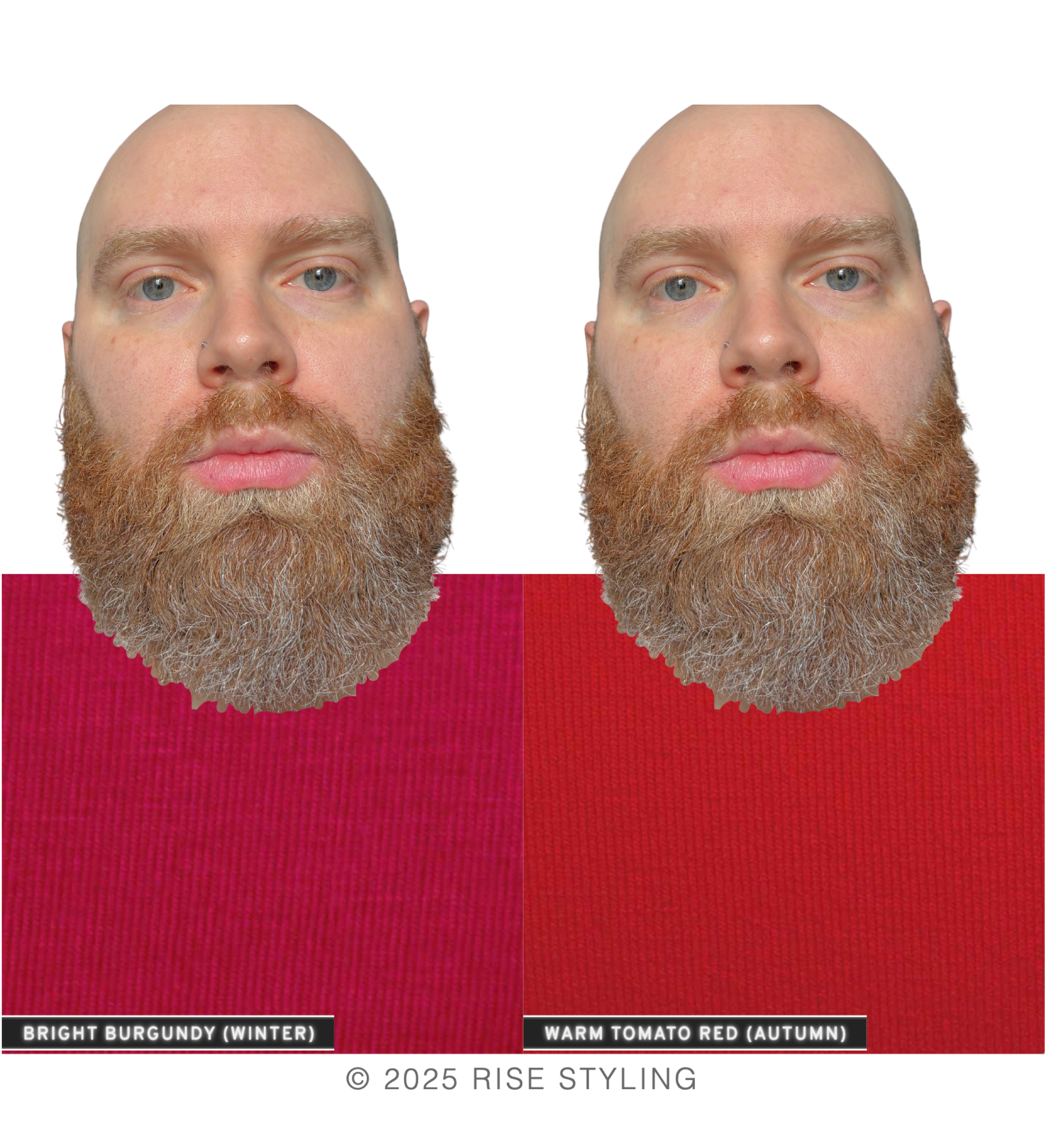
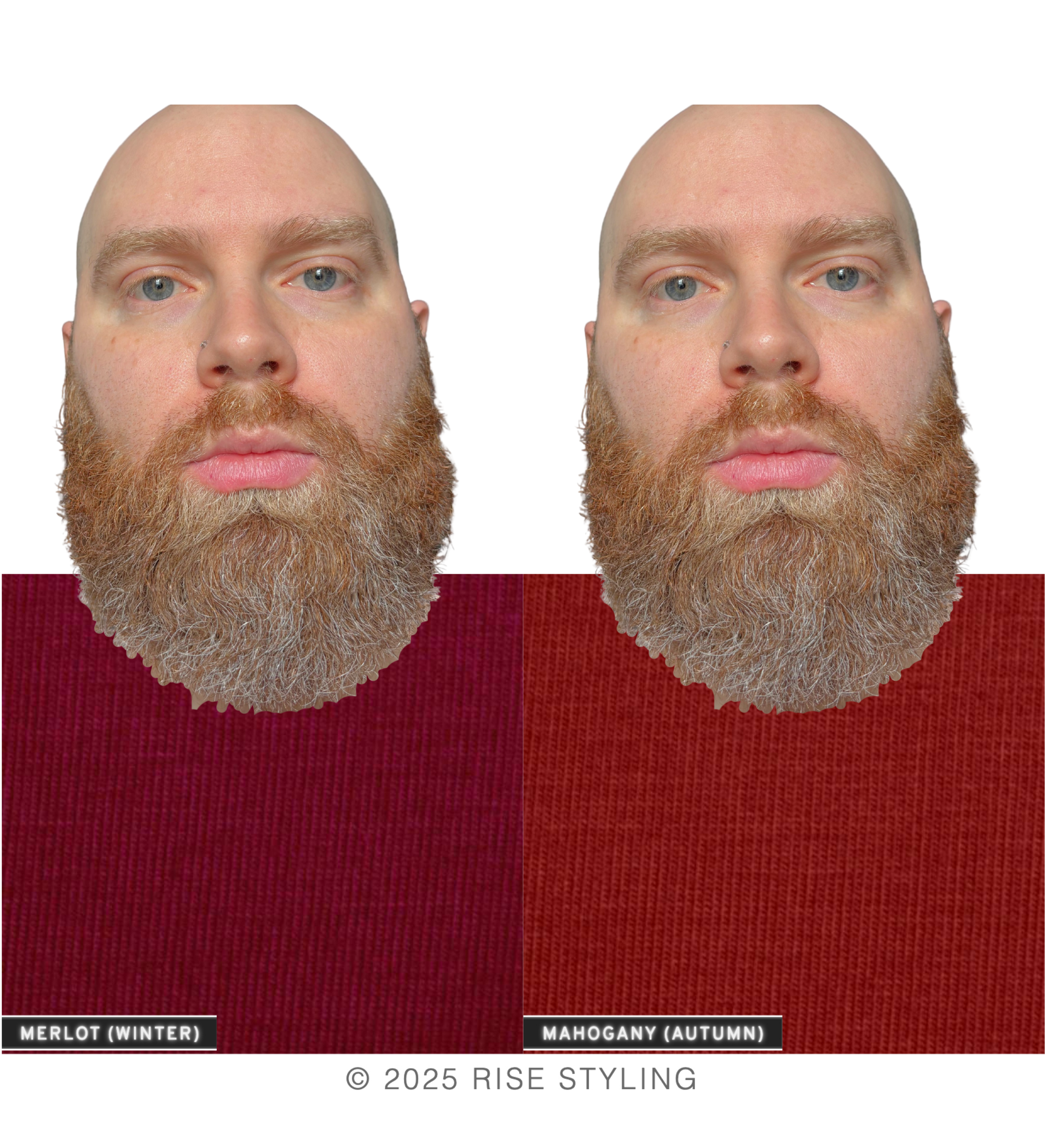
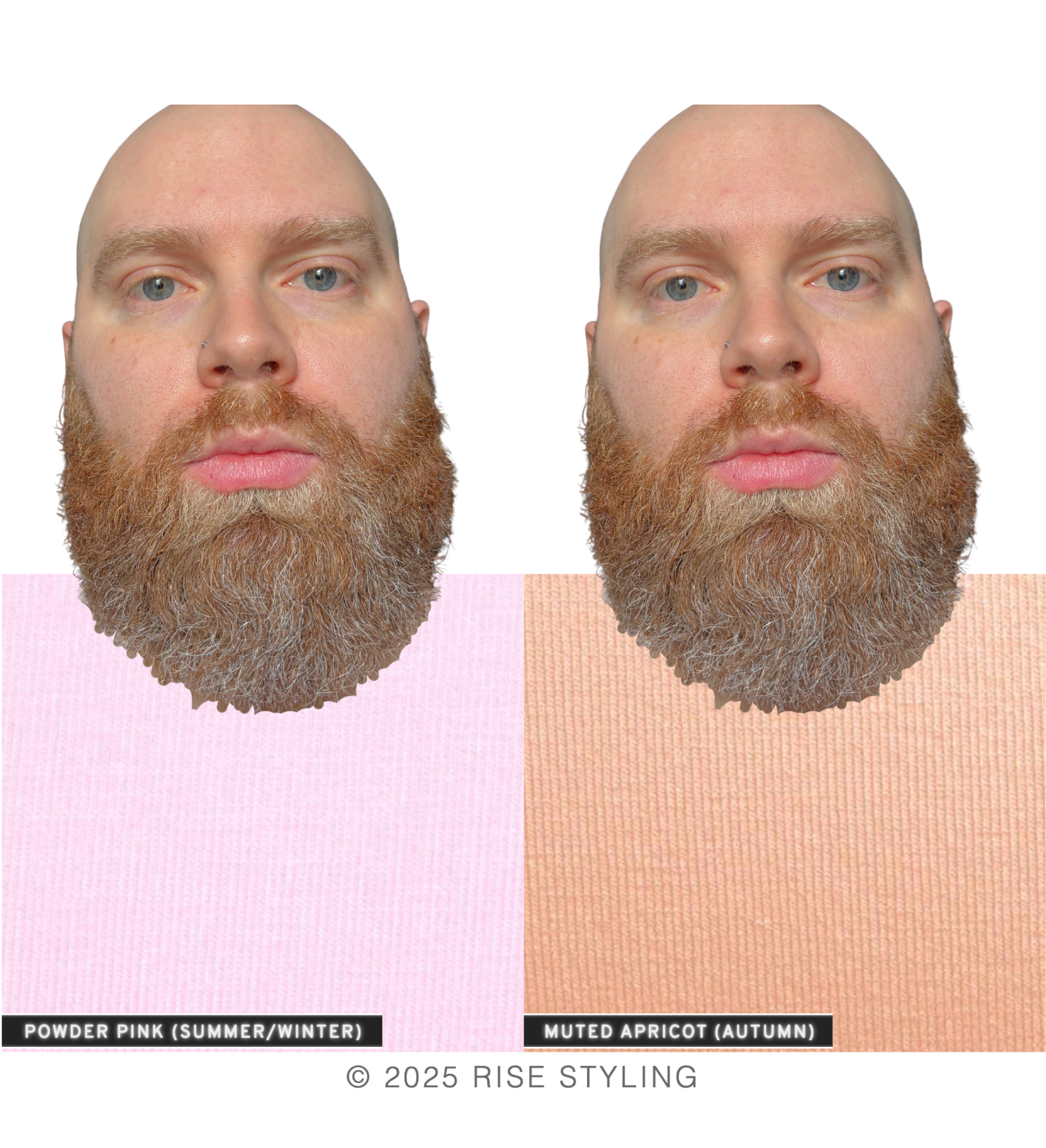
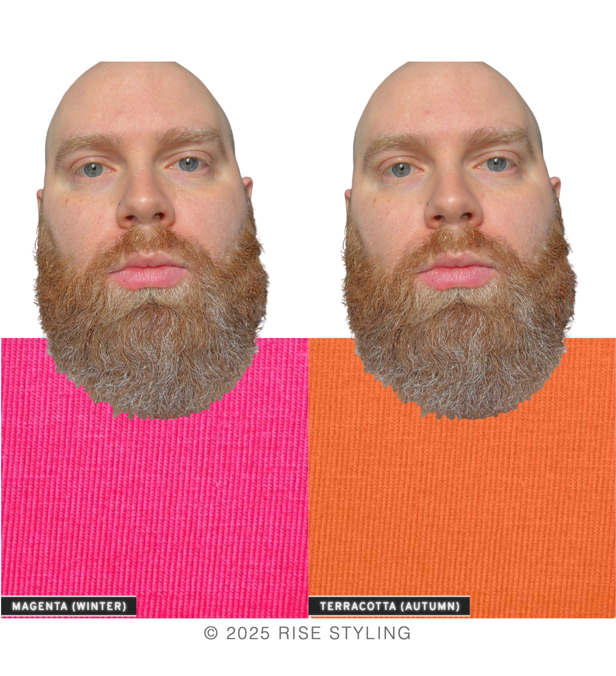
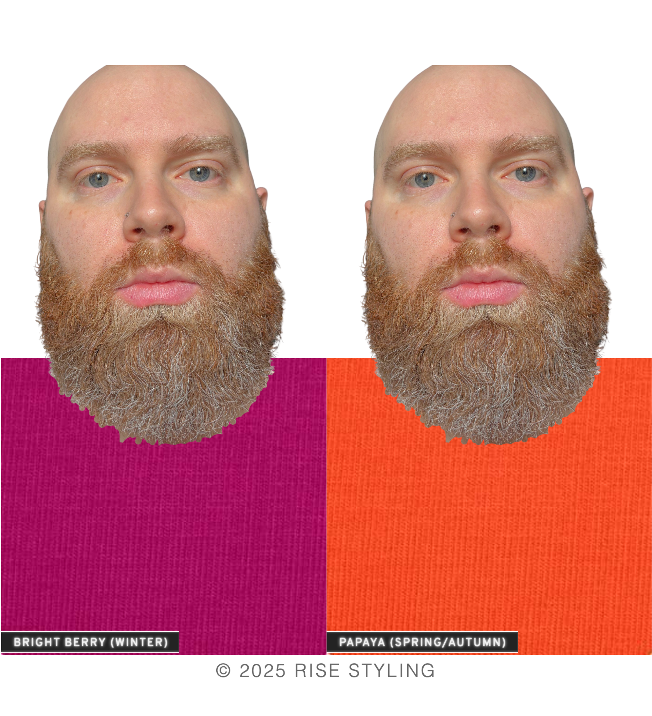
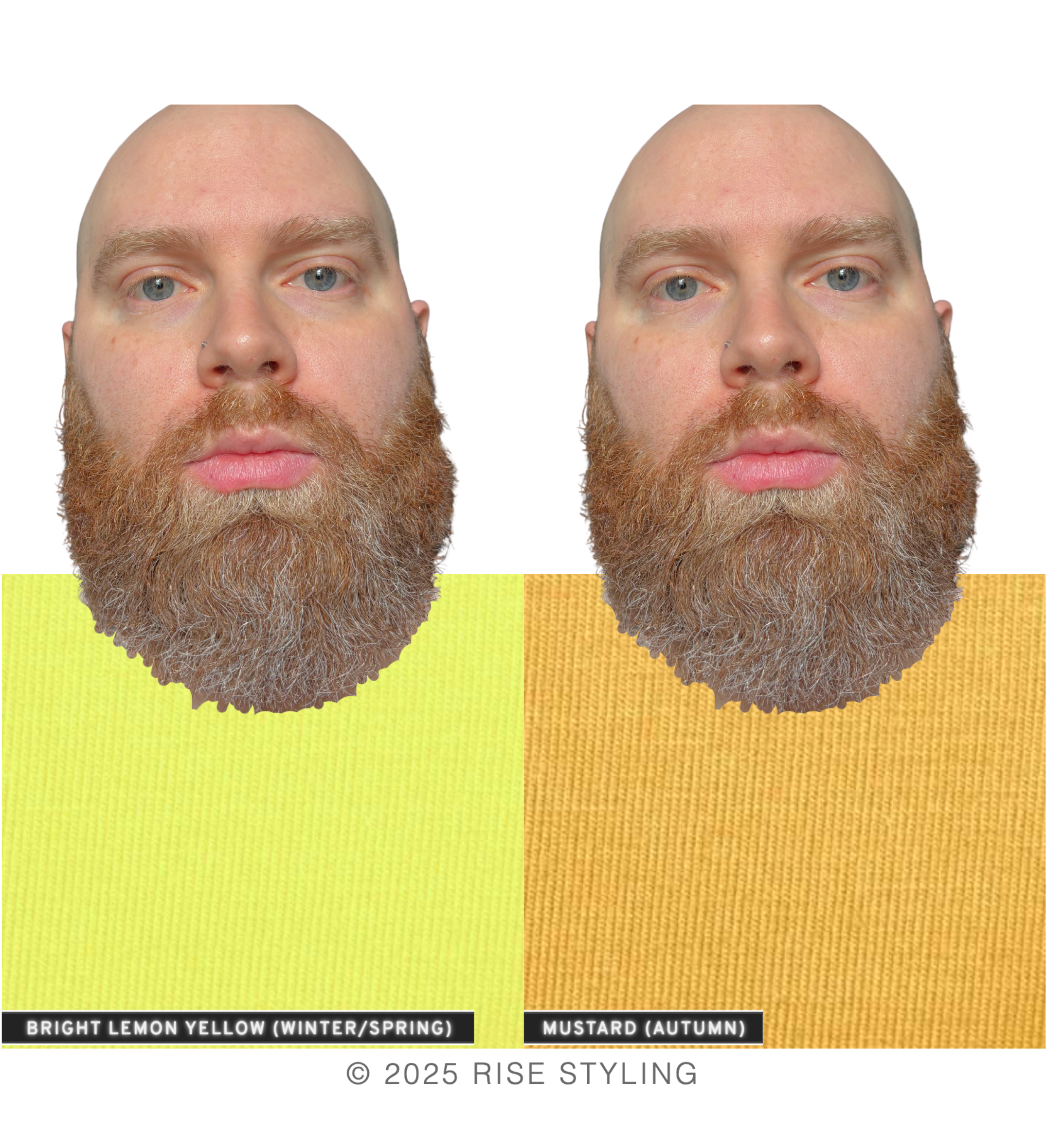
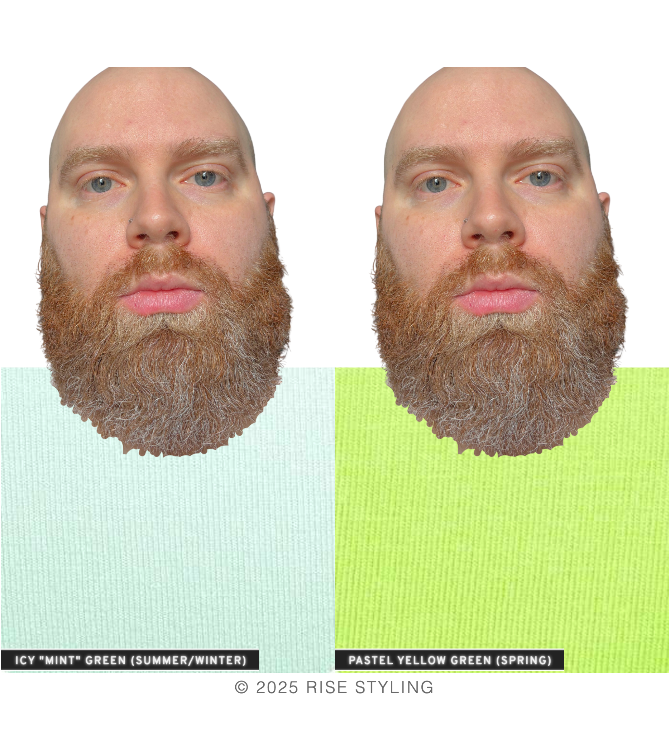
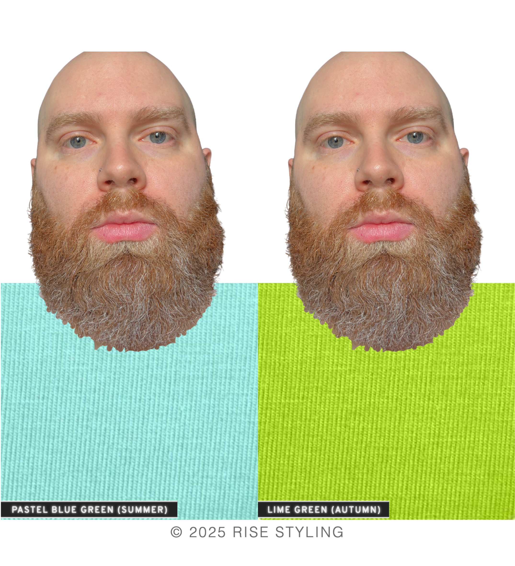
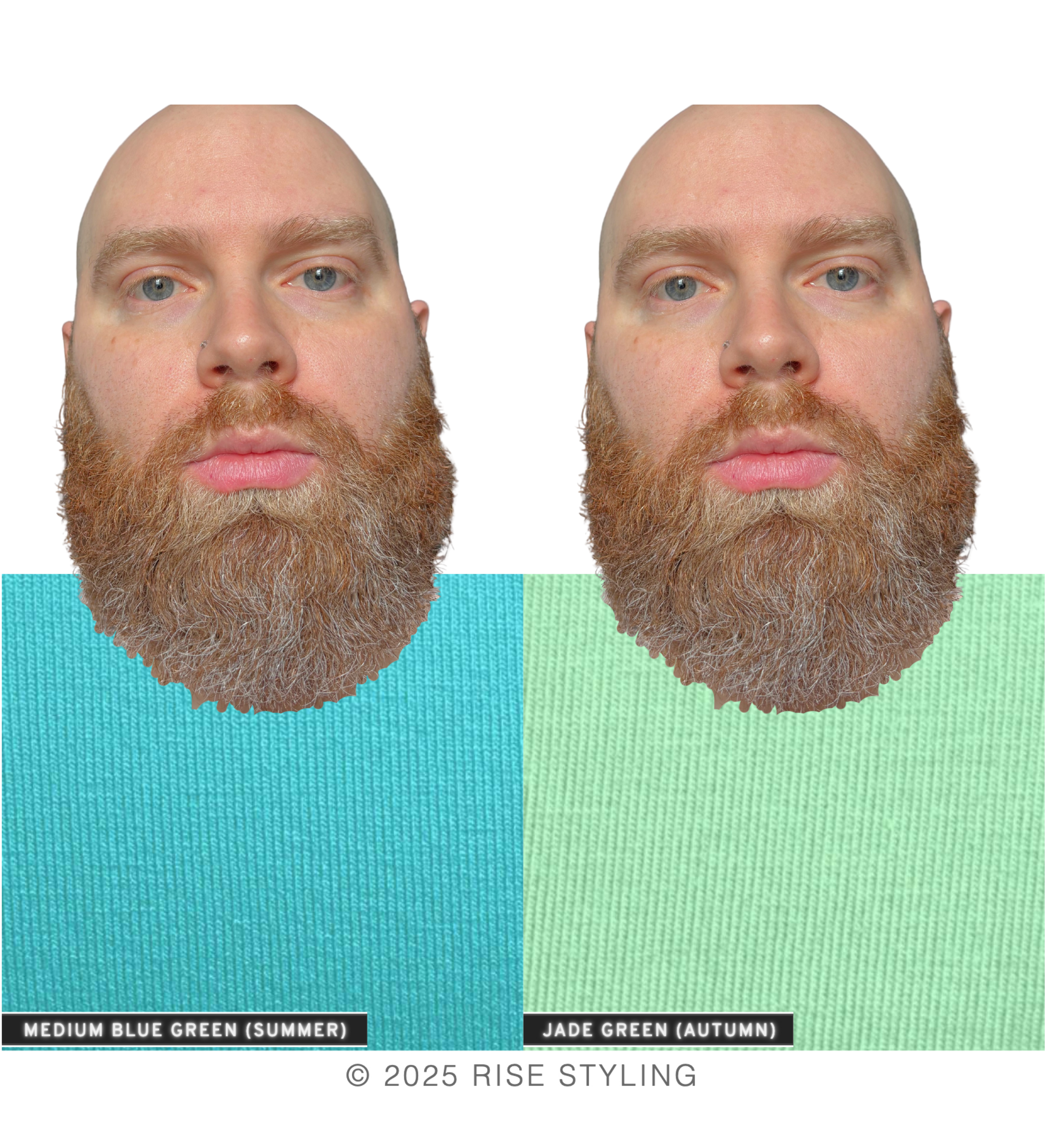
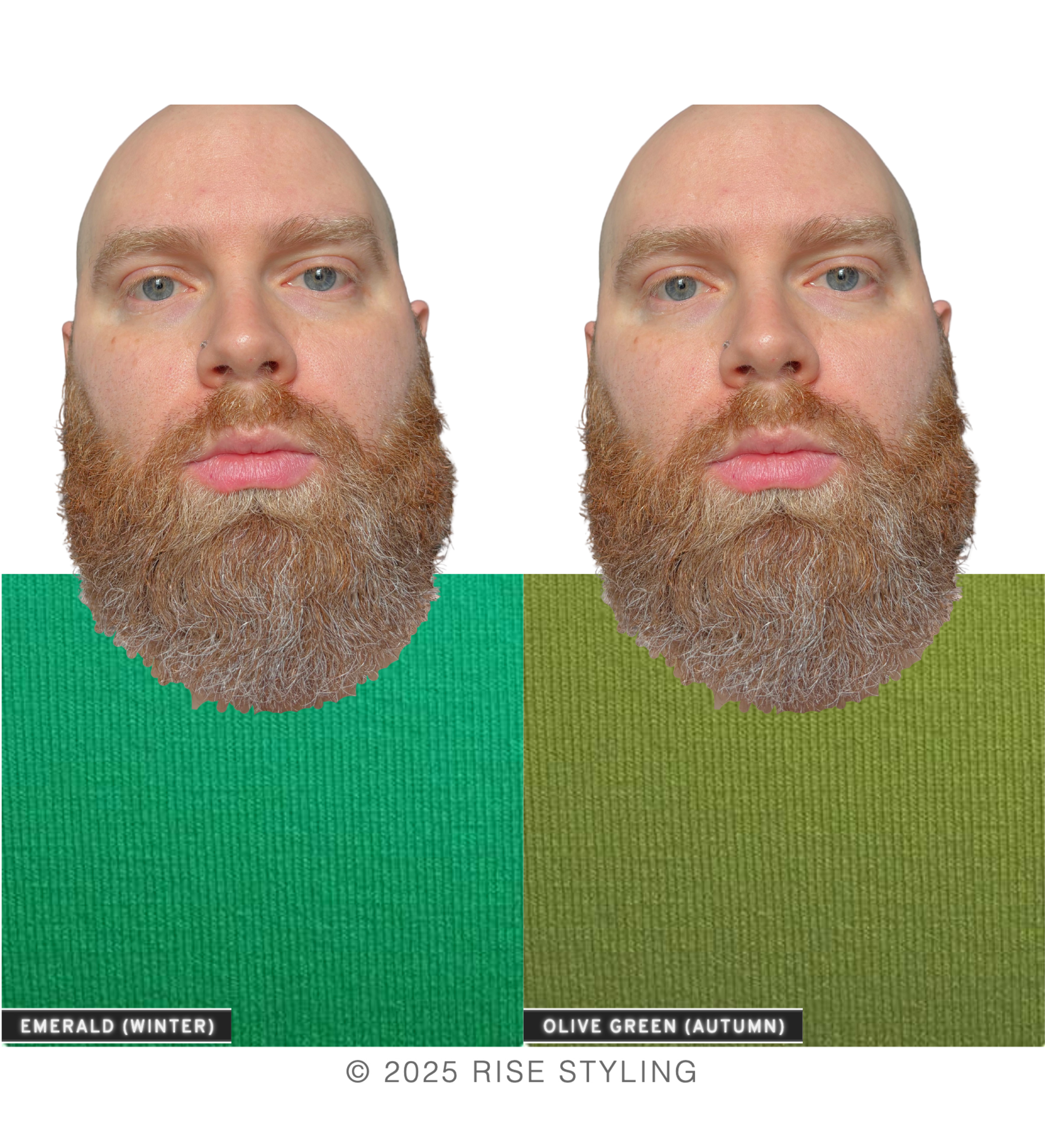
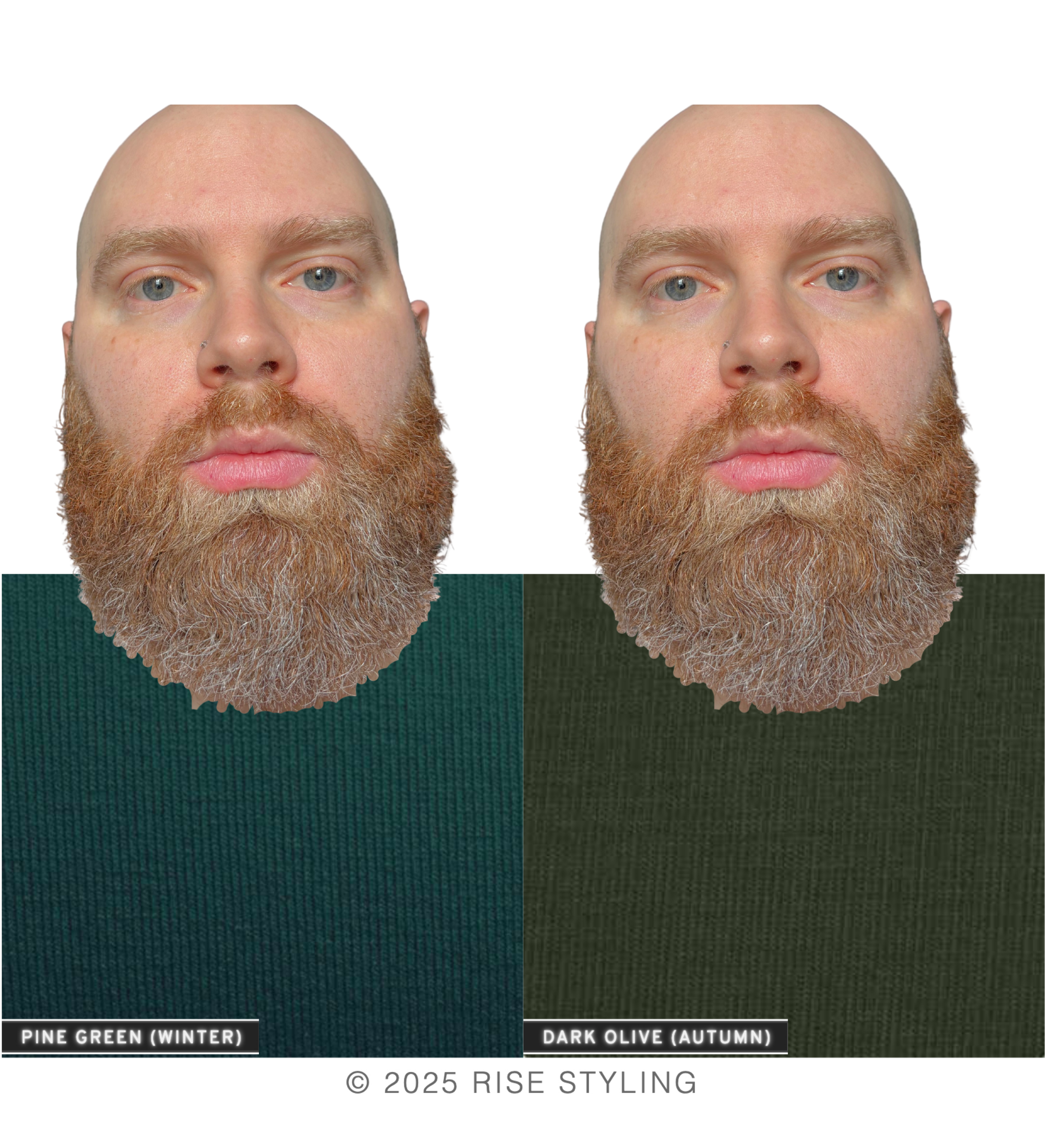
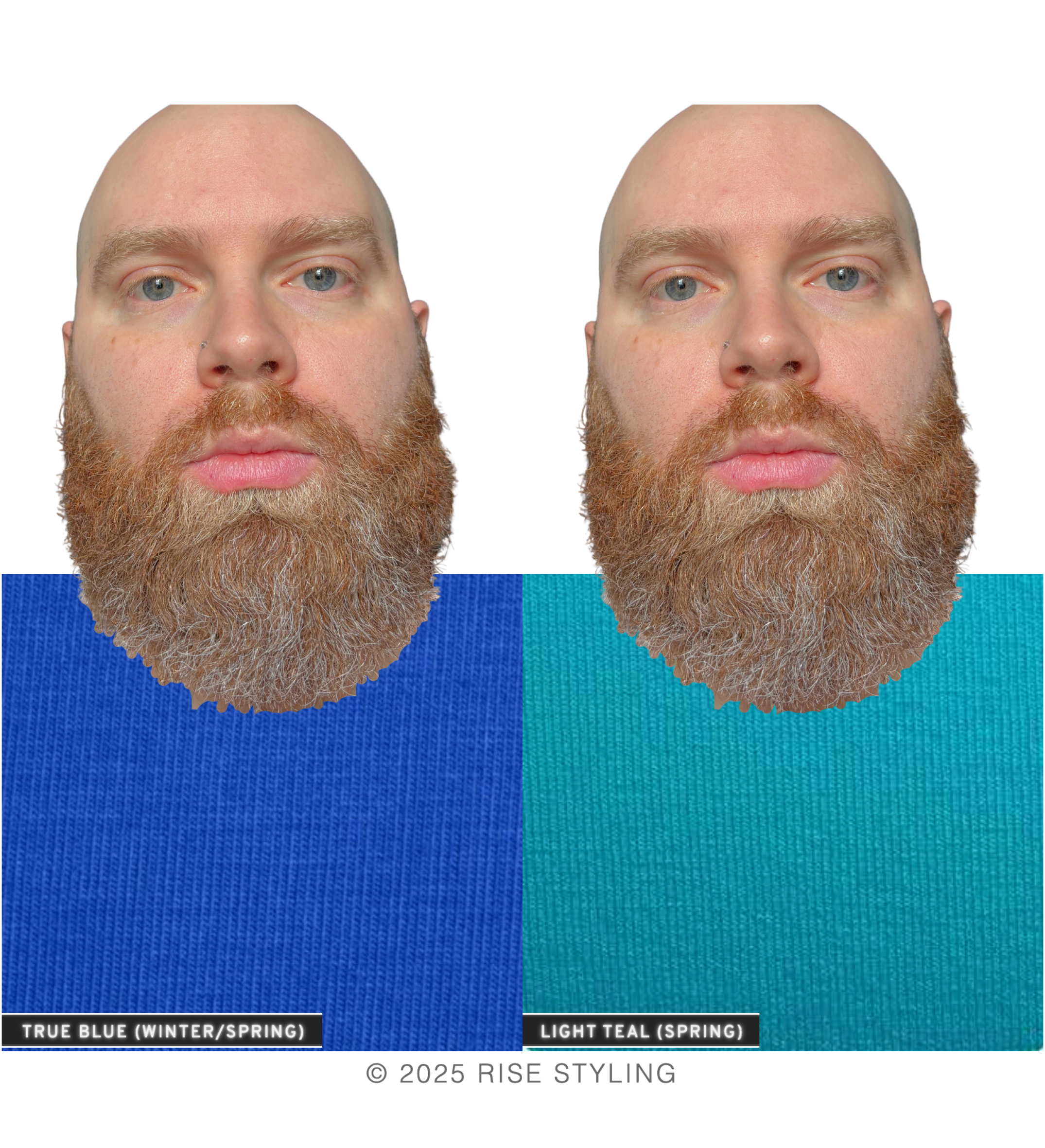
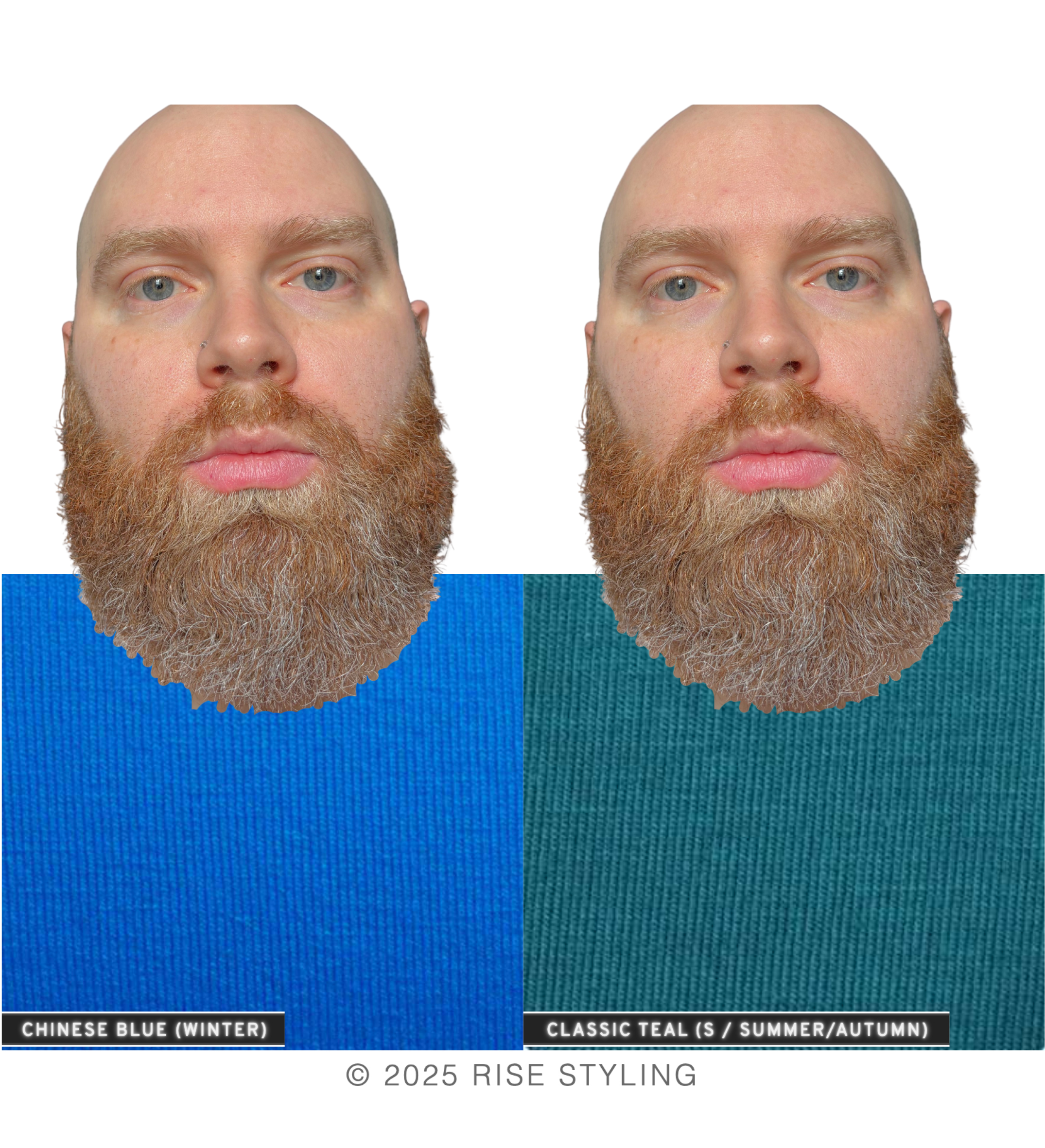
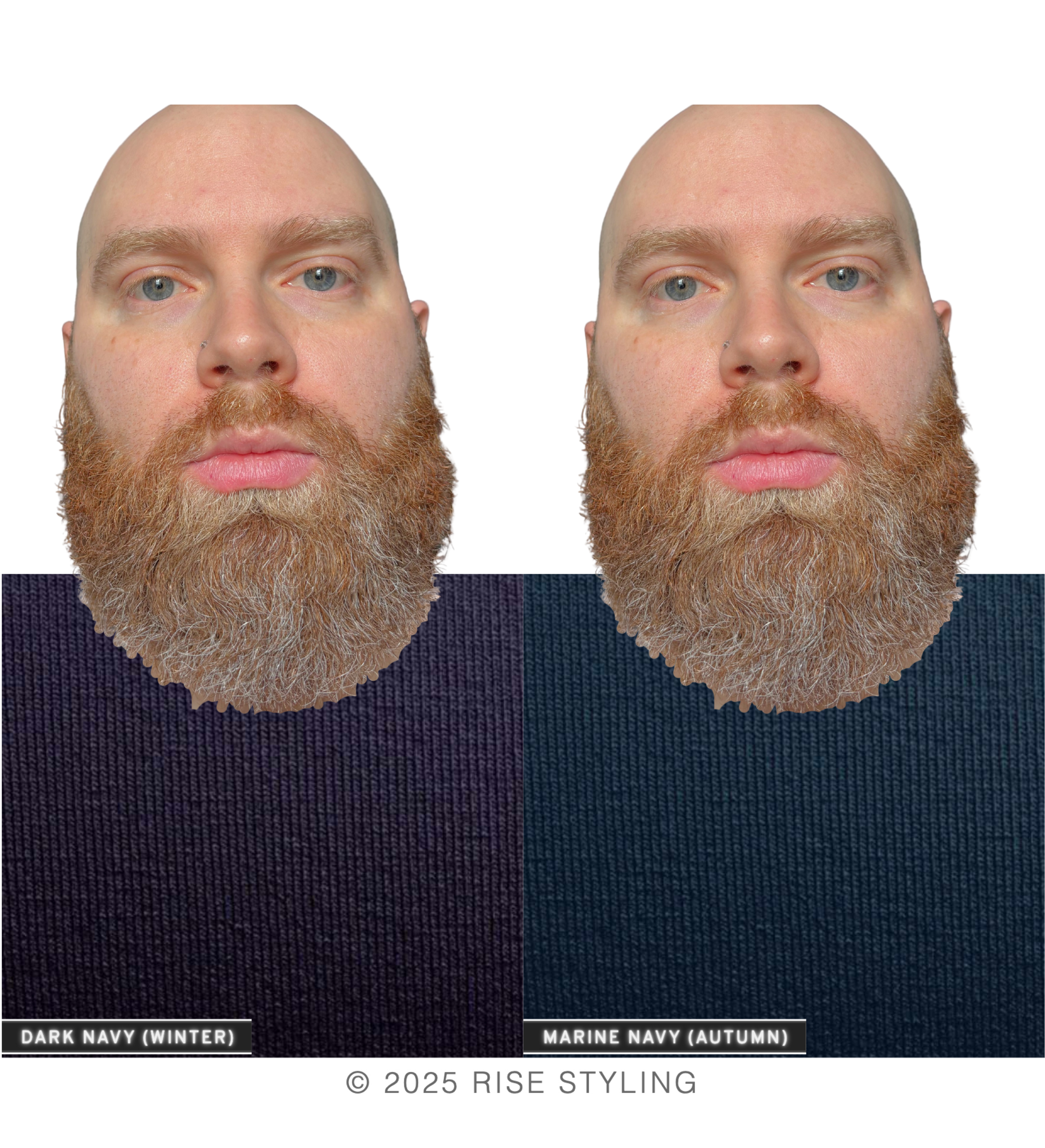
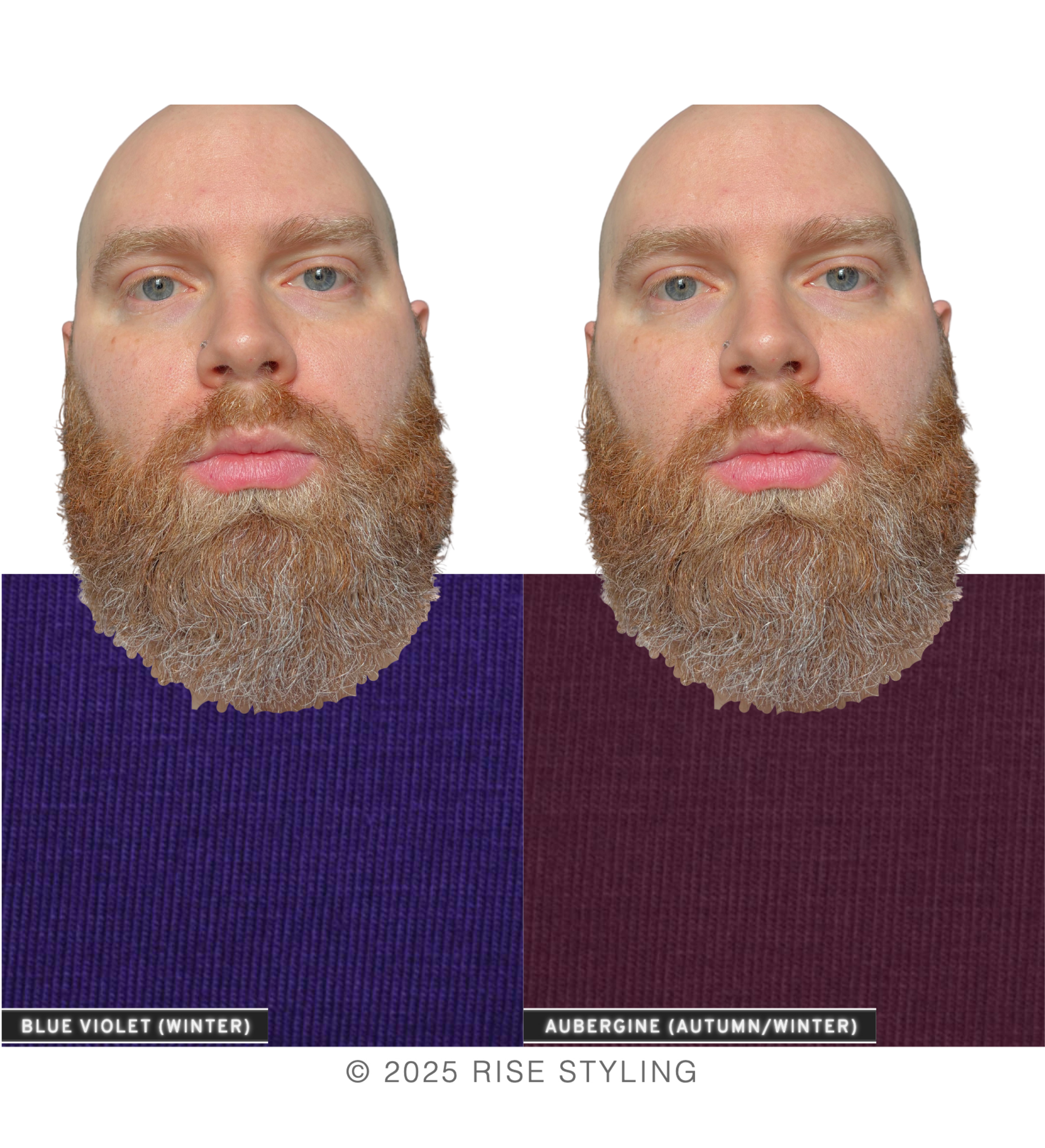
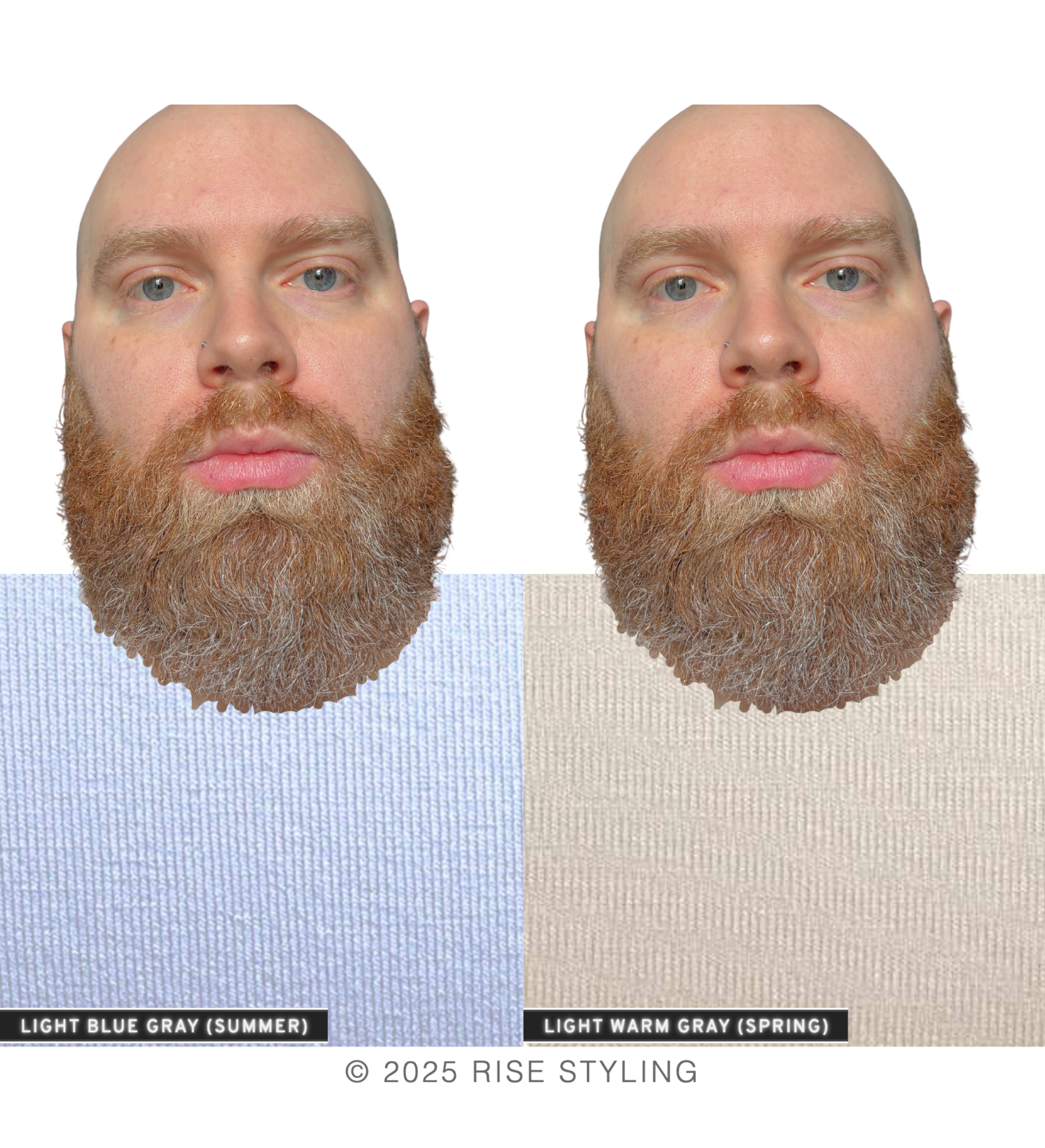
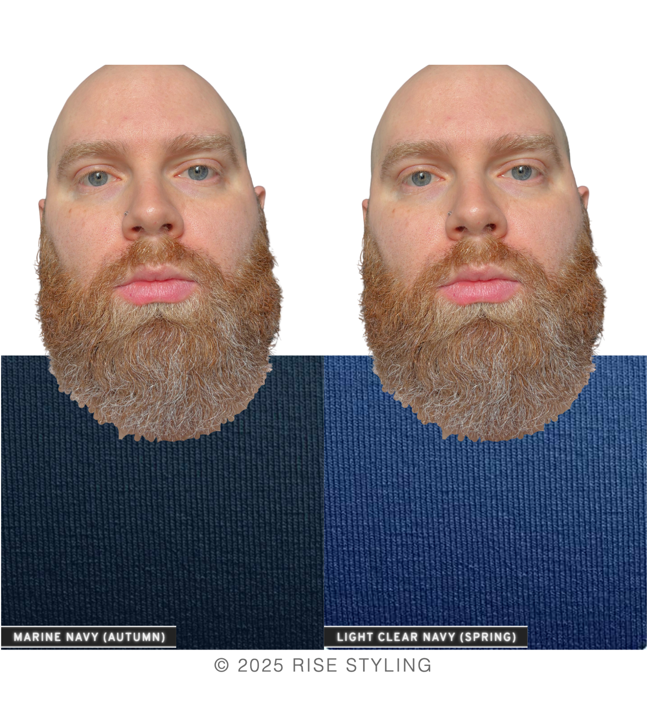
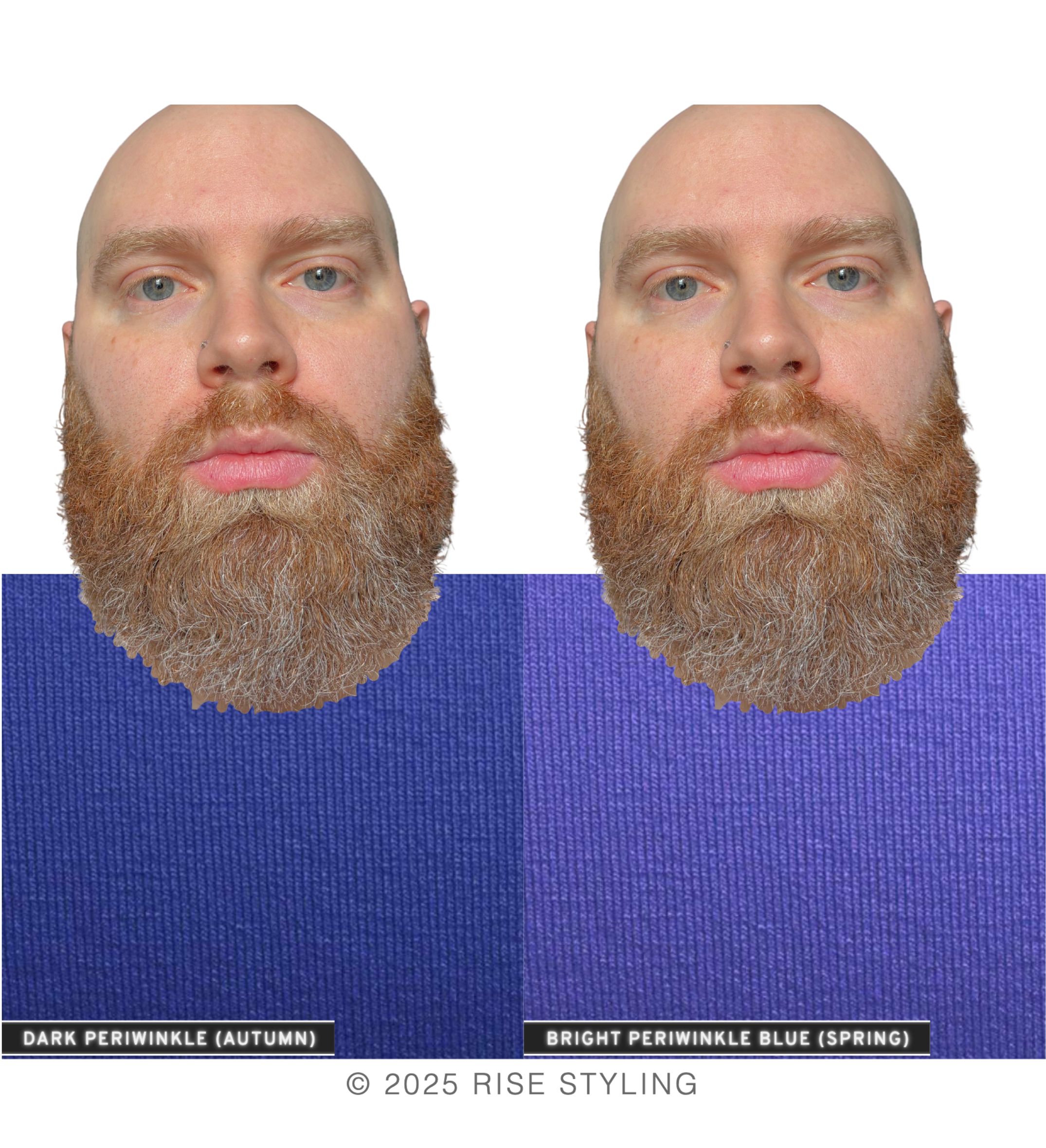
Overall, his undertones are quite WARM. Within each isolated comparison, the majority of the warm colors appear more harmonious with his complexion, shadows are diminished, and his areas of natural pink (lips, cheeks) appear refreshed.
Does that mean that cool colors cannot work for him, ever? Not at all!
Your season has three main criteria: Temperature (warm or cool), Value (light or deep), and Chroma (soft or bright). For any color to qualify for its season, it must satisfy only two out of the three criteria.
Therefore, even the warm seasons will contain some “cool” colors, as long as they are LIGHT & BRIGHT (Spring) or SOFT & DEEP (Autumn).
As I like to say, all colors are fine options for you. A smile is the most beautiful thing you can wear, so choose colors that bring you joy!
The purpose of this first test in your analysis is to first reveal which temperature of colors are BETTER than fine (warm or cool).
Now that we know Sam is WARM, we can eliminate two of the four parent seasons for him:
WINTER (cool)
SPRING (warm)
SUMMER (cool)
AUTUMN (warm)
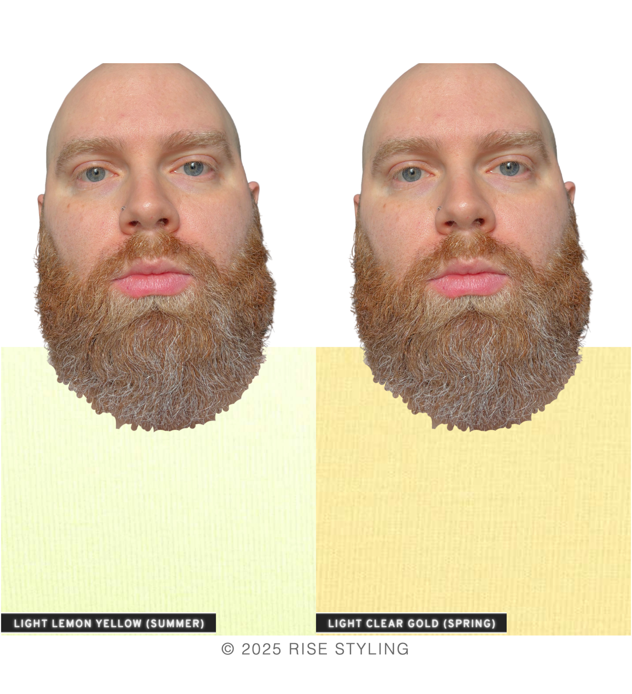
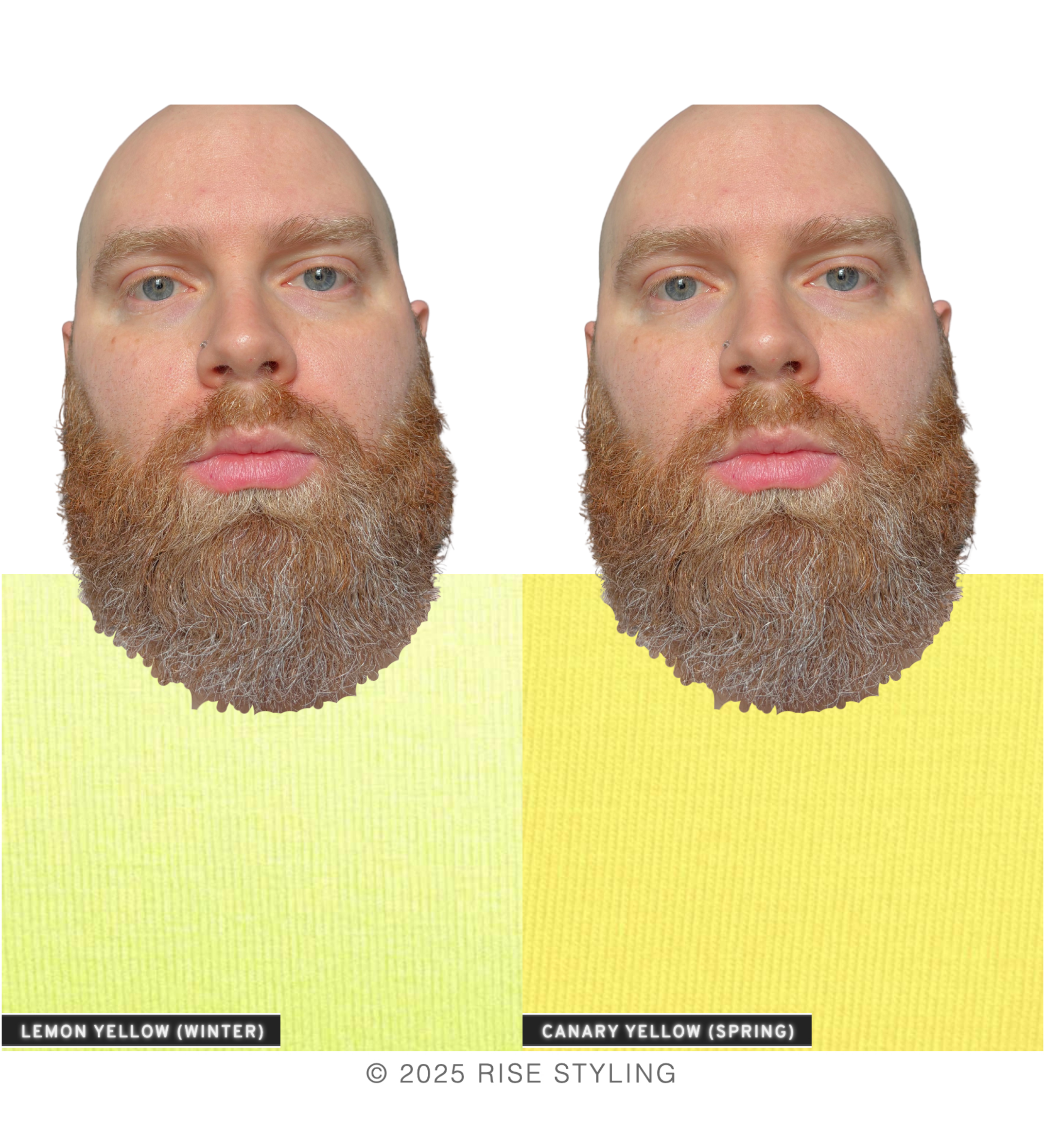
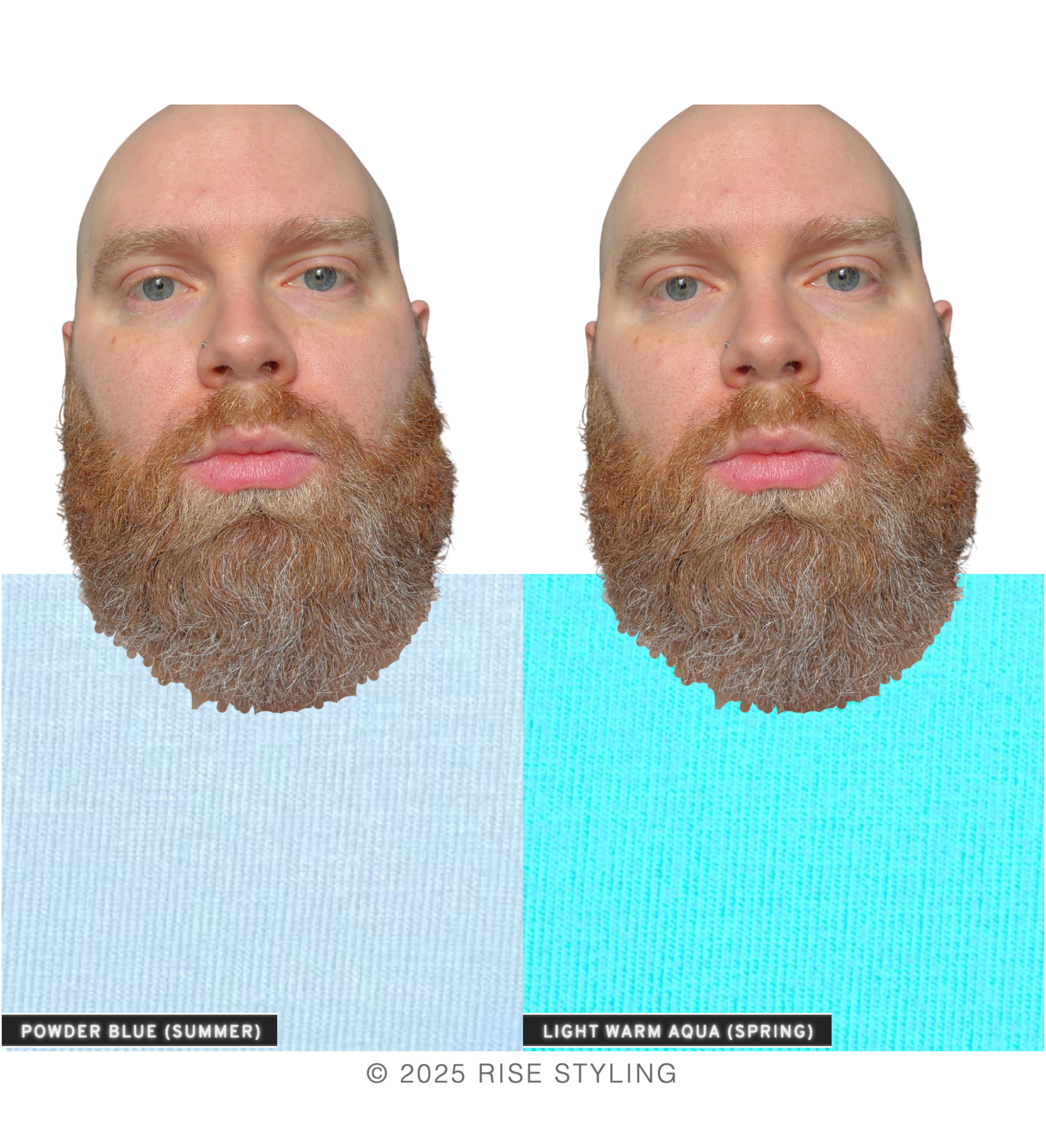
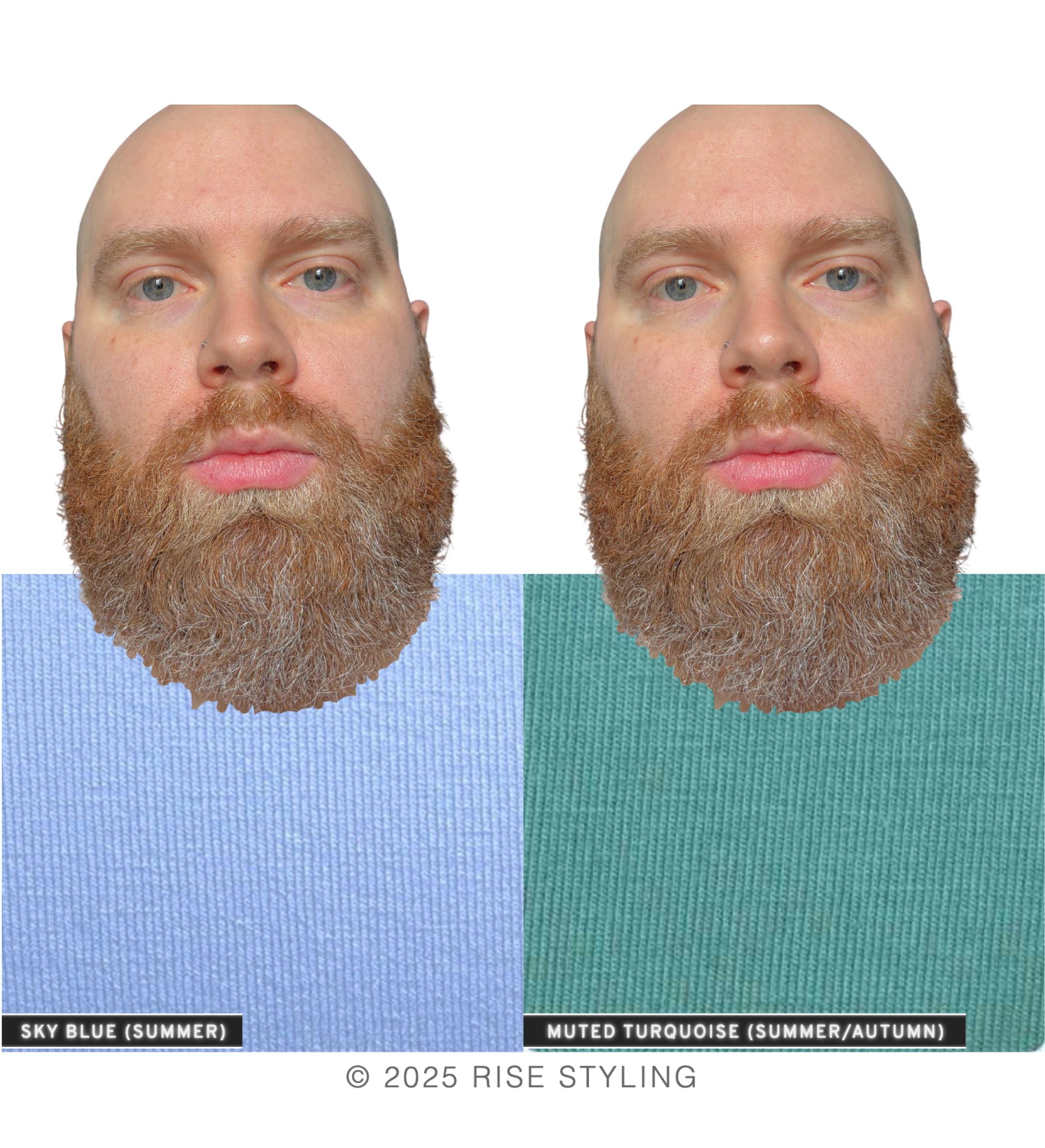
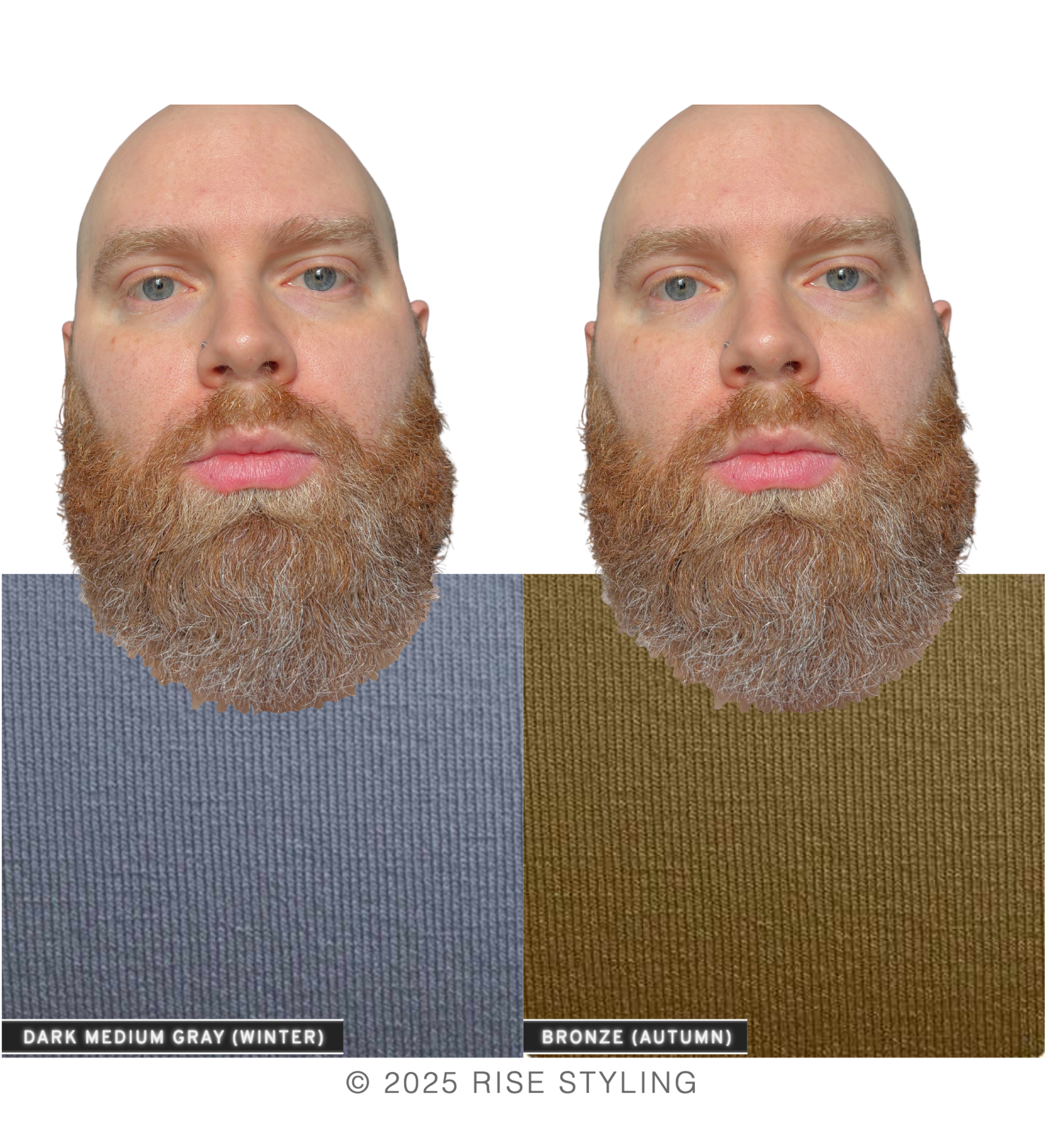
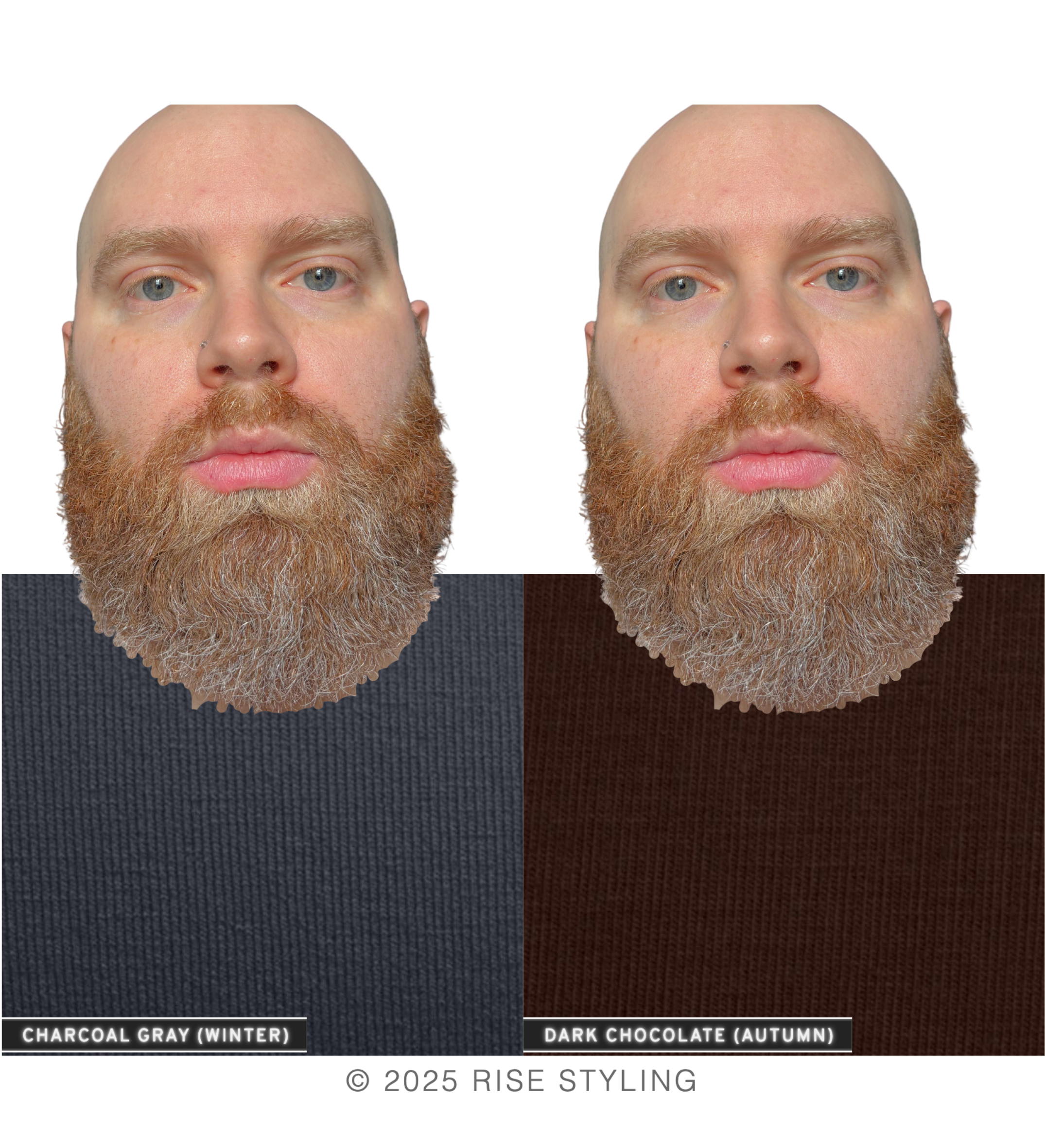
In the next test, we aim to find out if he needs warm AND bright (Spring) or warm AND soft (Autumn). This is how we determine his season!
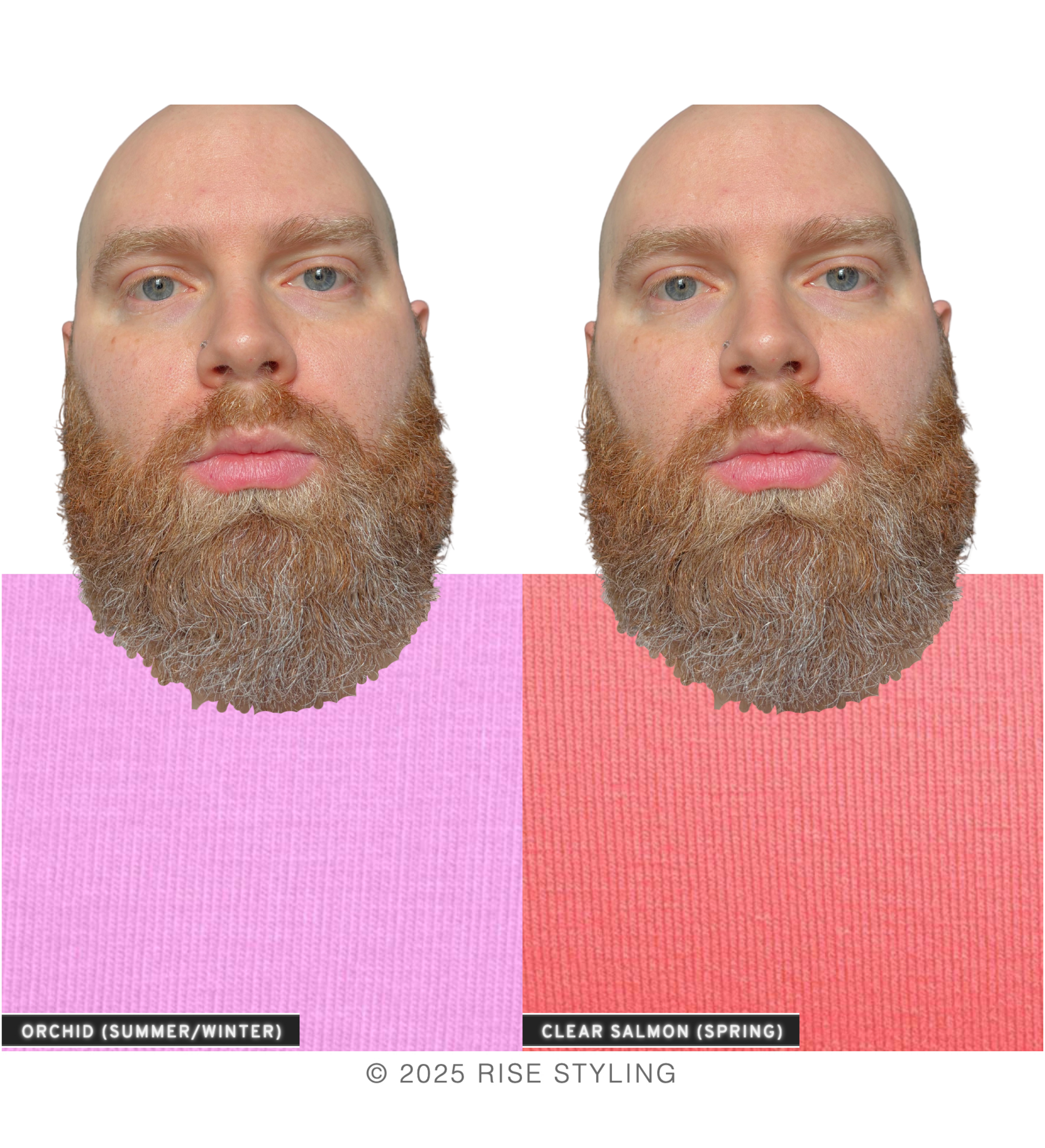
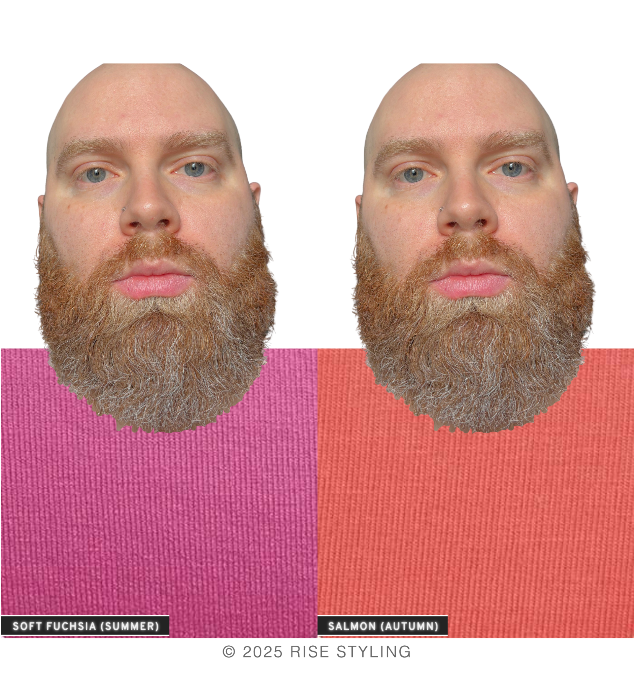
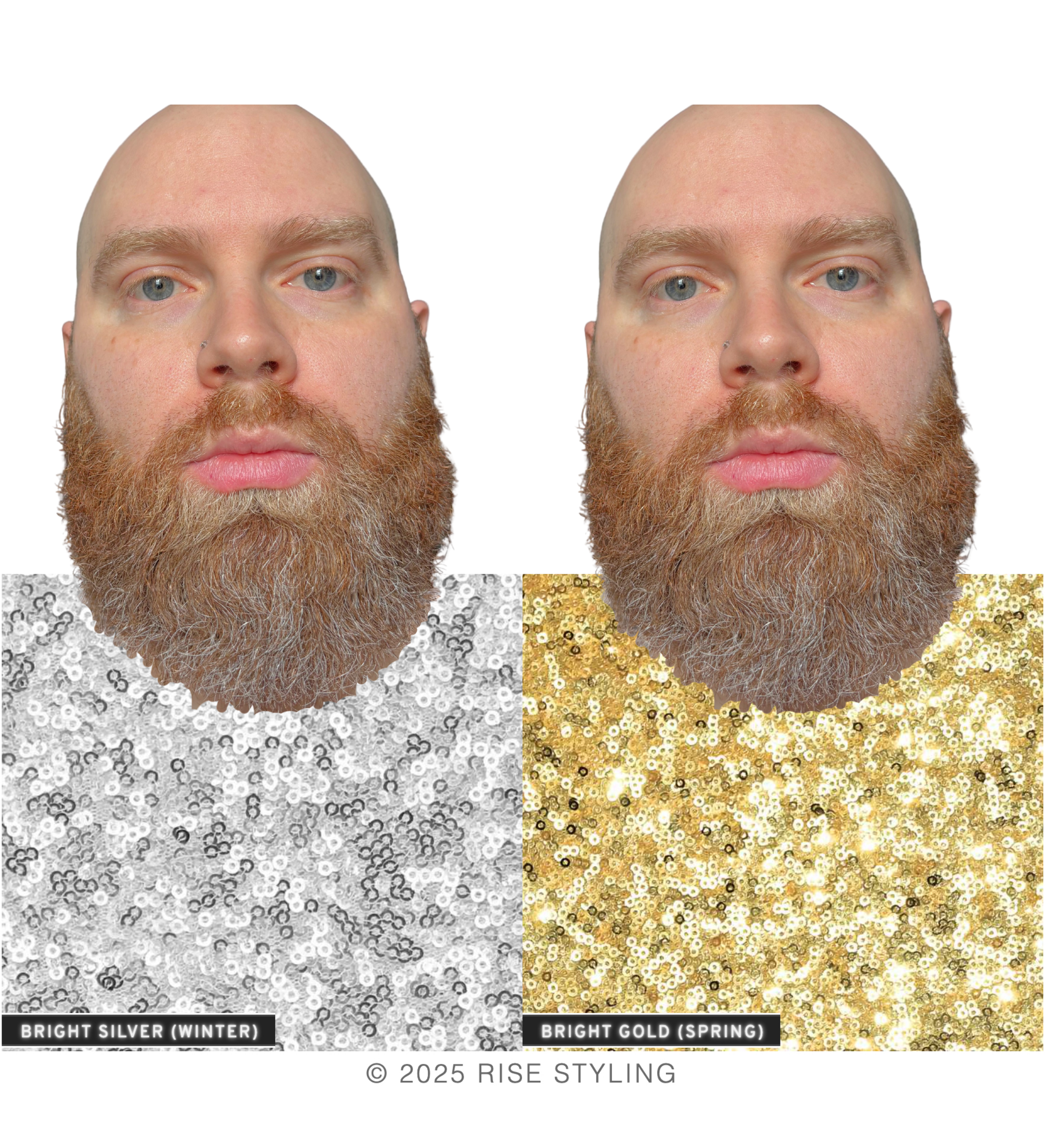
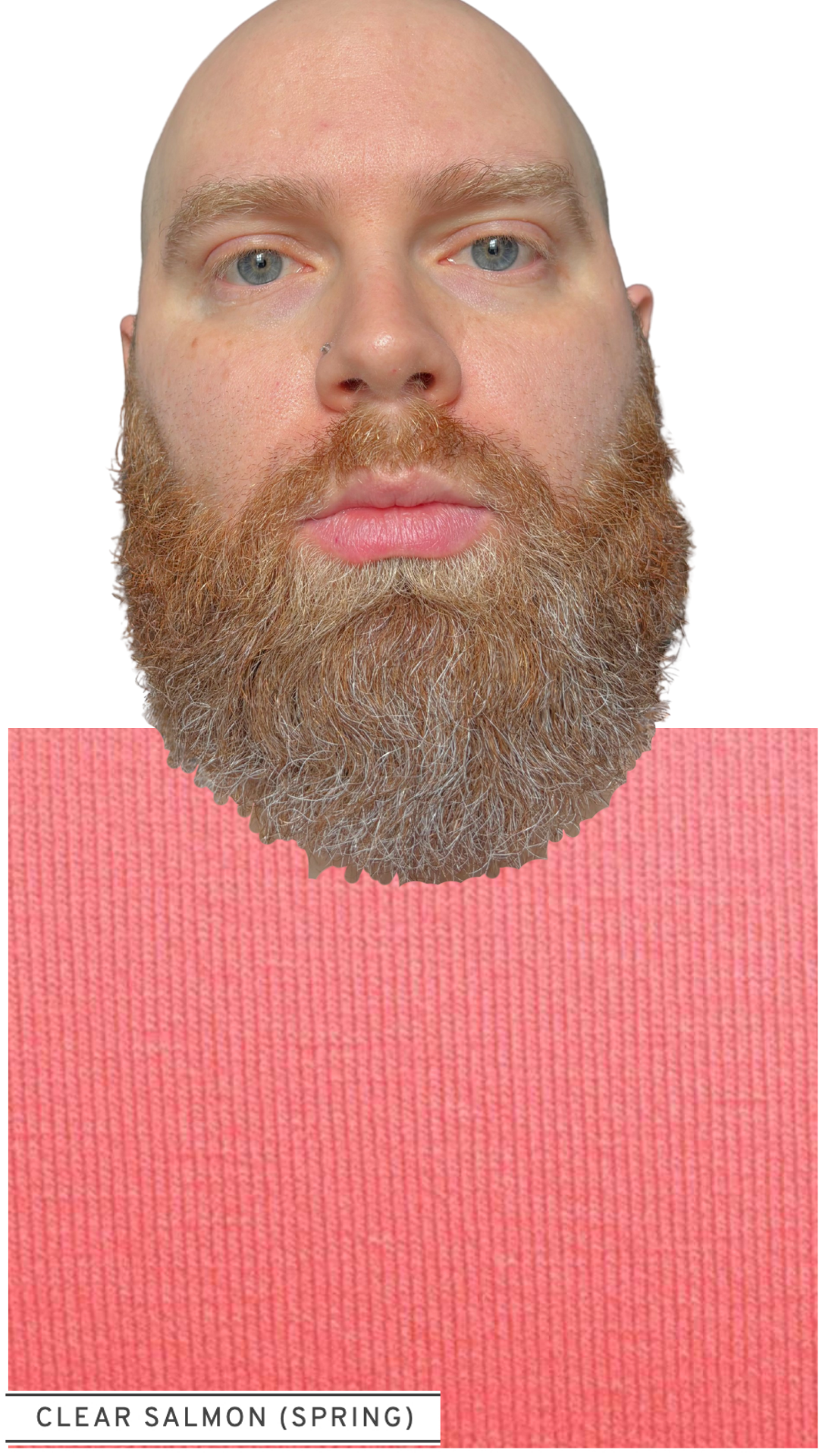
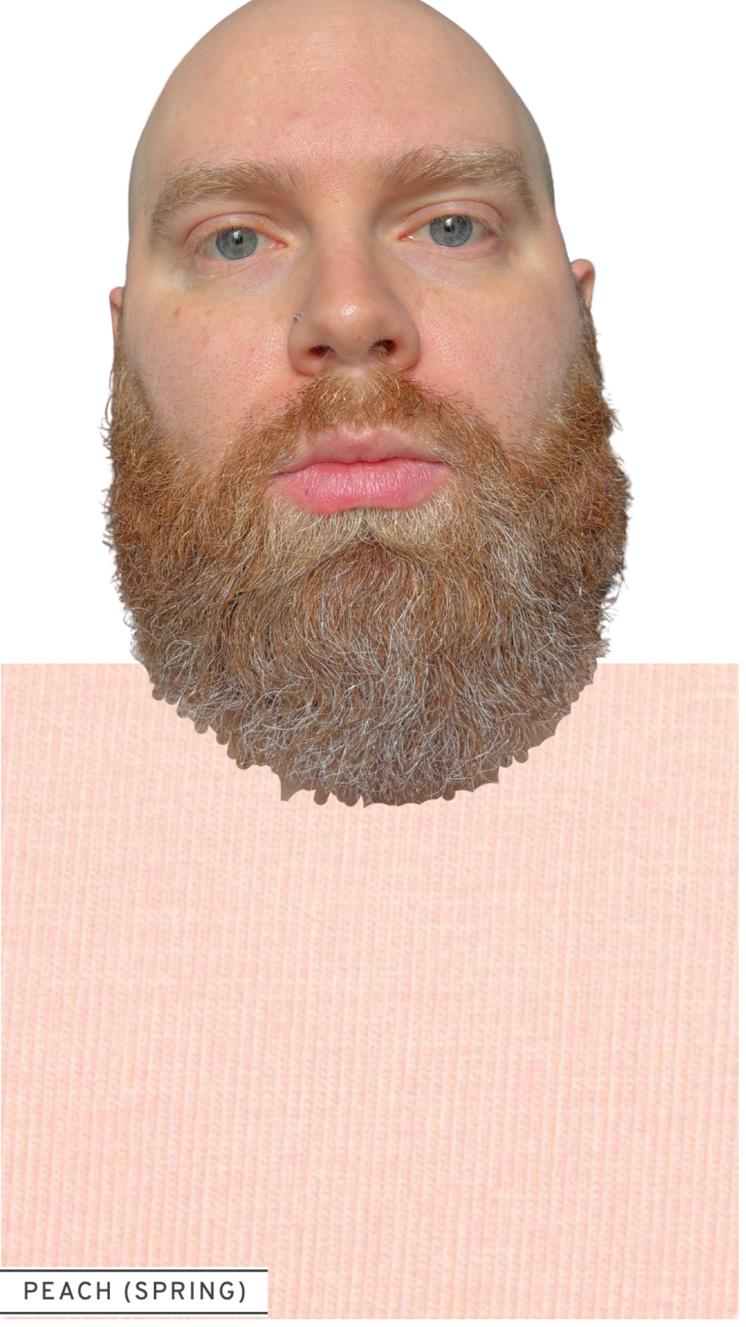
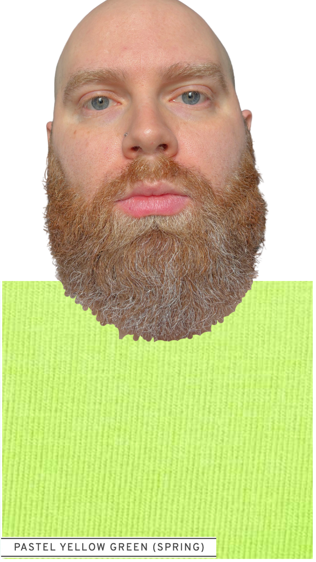
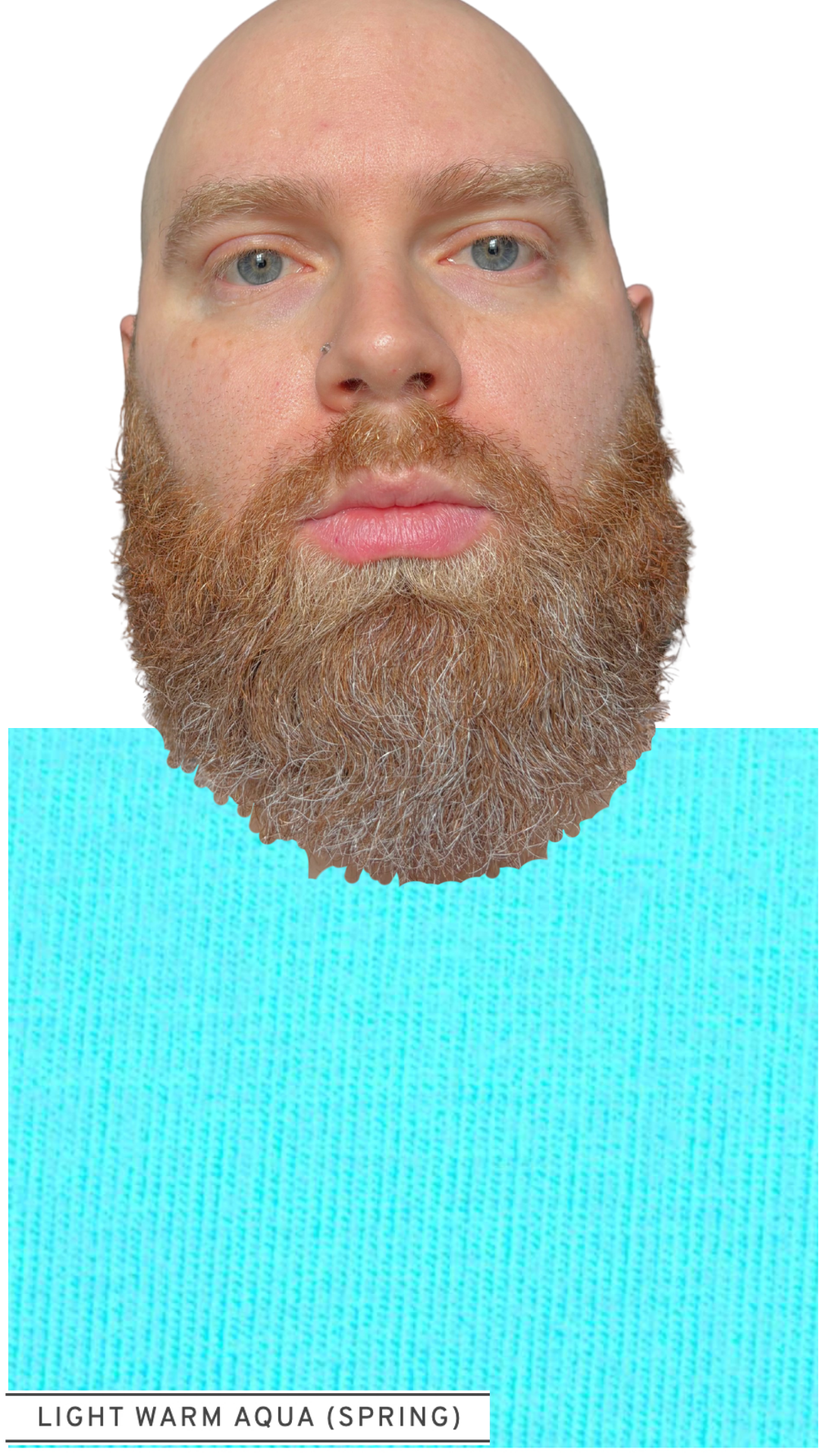
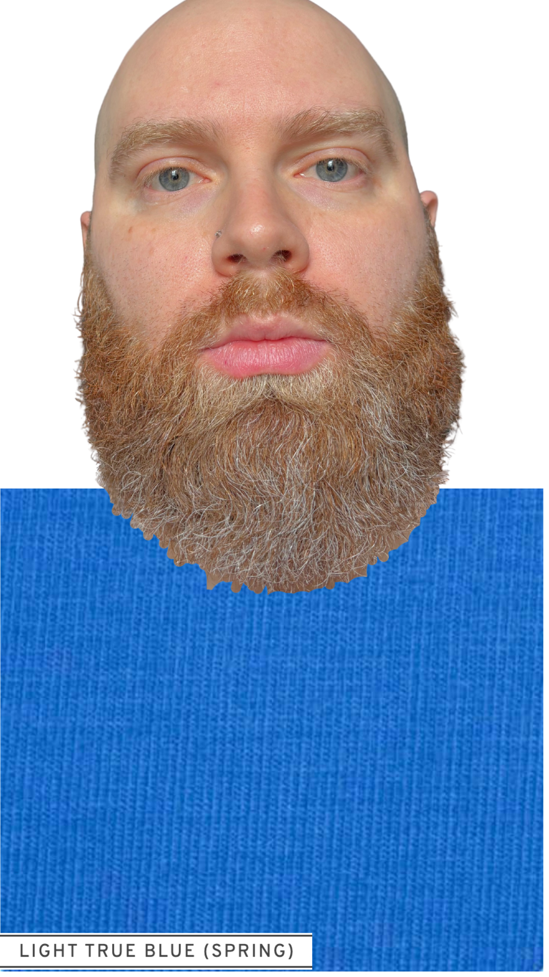
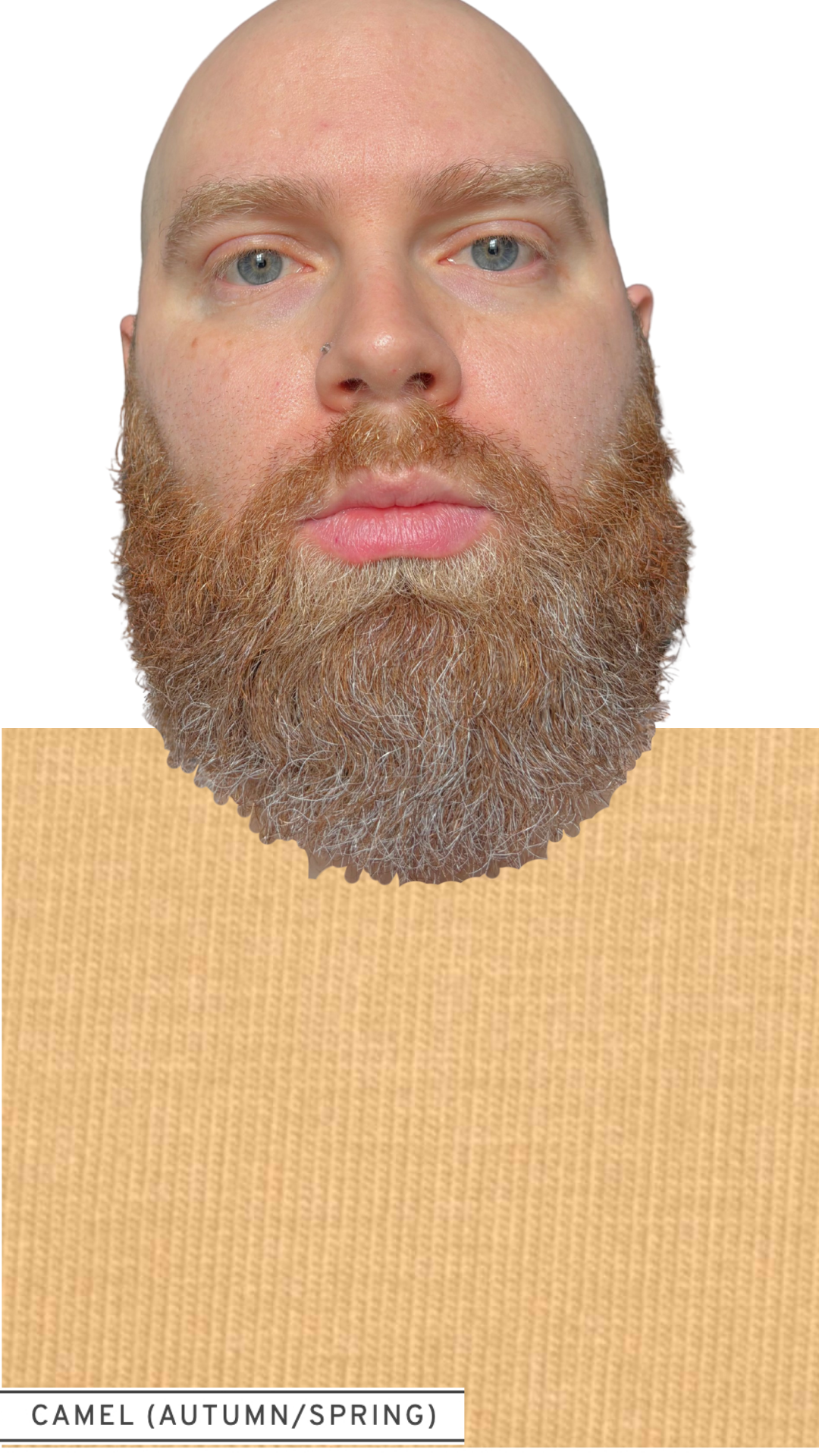
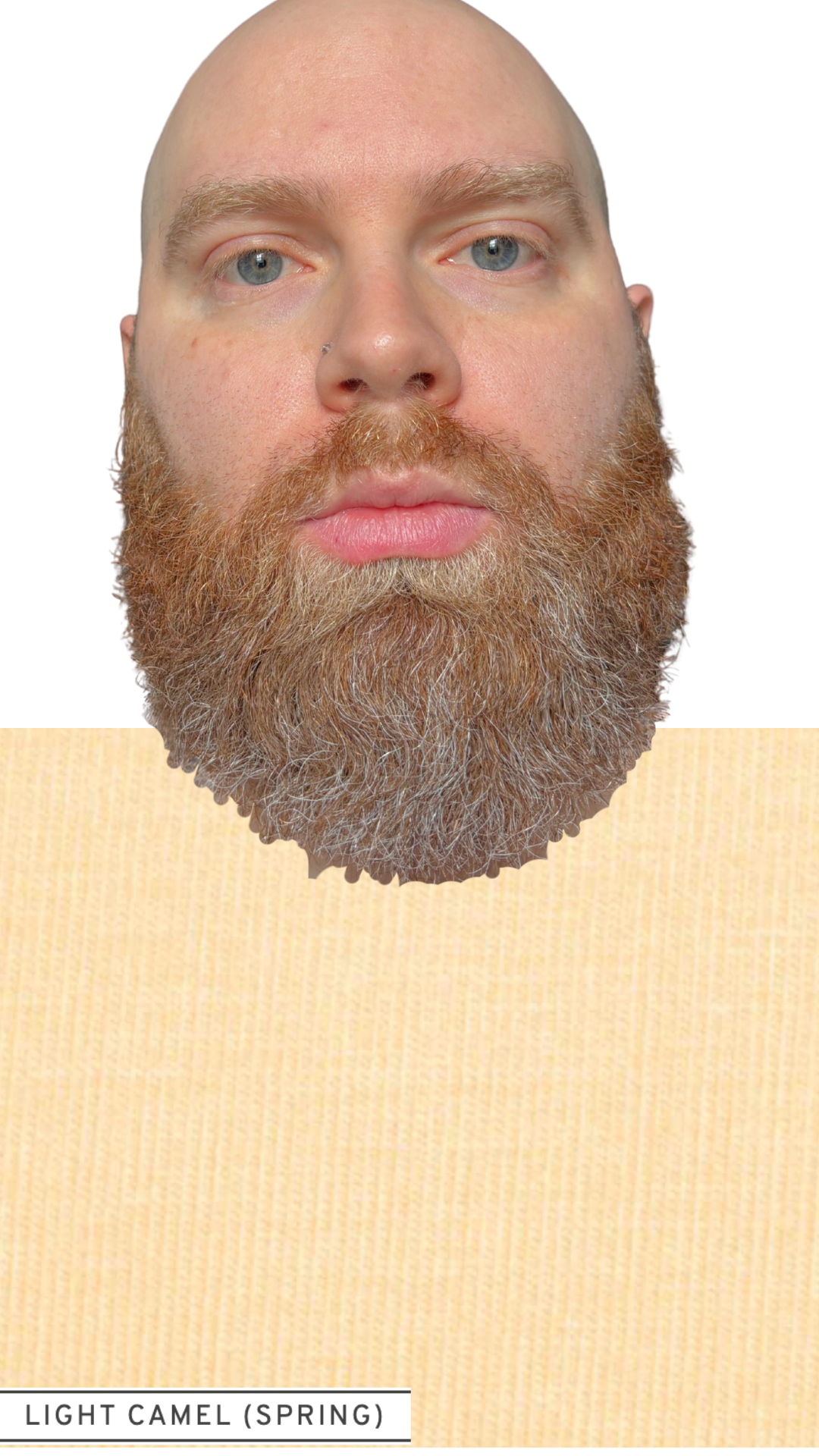
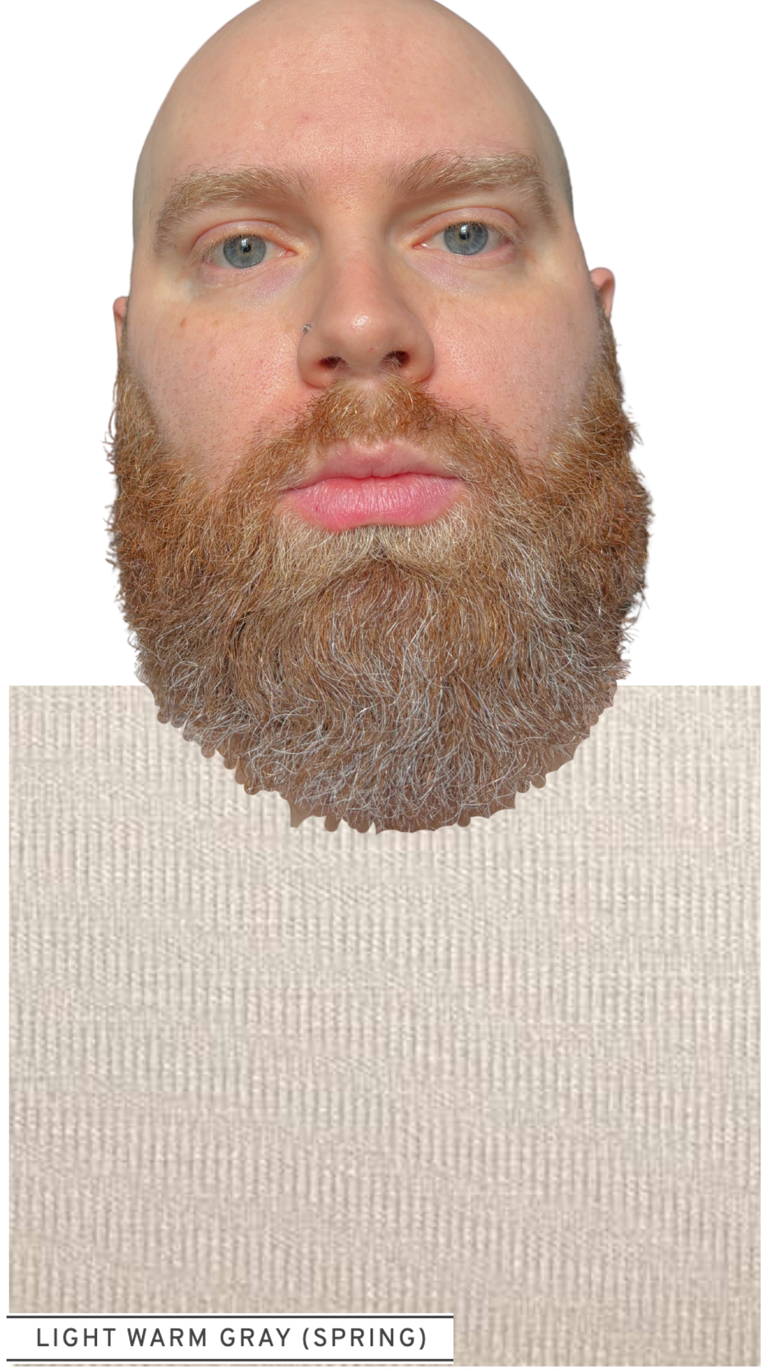
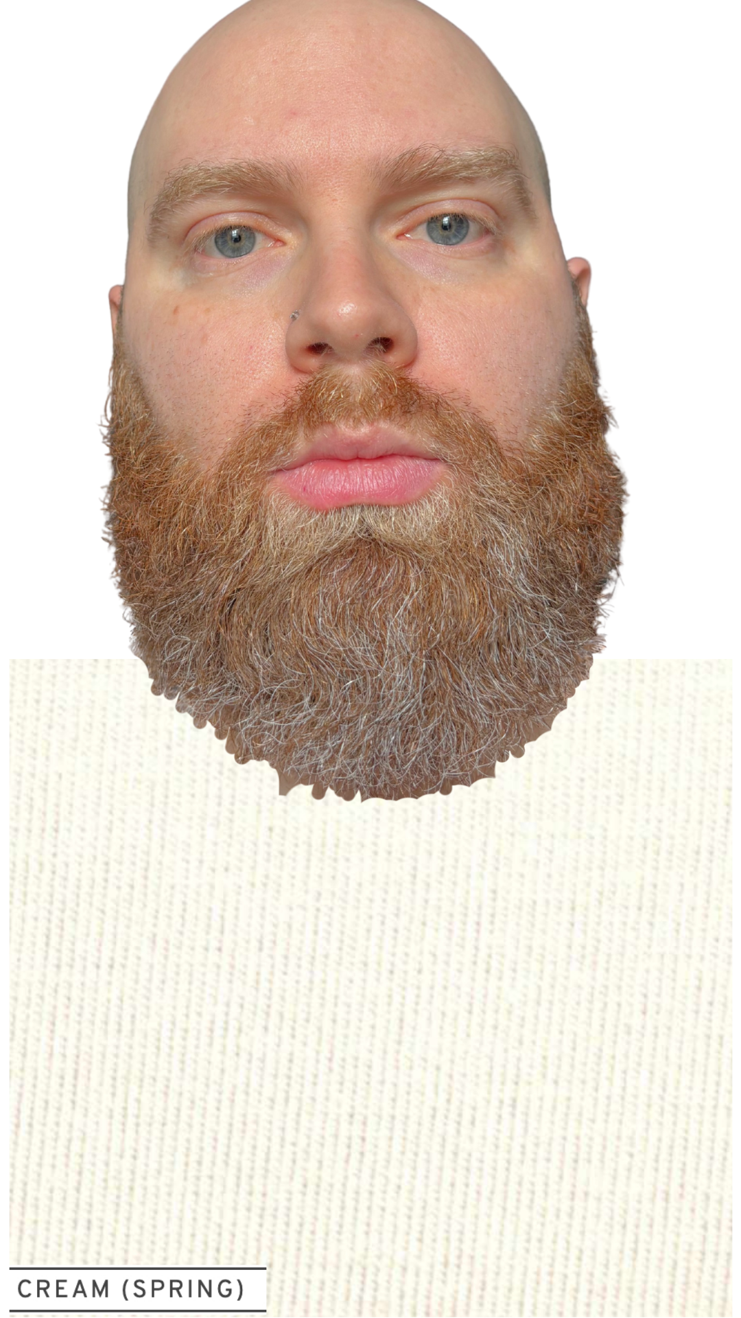
In the images below, we are comparing all WARM colors, varying only the CHROMA (saturation) within each comparison. Does Sam need lower chroma (soft, Autumn) or higher chroma (bright, Spring)?
Slide through to view Sam alternating between wearing Autumn colors (left) and Spring colors (right):
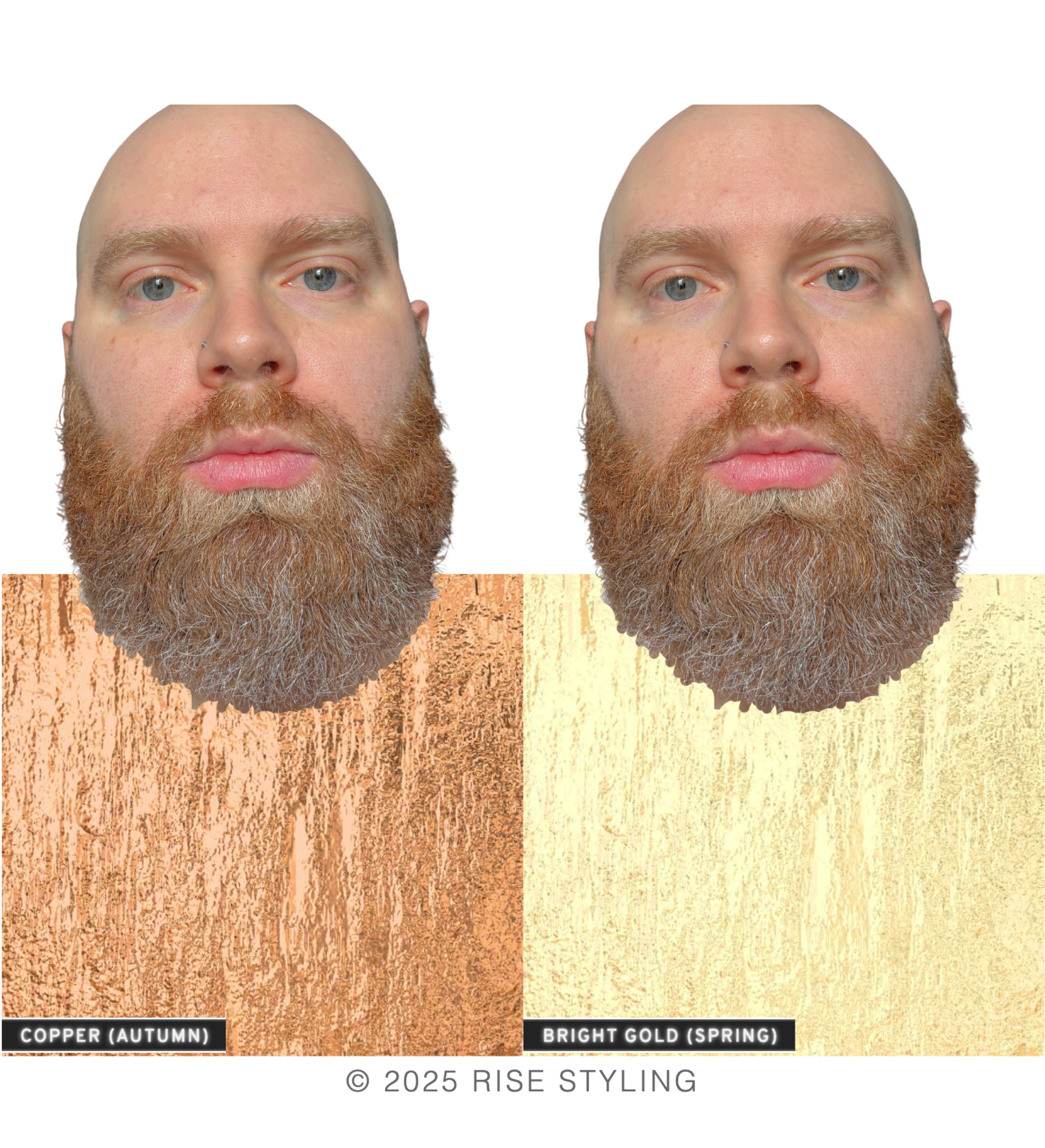
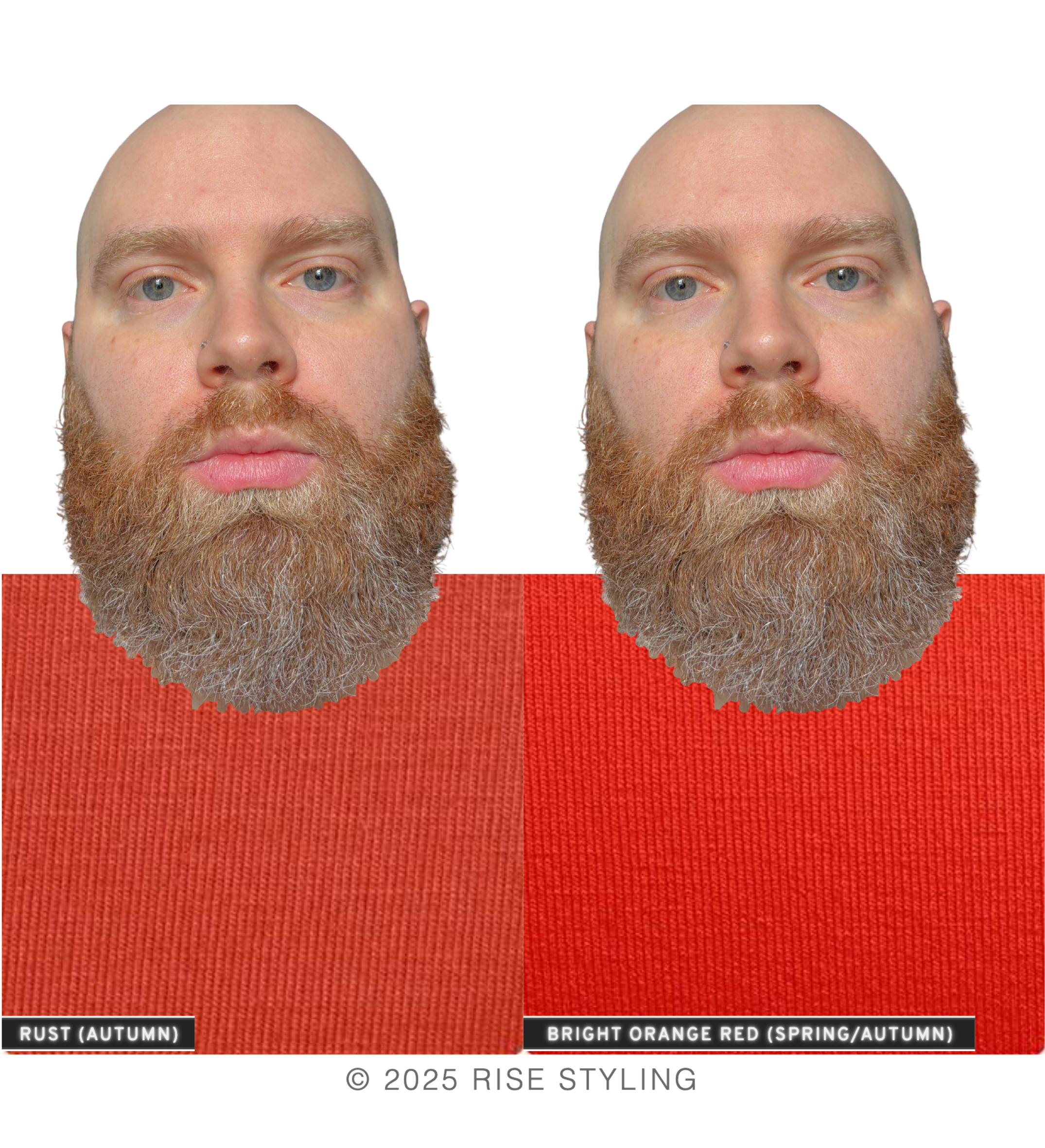
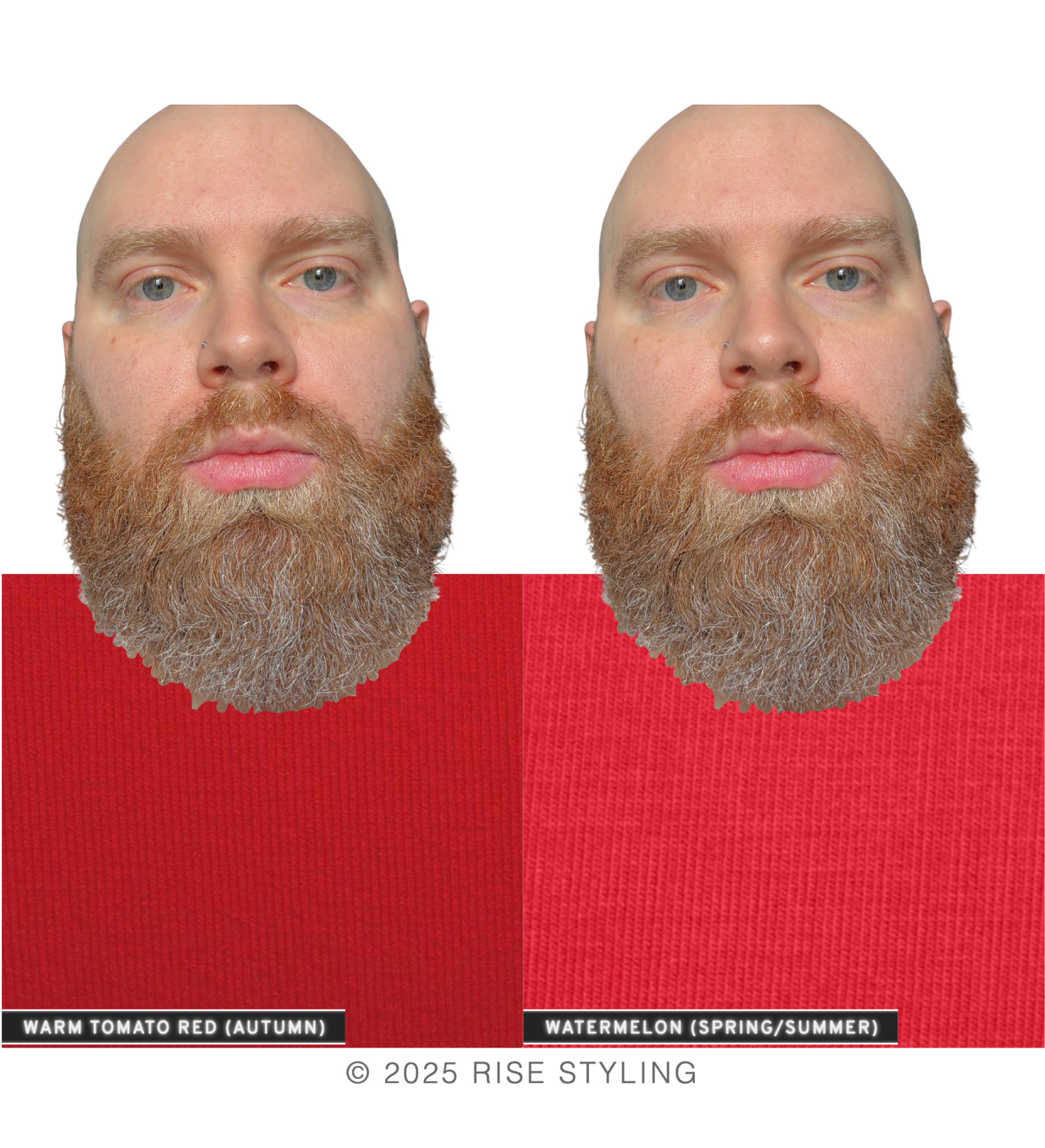
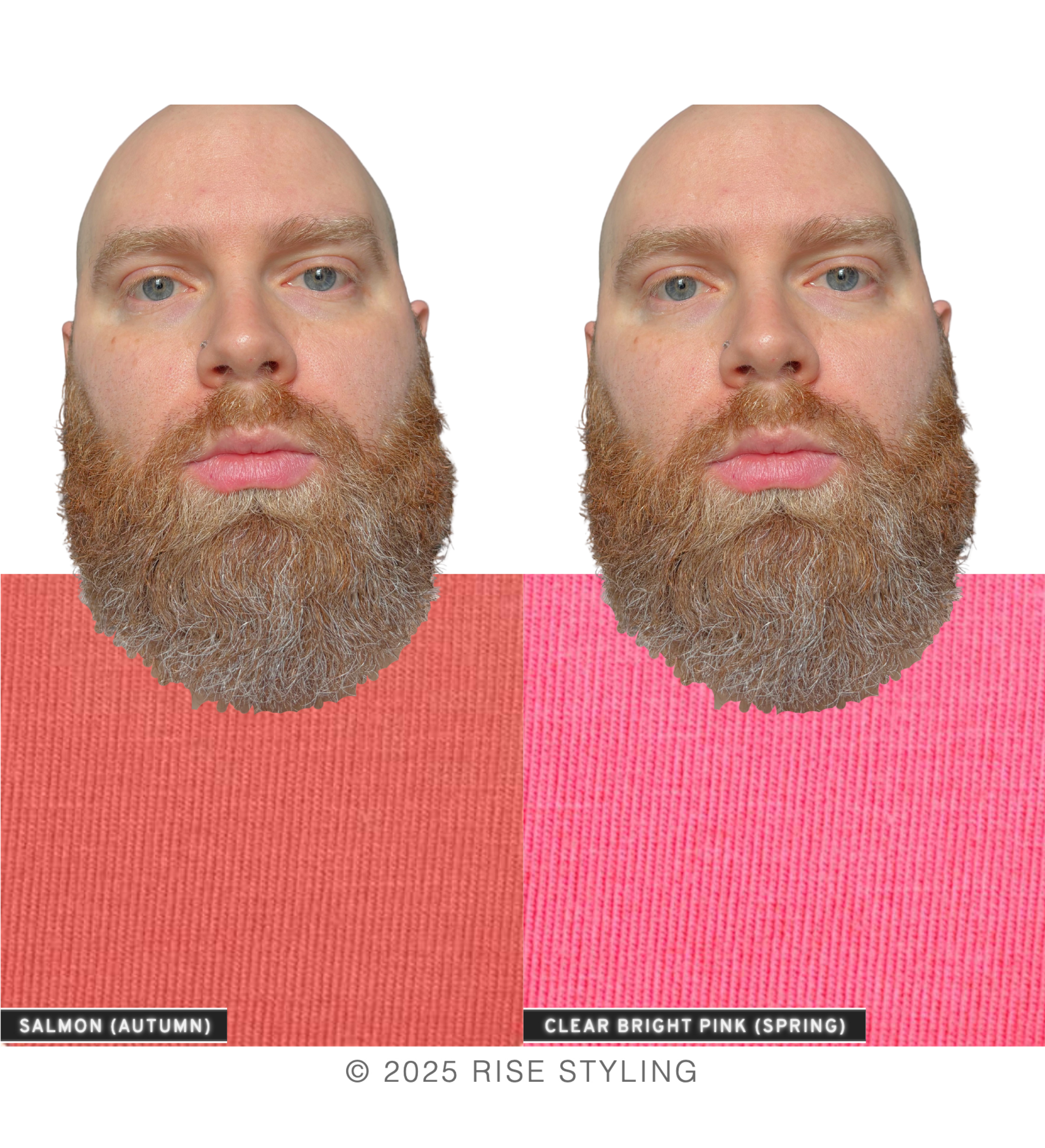
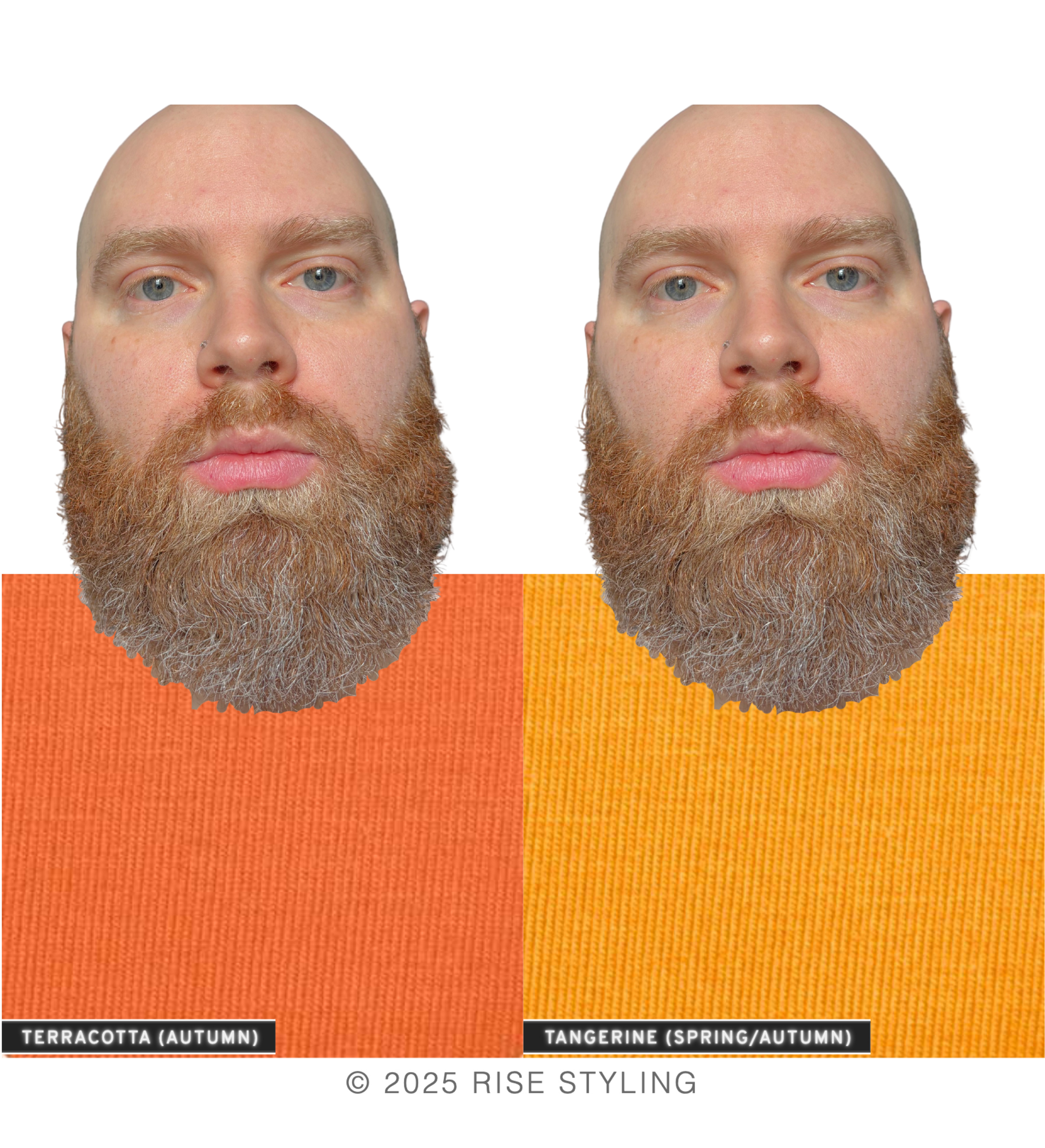
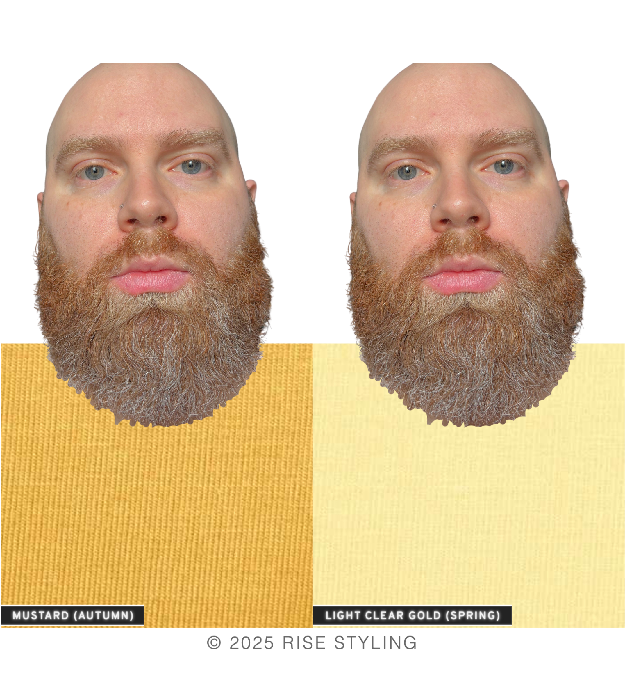
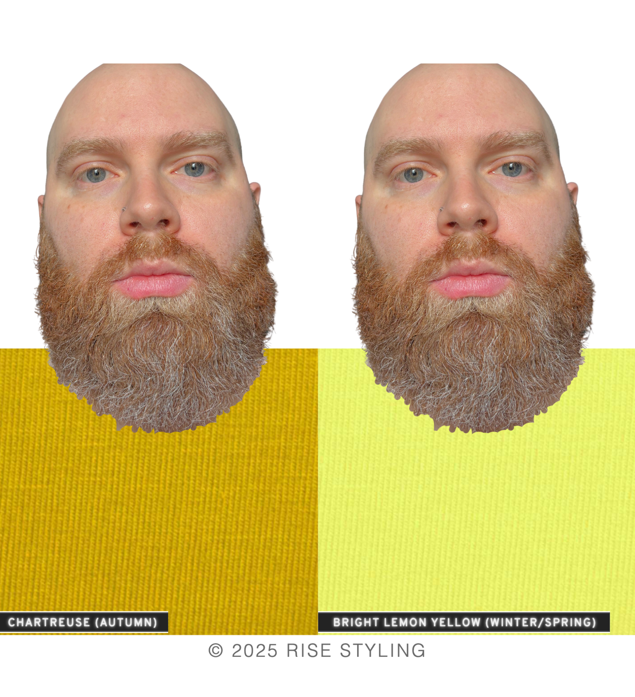
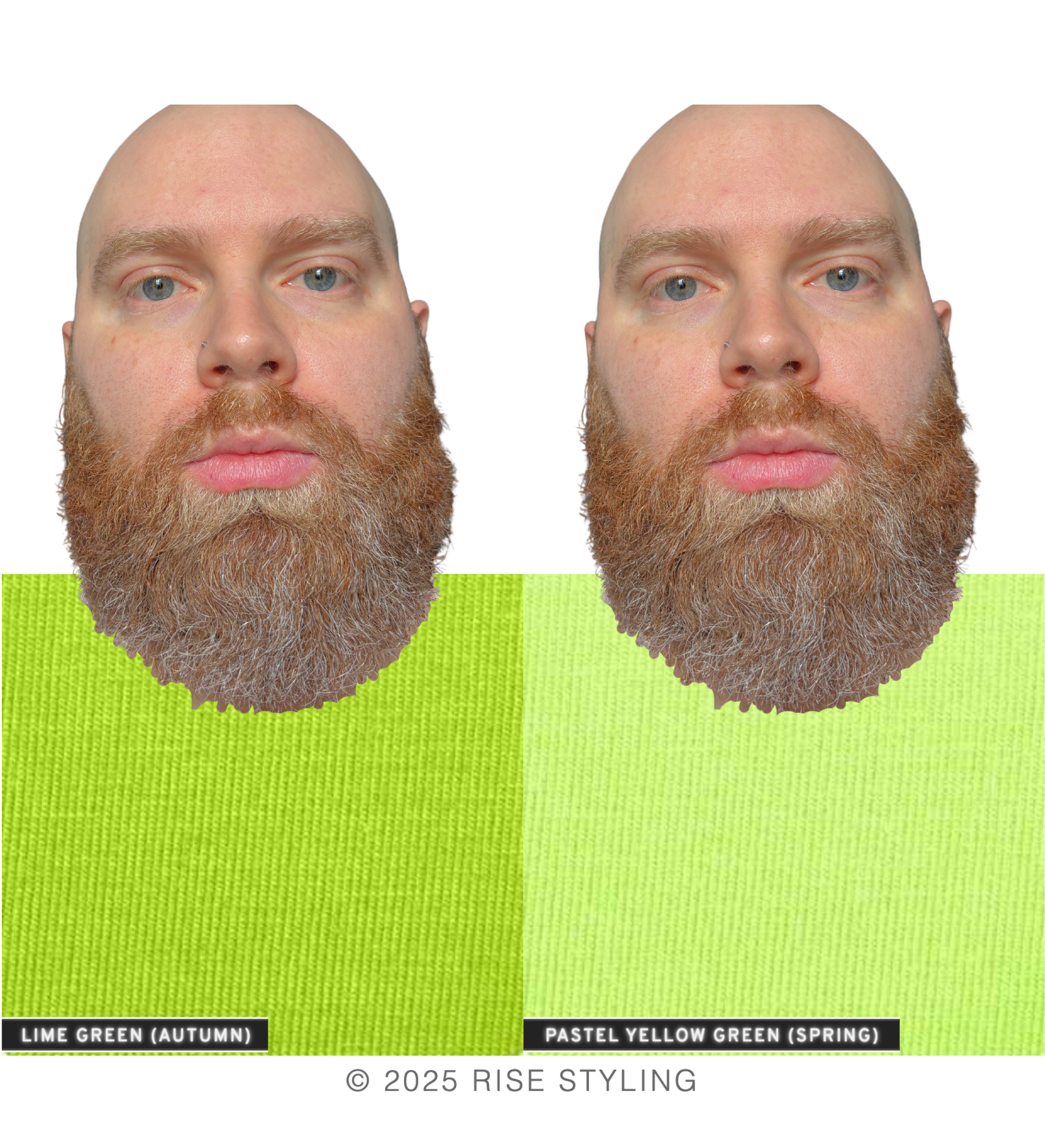
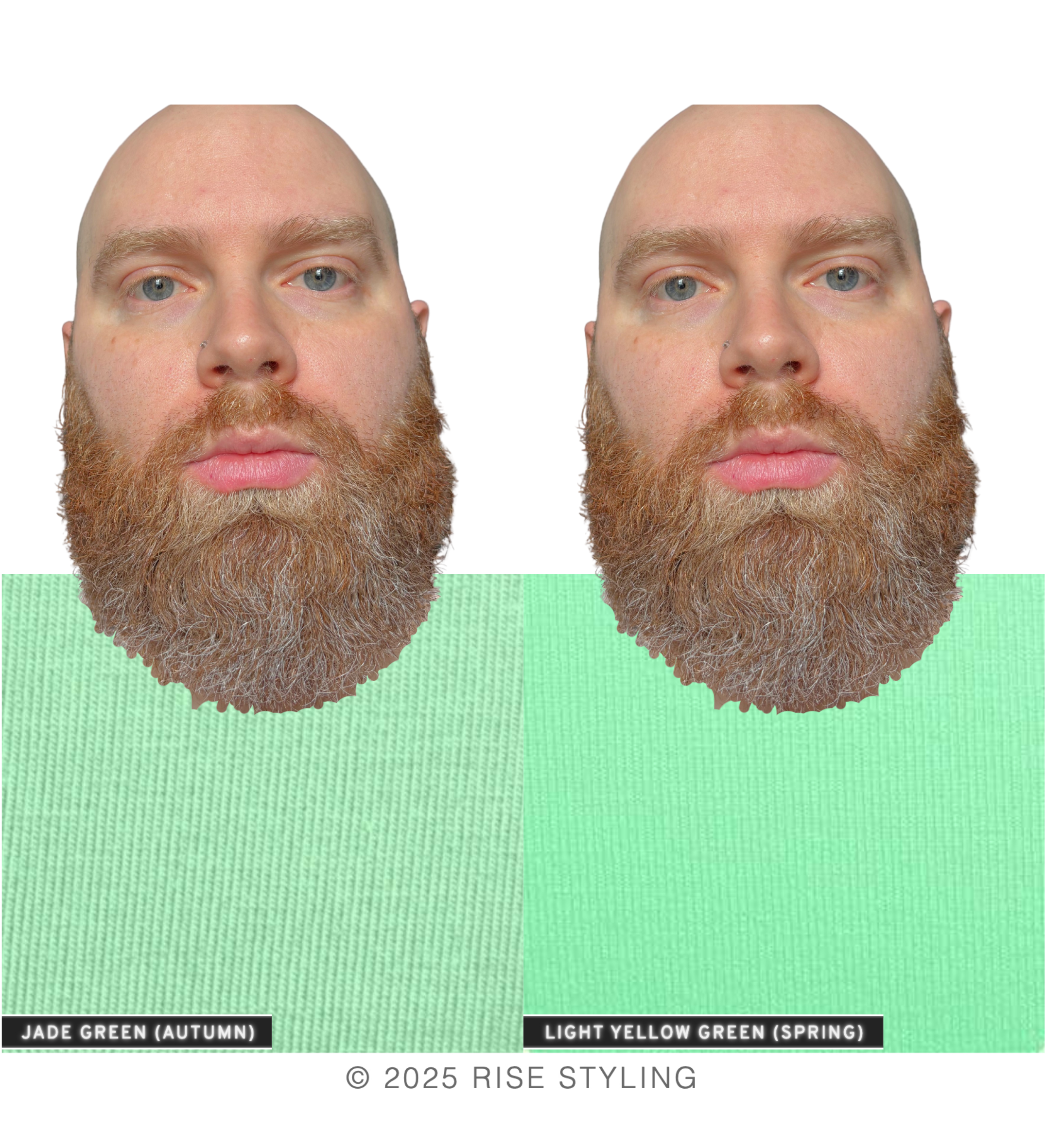
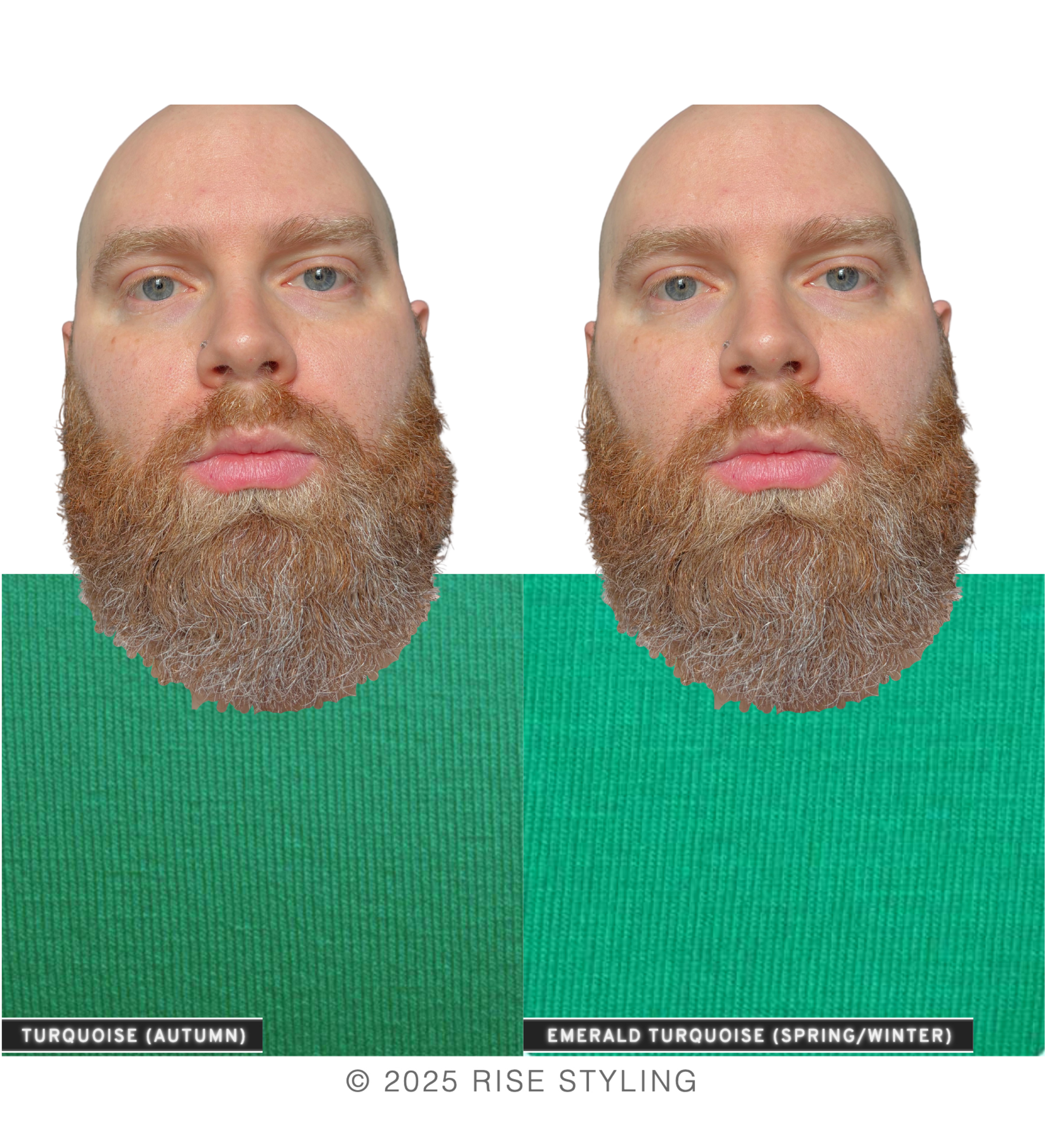
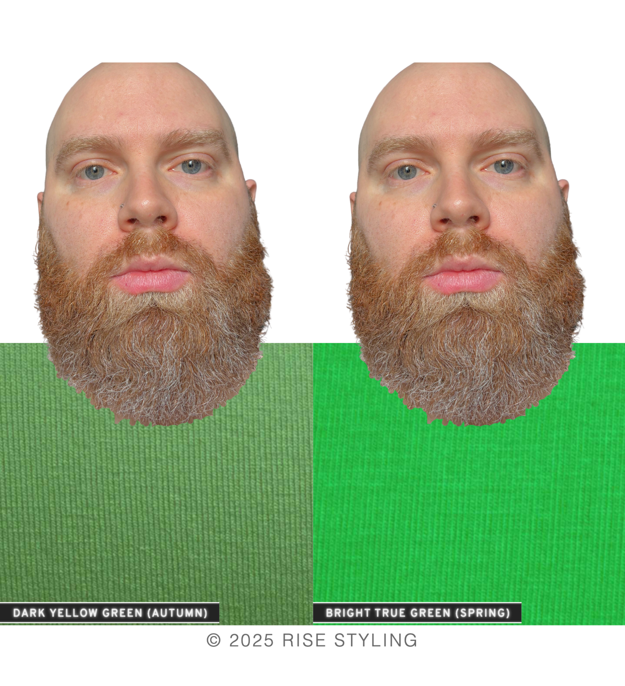
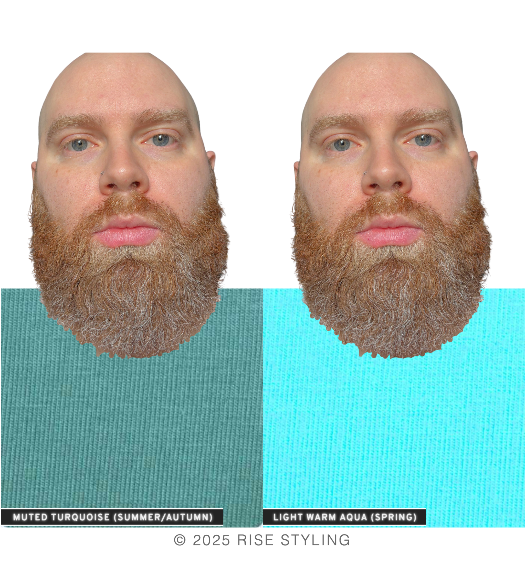
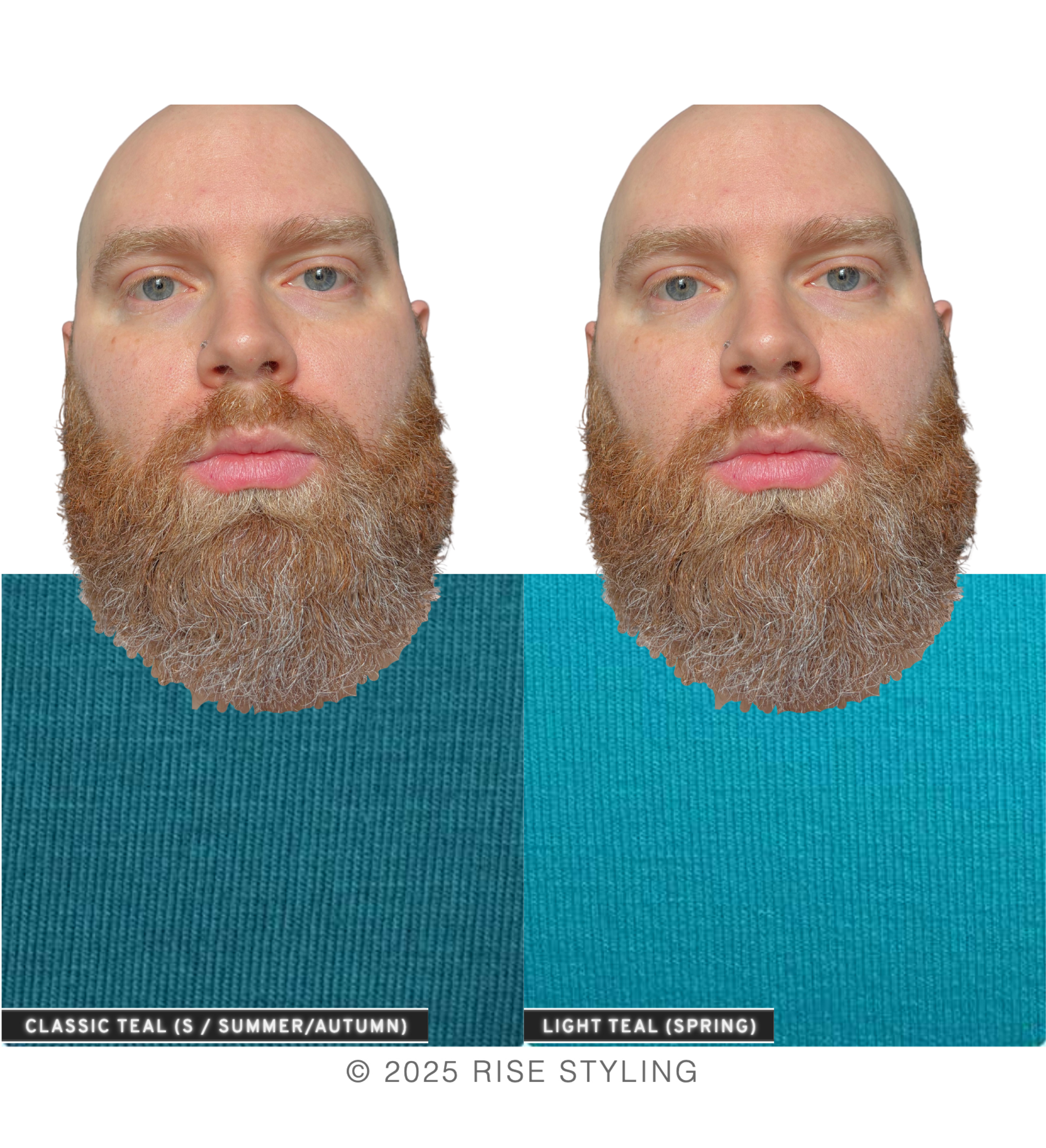
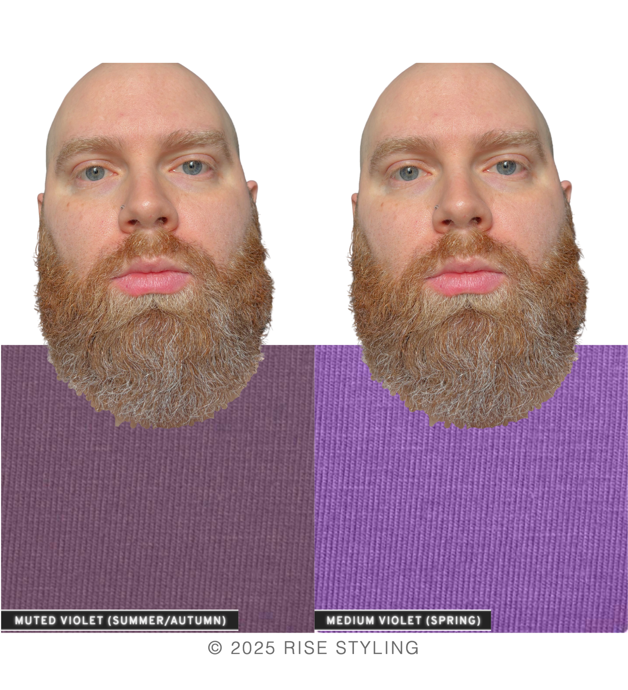
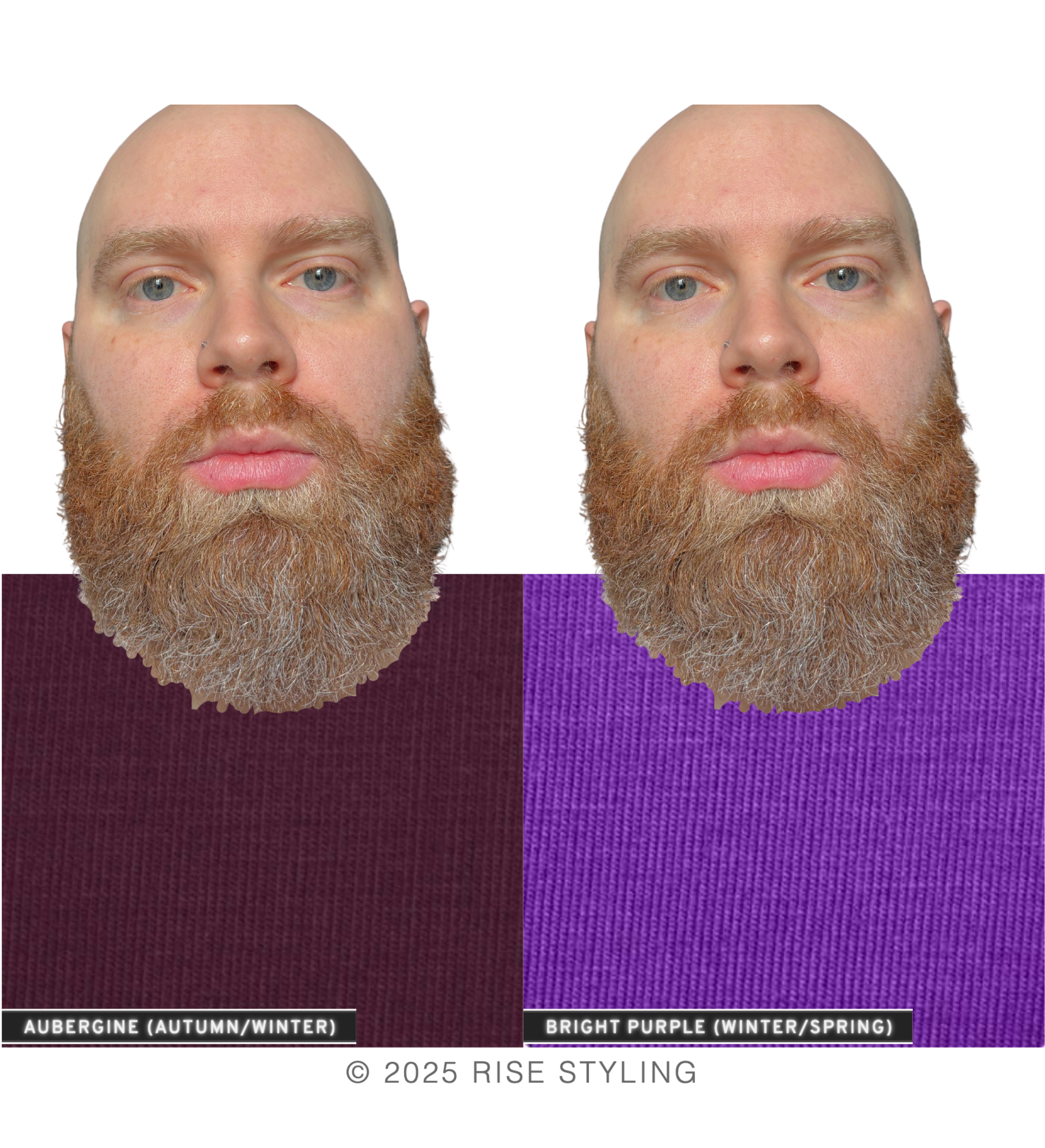
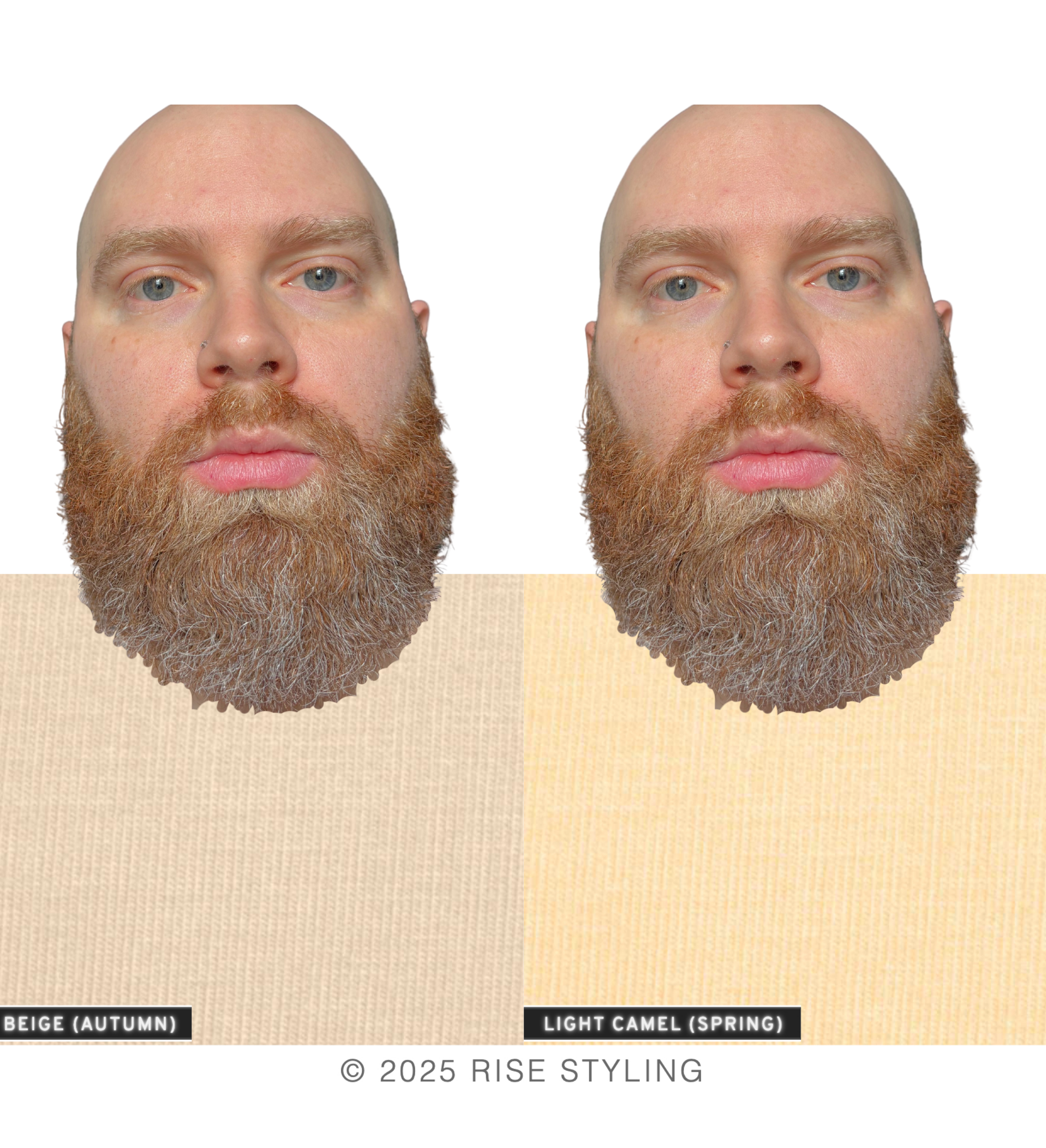
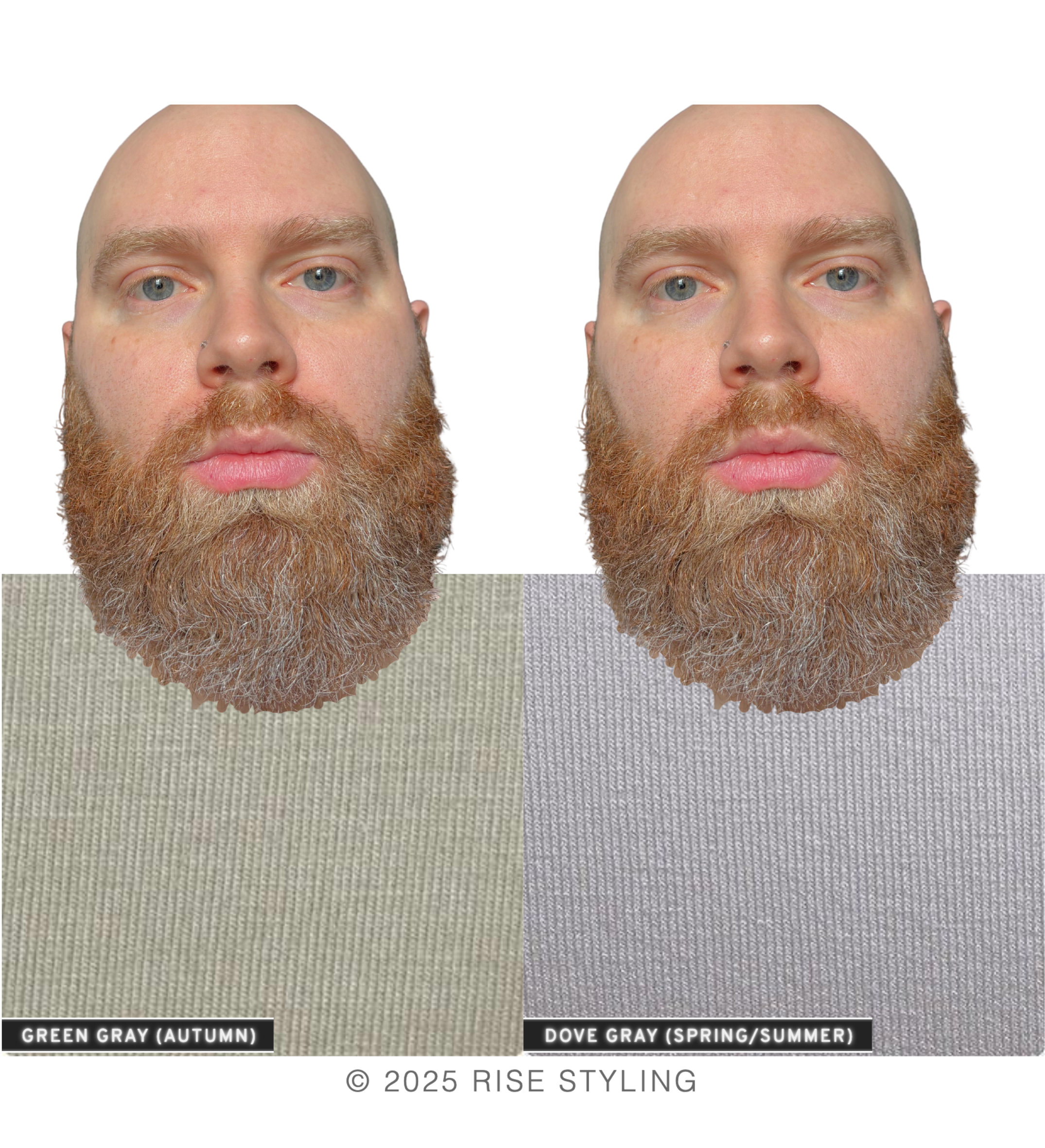
In which season’s colors does he appear to “pop”? In which season does he appear more in focus, clearer, as though he’s “listening” to you?
AUTUMN colors have a low chroma, and all have an influence of brown and/or appear “old” or “faded”.
SPRING colors have high chroma, and appear “clean” compared to Autumn colors. There is no influence of brown in these colors.
To my eye, the SPRING colors win by a landslide. The Autumn colors are dragging my eye down, blurring Sam’s features, and creating a tired energy in his face.
SPRING is mirroring his natural coloring, creating a balanced image that lifts and highlights his features.
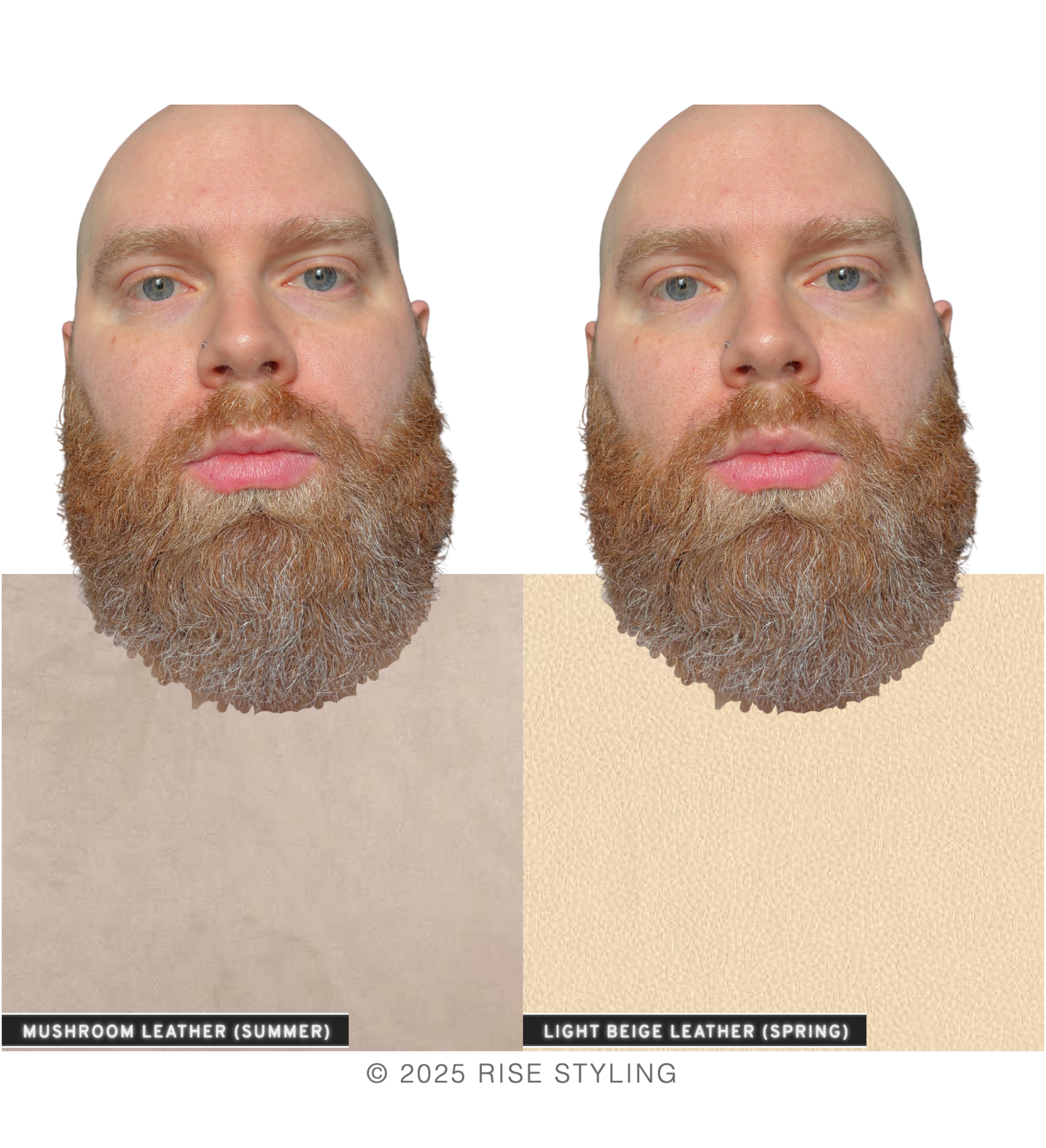
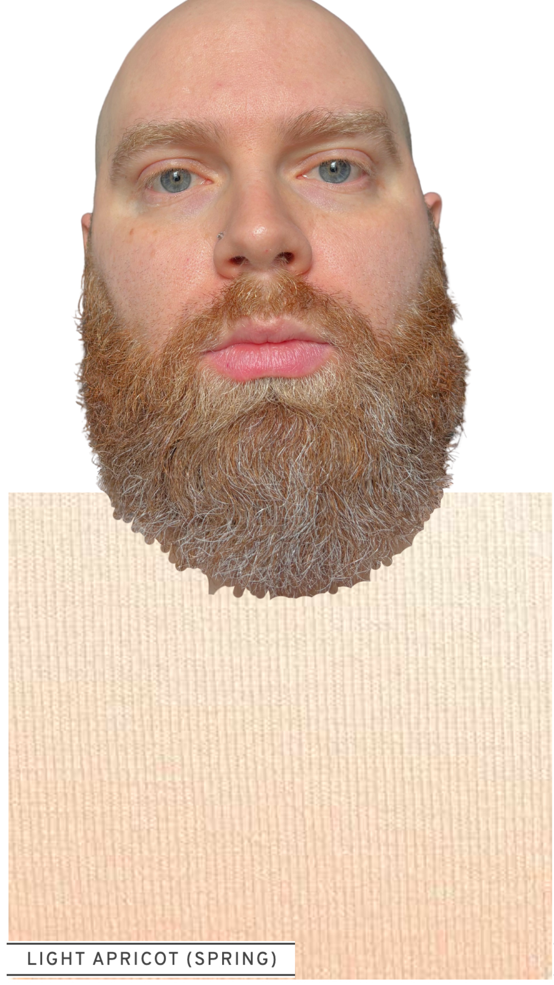
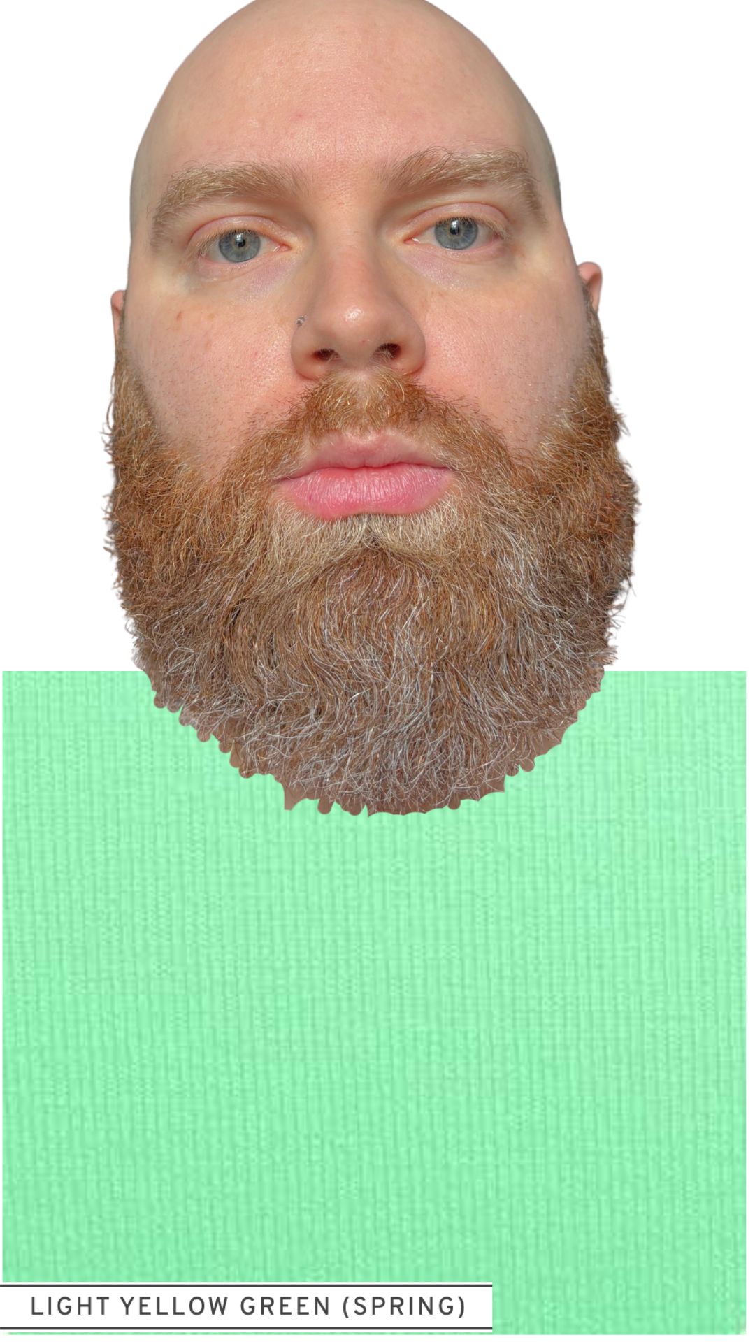
In the next section, we will further compare the Spring colors to verify Sam’s sub-season: BRIGHT, WARM, or LIGHT.
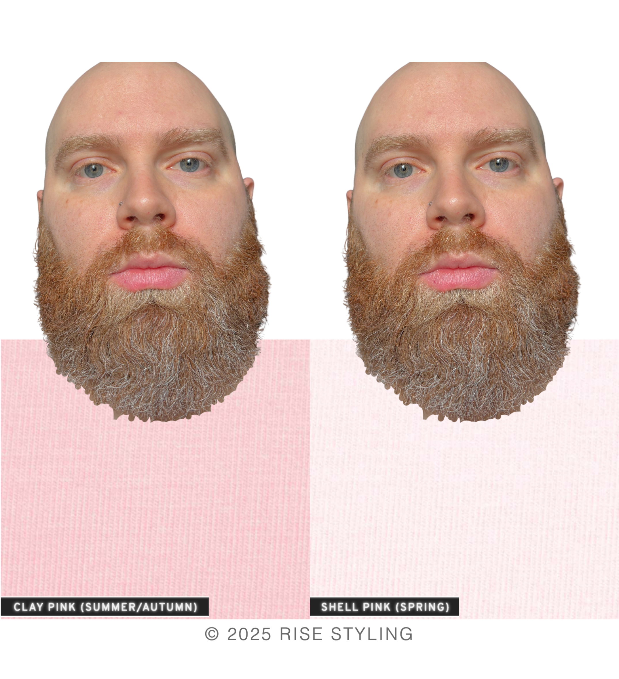
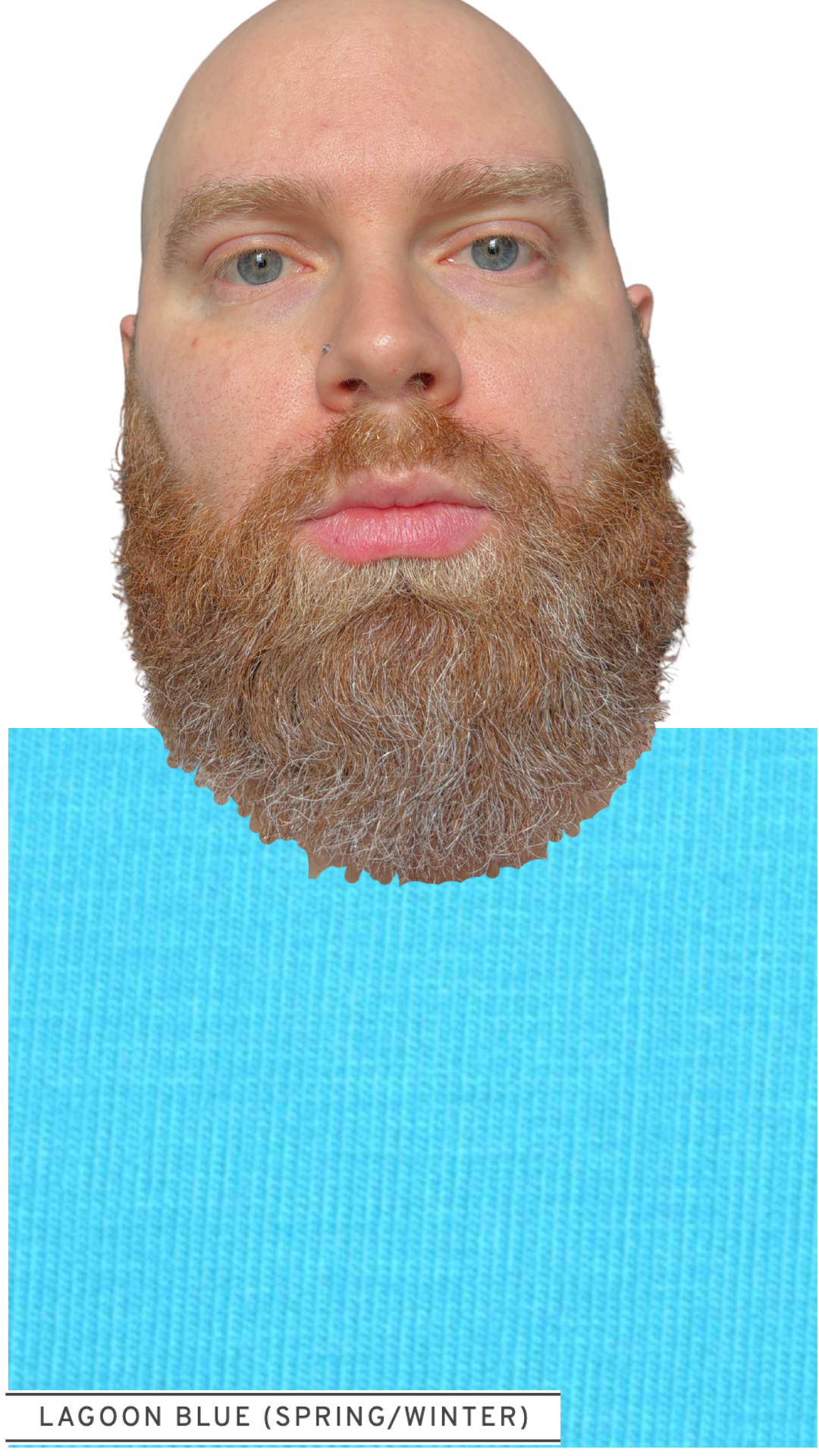
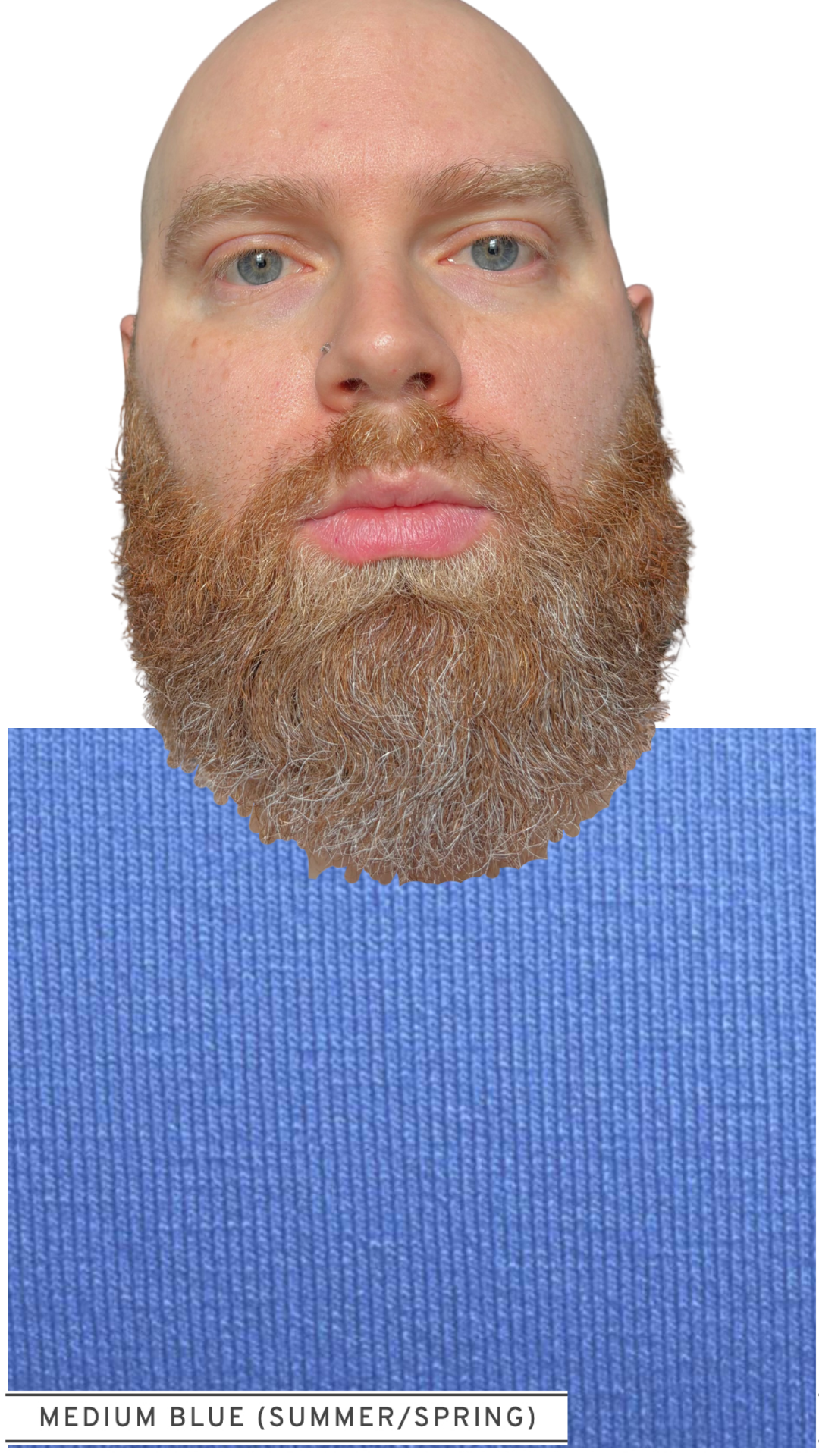
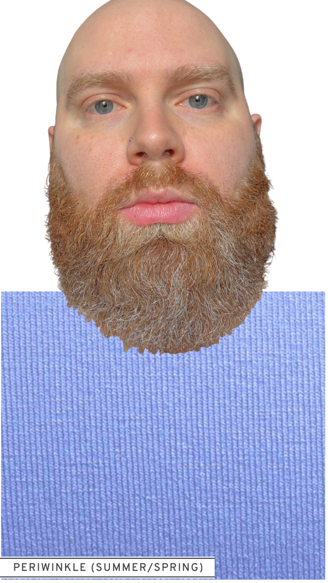
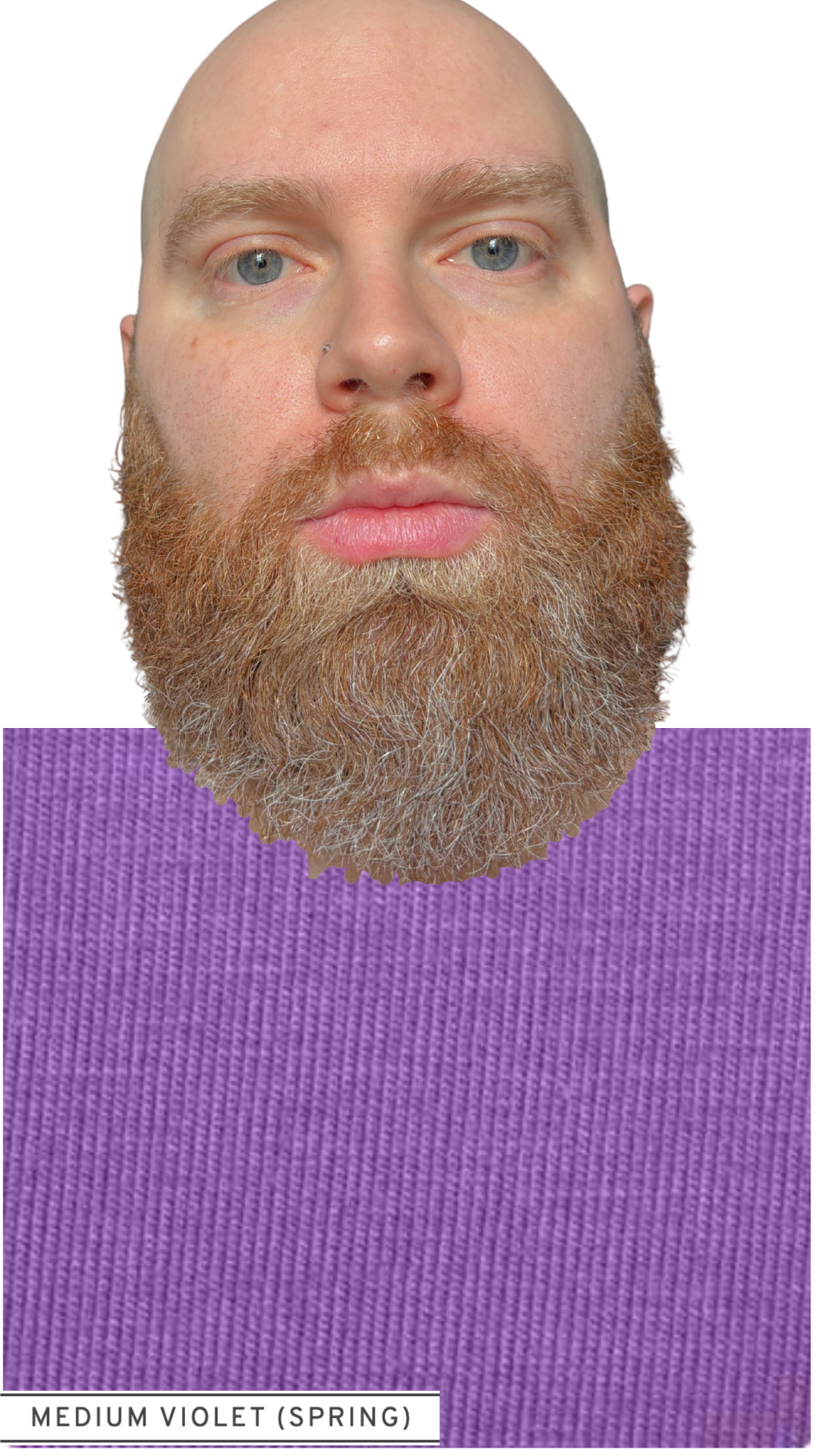
First, here is Sam framed in a sampling of each Spring subseason:
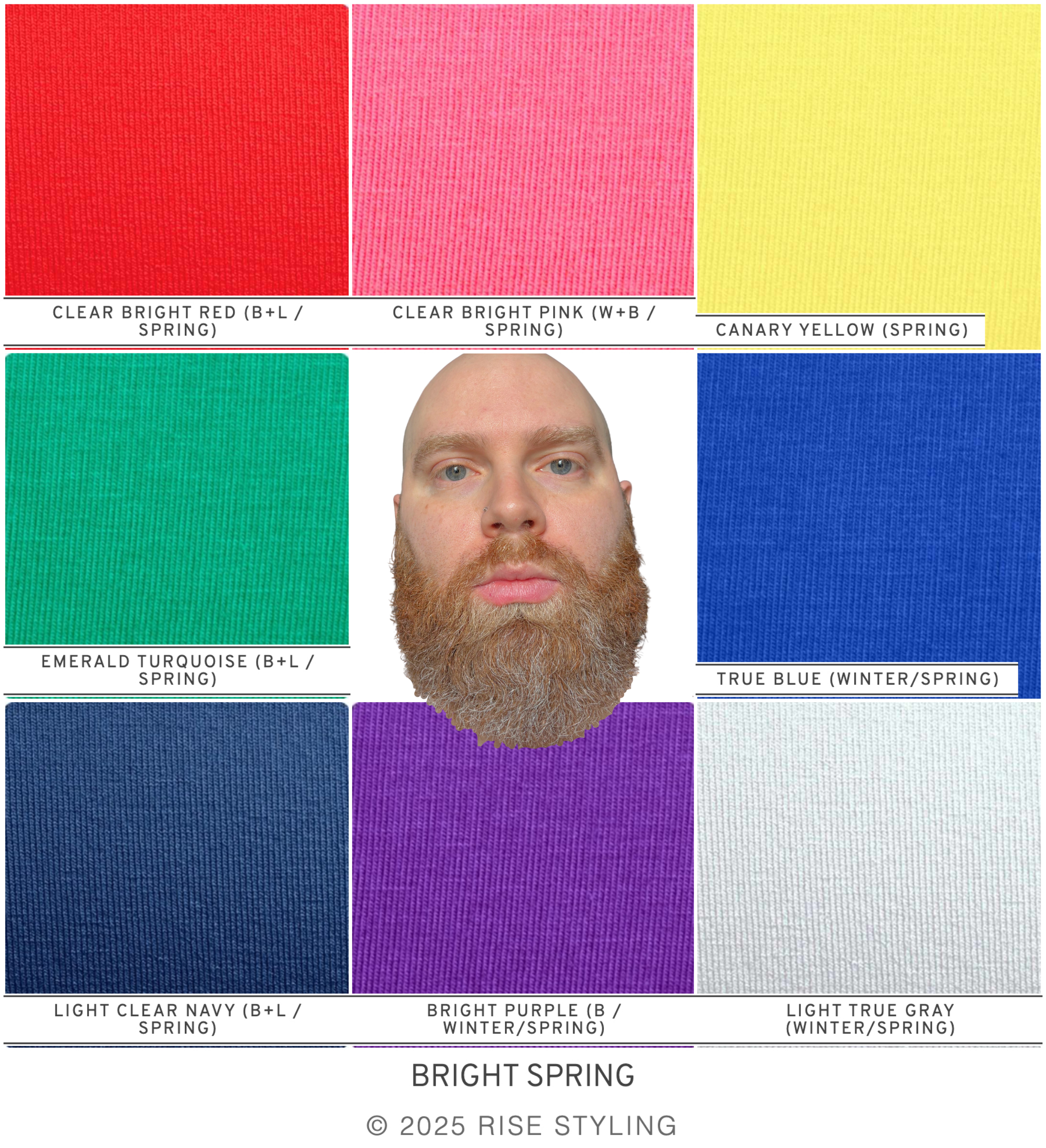
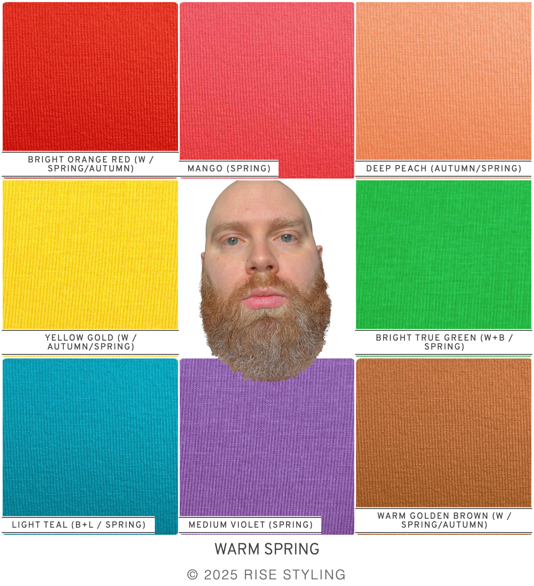
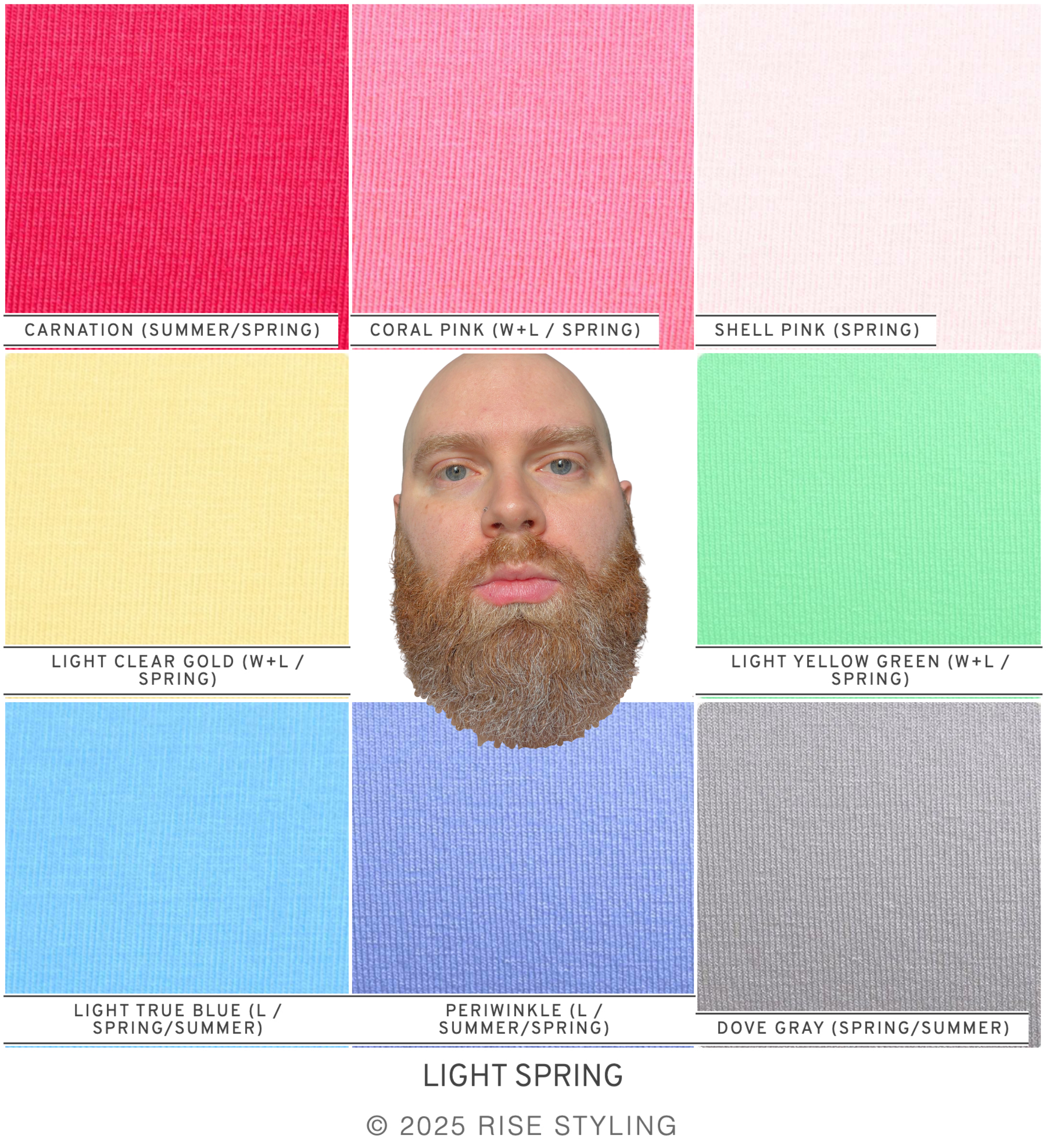
This is where I form an initial hypothesis that Sam is a Light Spring. That is where I see him most clearly and he is neither overpowered nor does he appear unsupported by the colors around him.
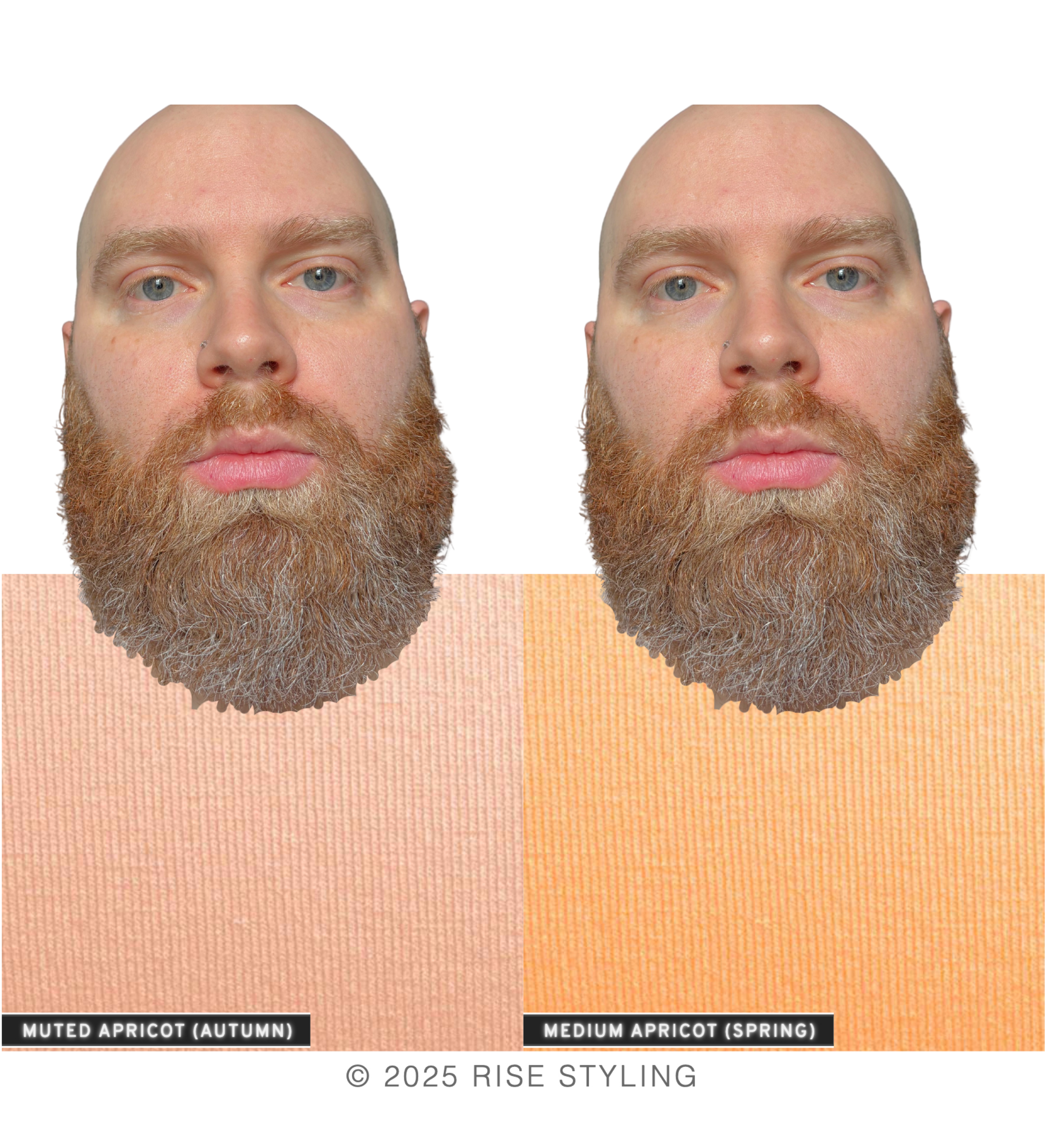
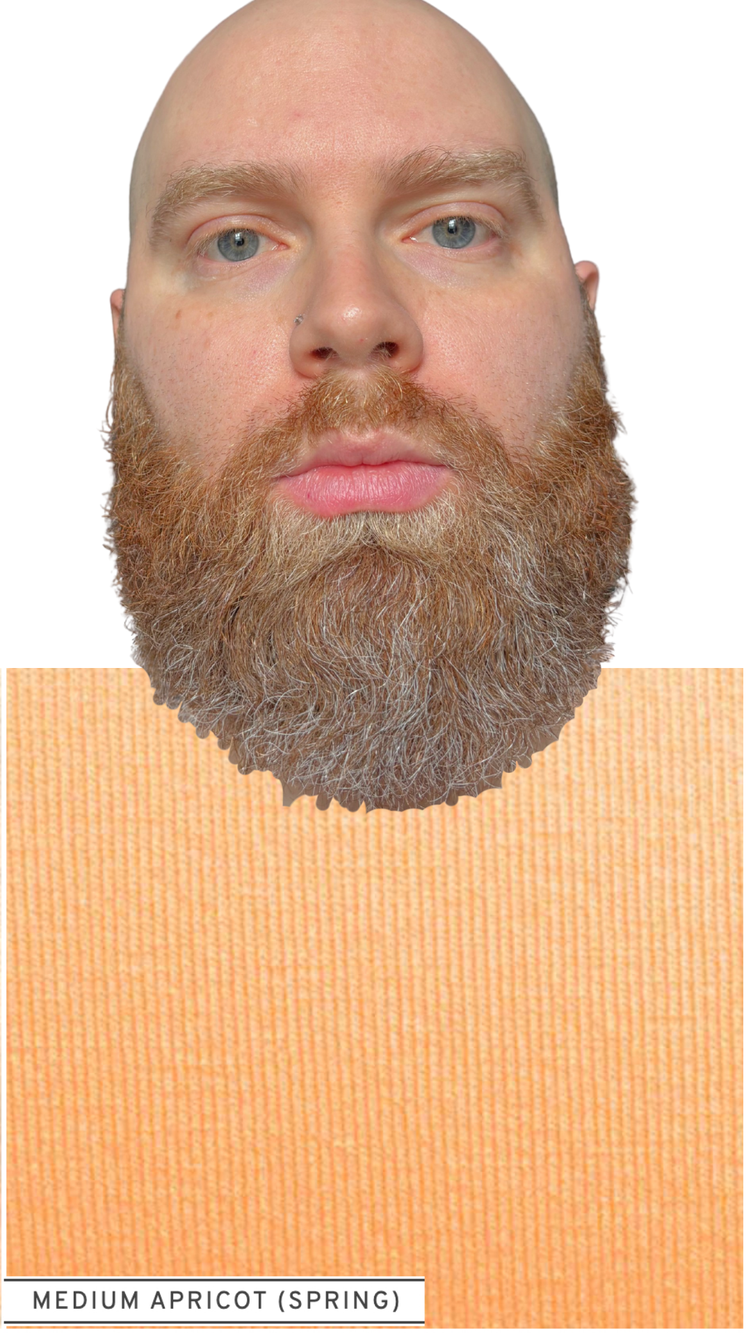
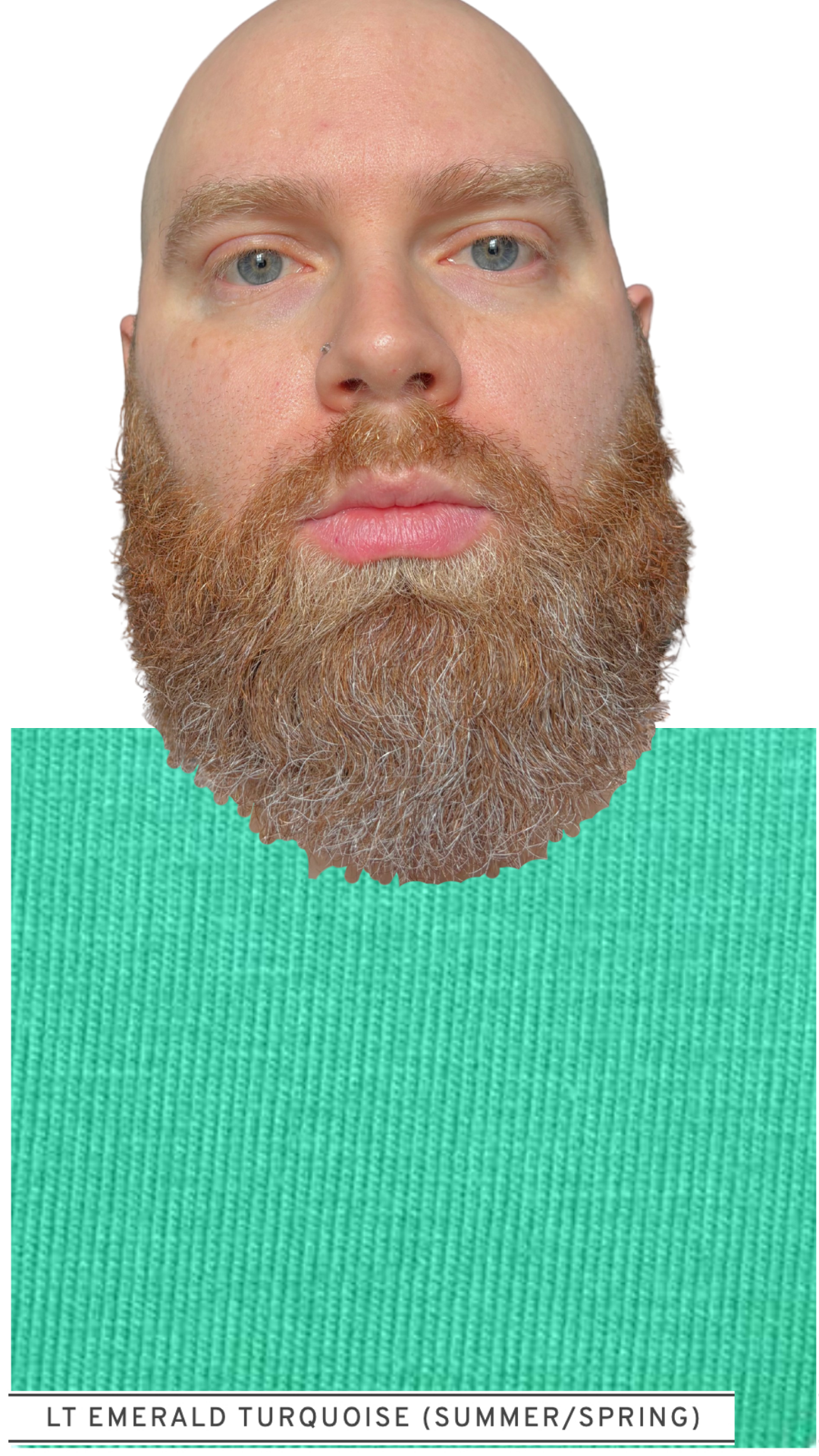
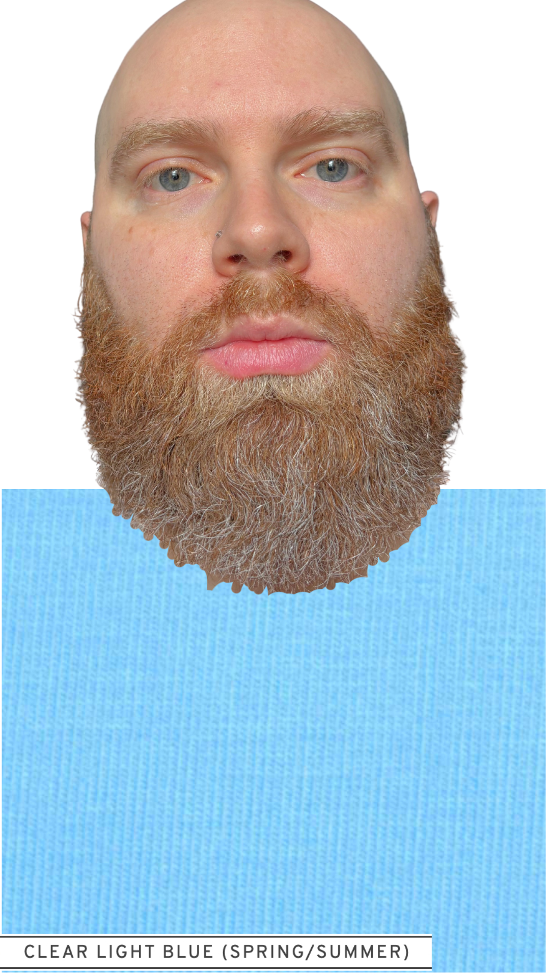
To test this hypothesis, we compare three sub-season-specific Spring shades from each individual color family (e.g. red, blue) and see which appears most harmonious on him.
Slide through to view Sam wearing quintessential Bright, Warm, and Light Spring colors from each color family, and see where your eye is most drawn to him:
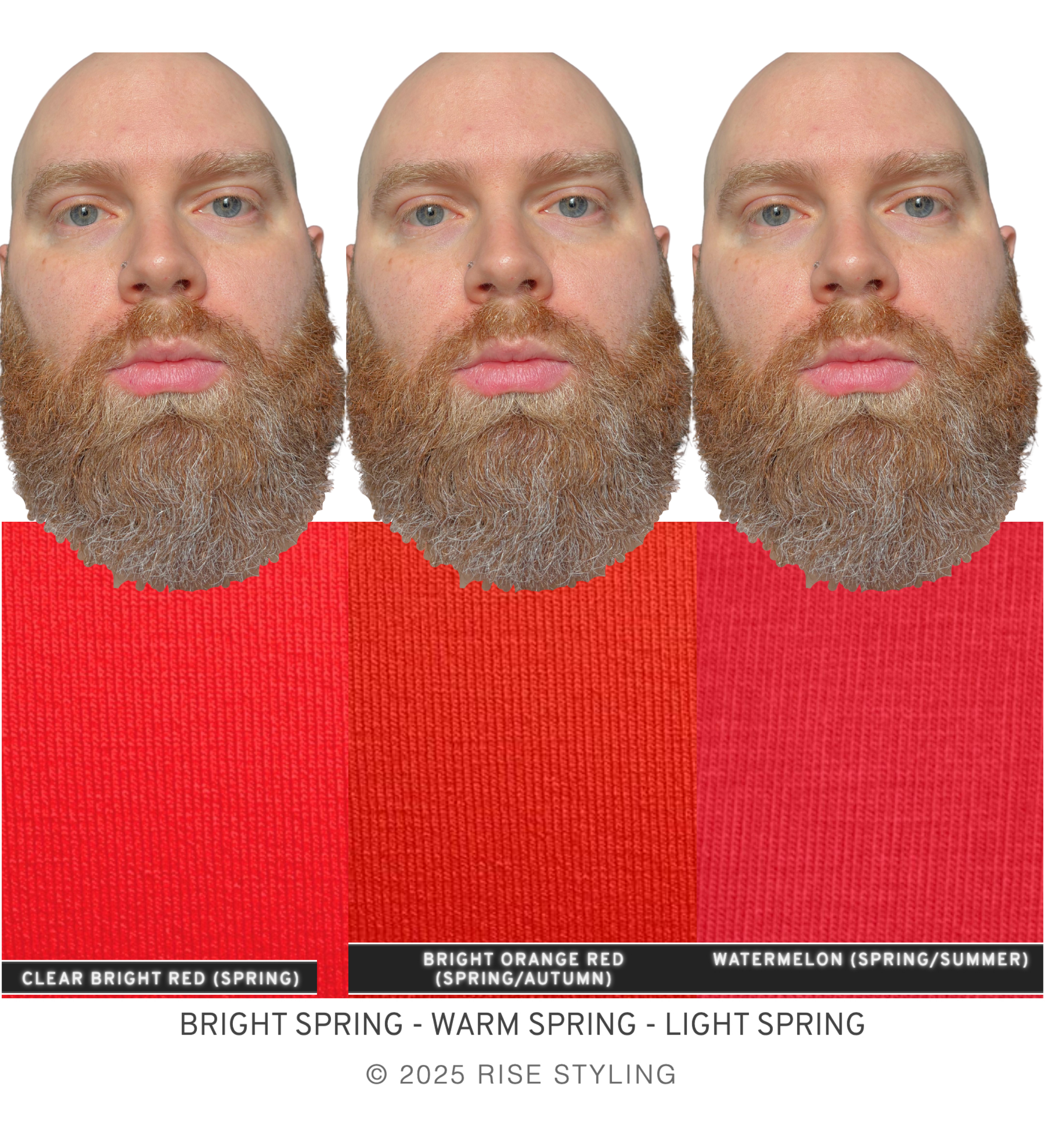
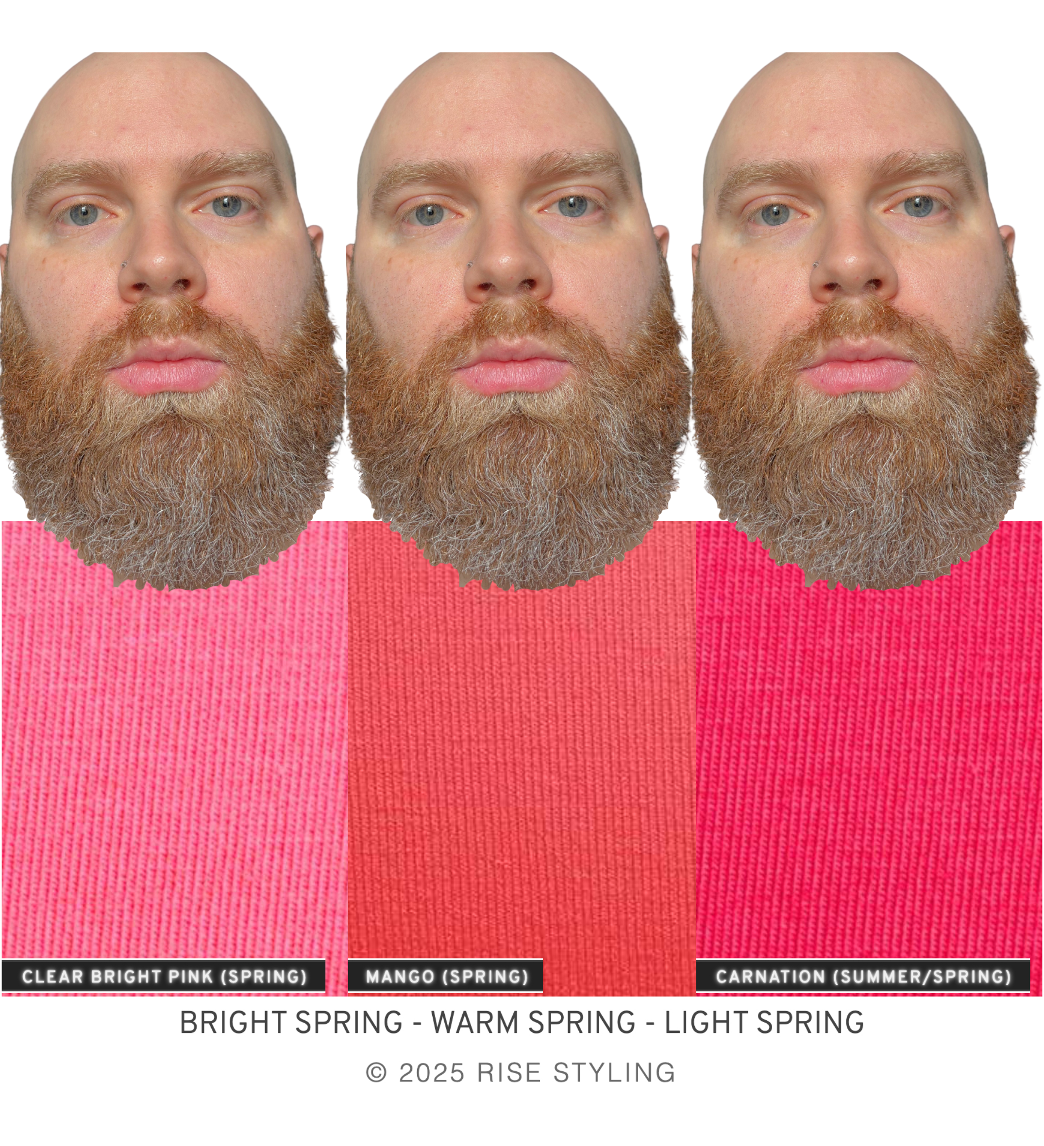
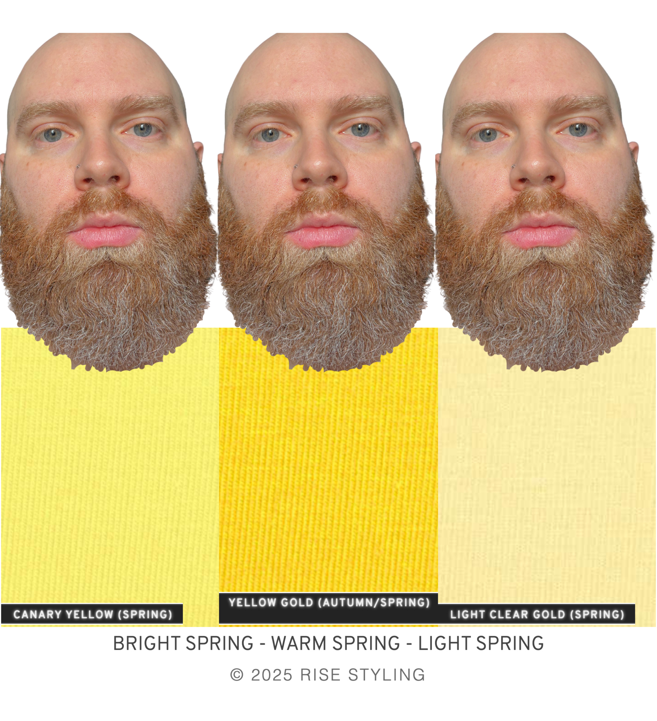
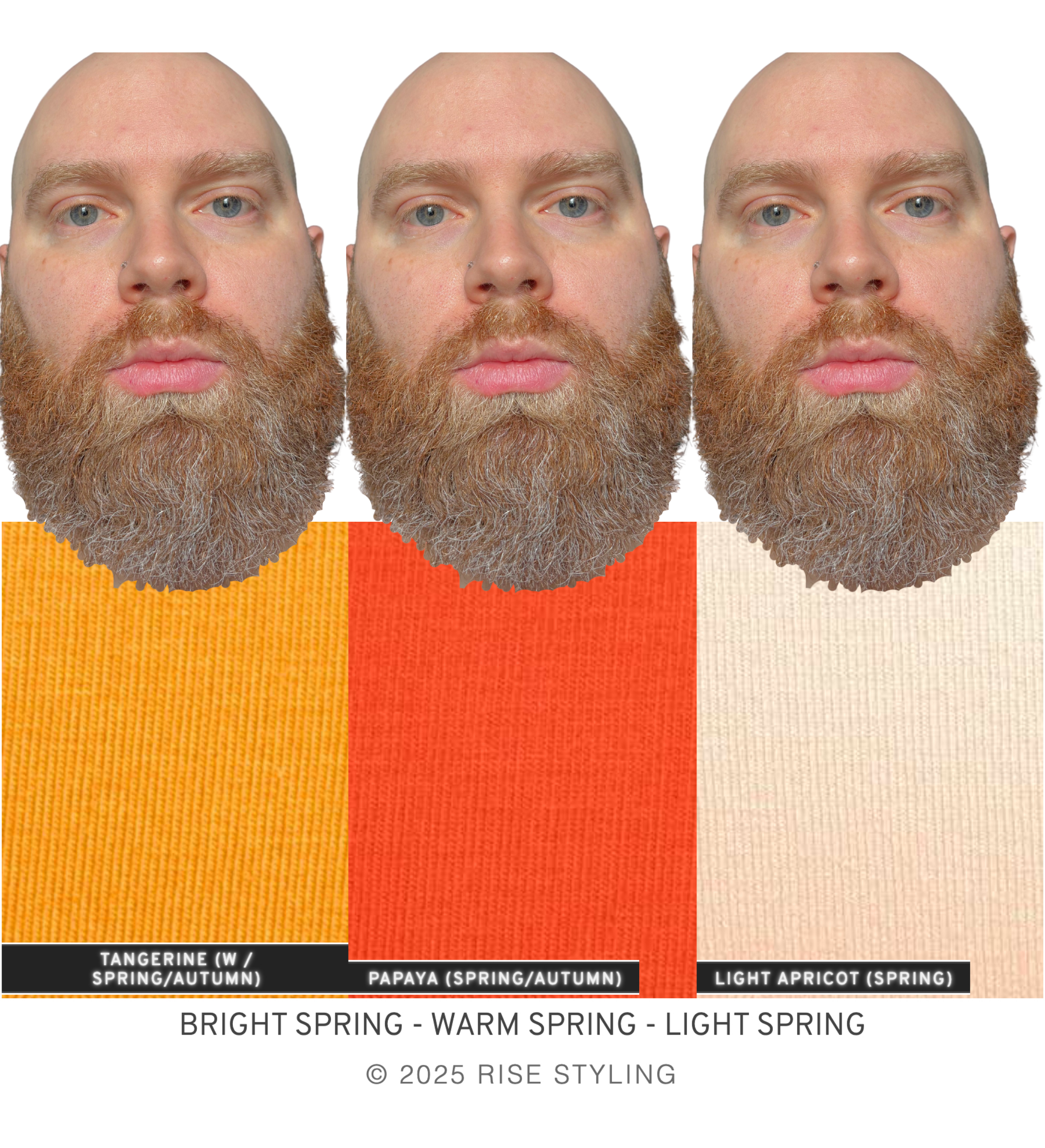
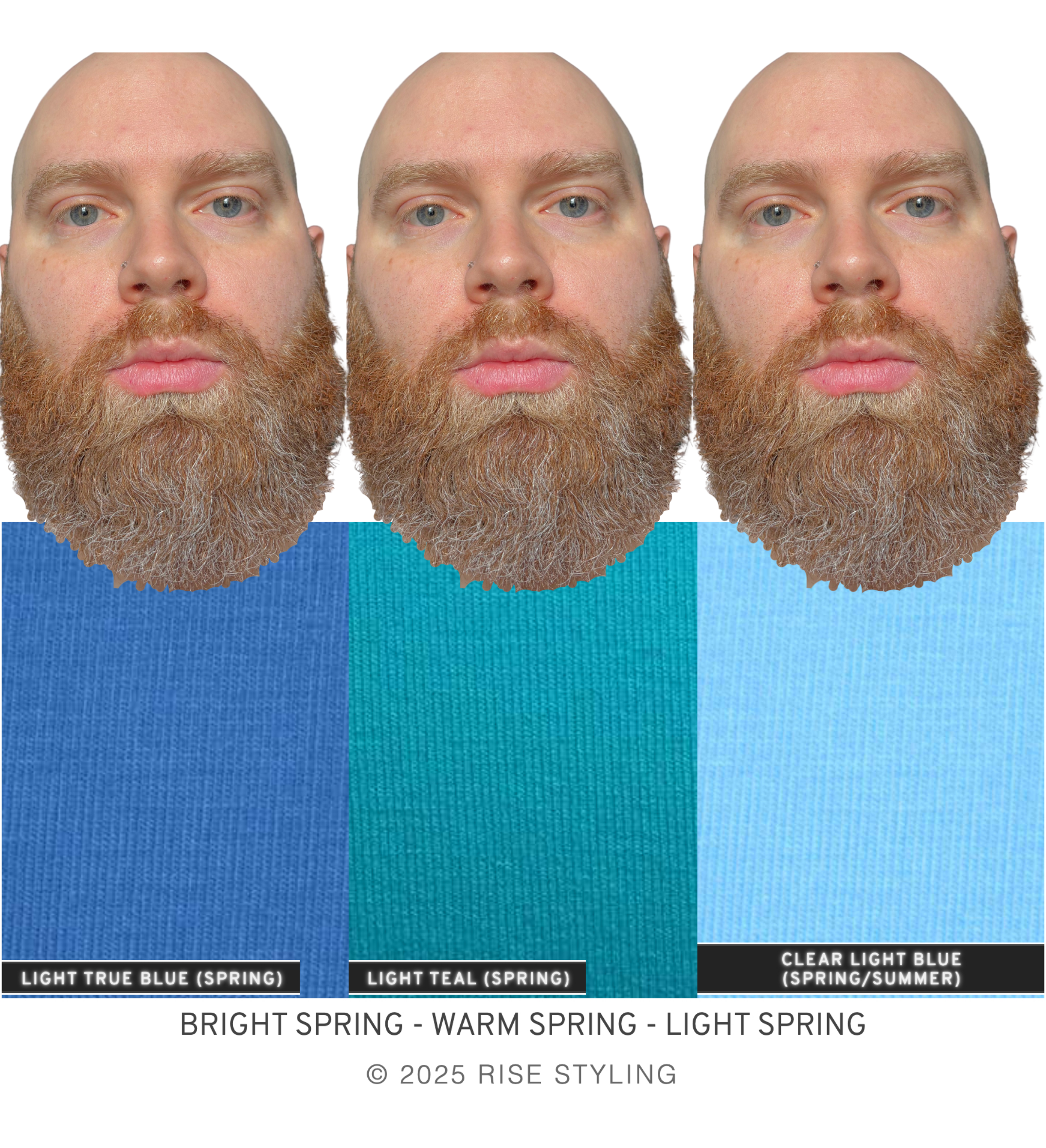
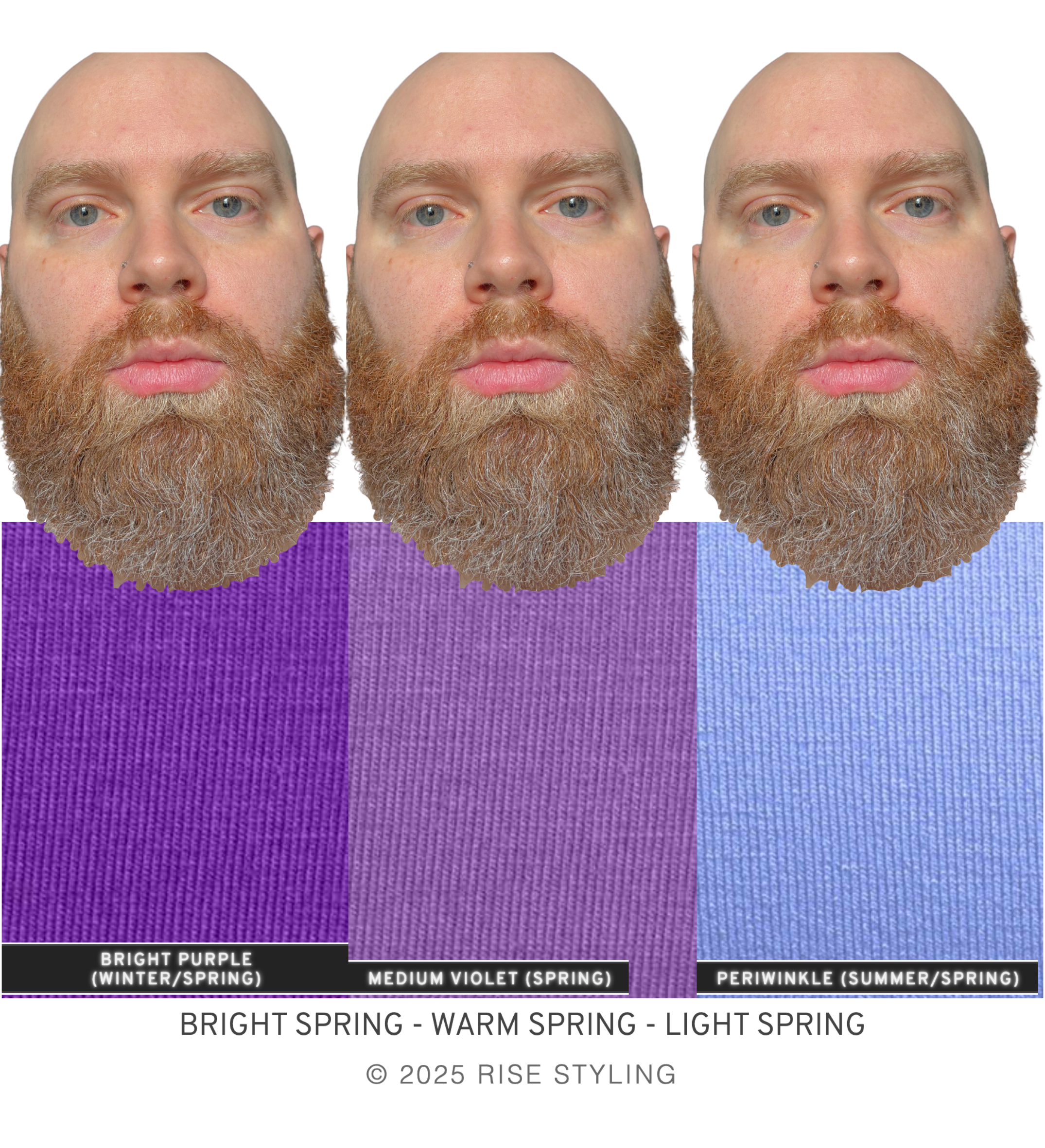
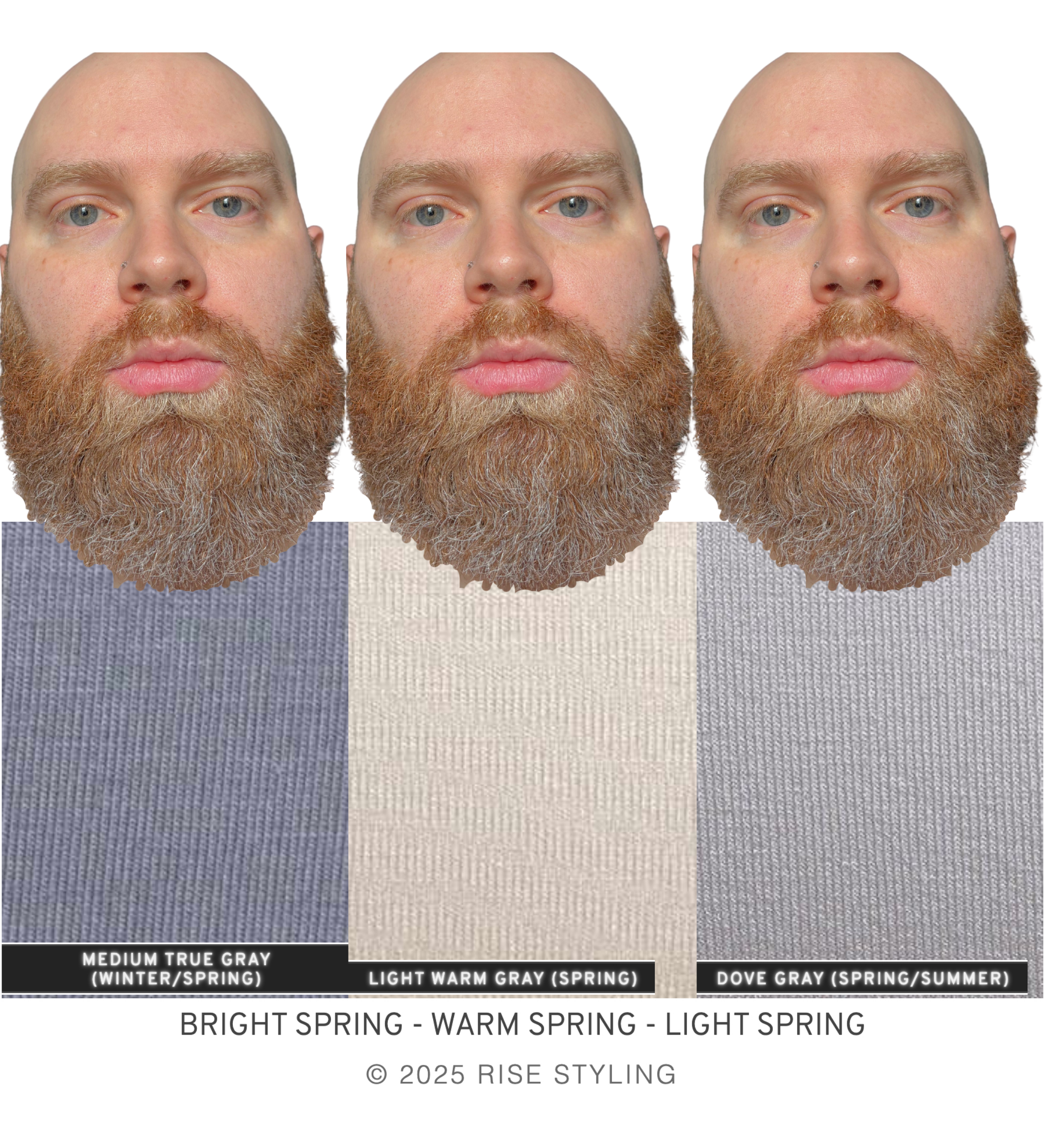
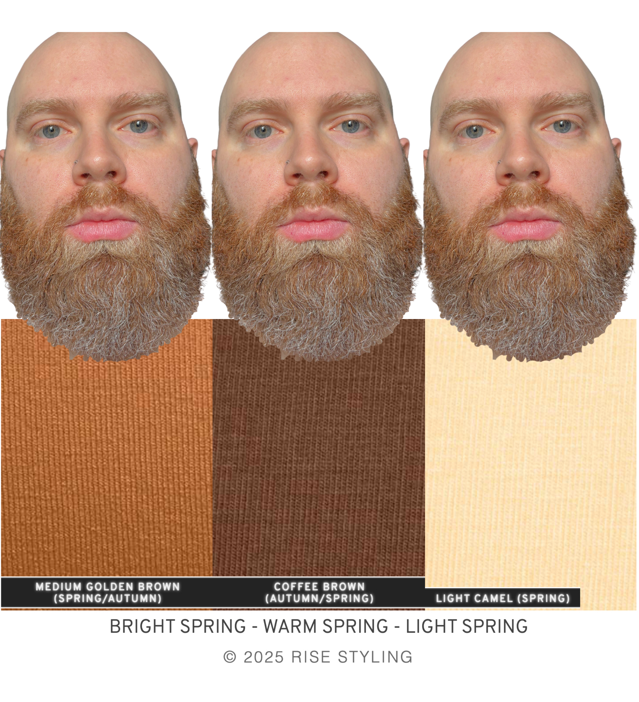
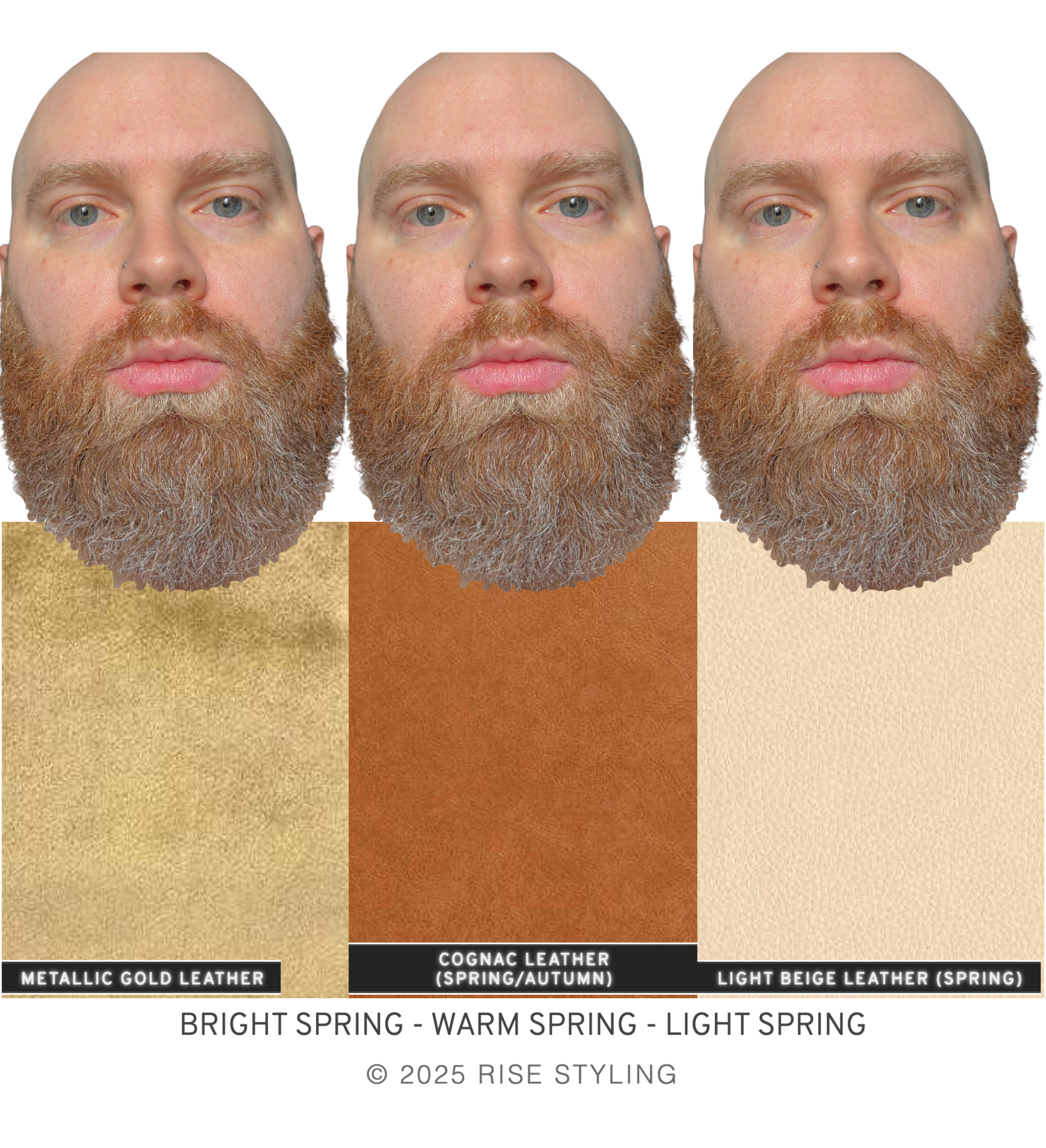
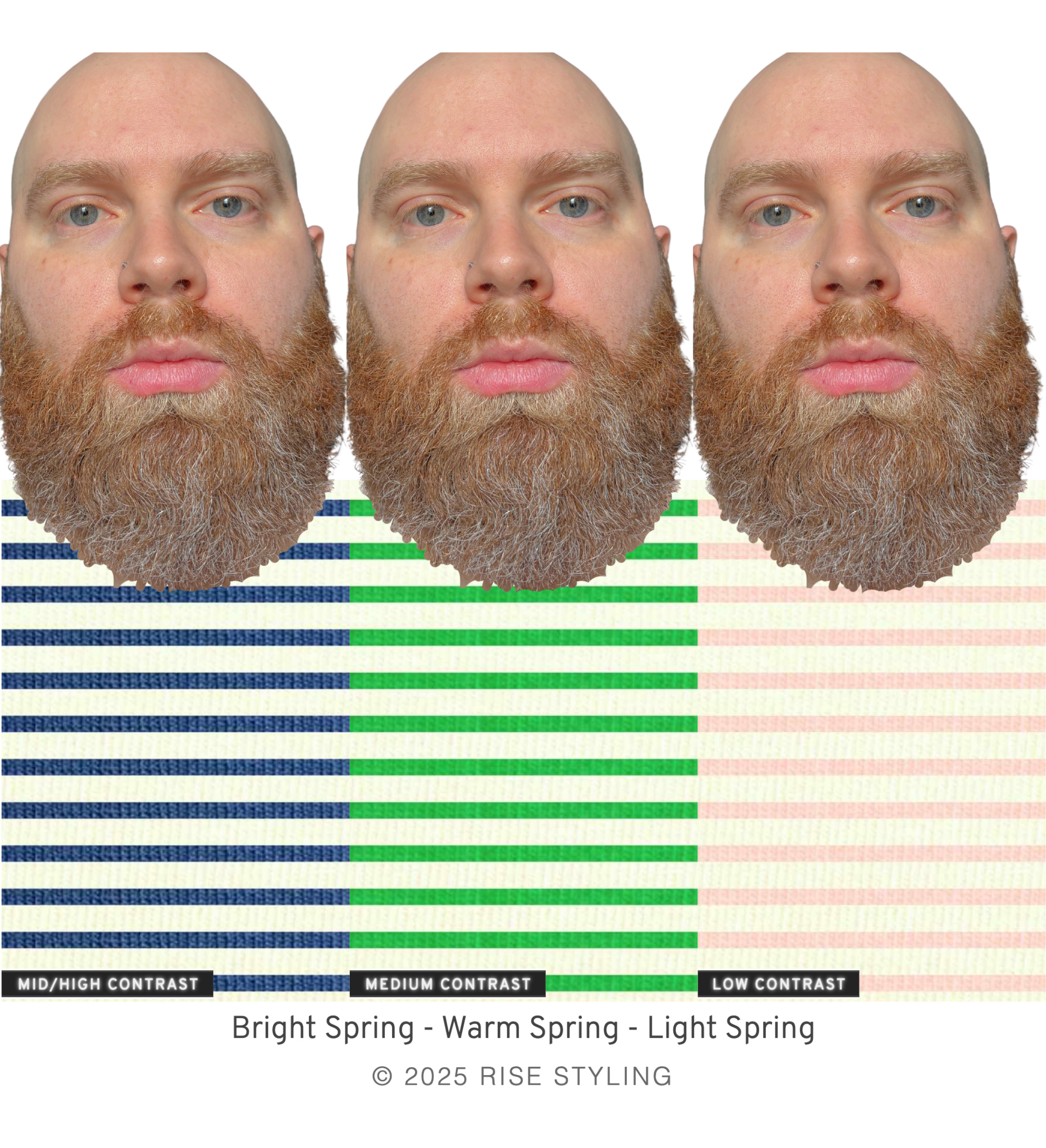
My eye rests immediately and comfortably on Sam in the Light Spring colors, and a few Bright and Warm Spring colors. Remember, no one is ONLY their sub-season. Sam is a Spring first and foremost, and a Light Spring second.
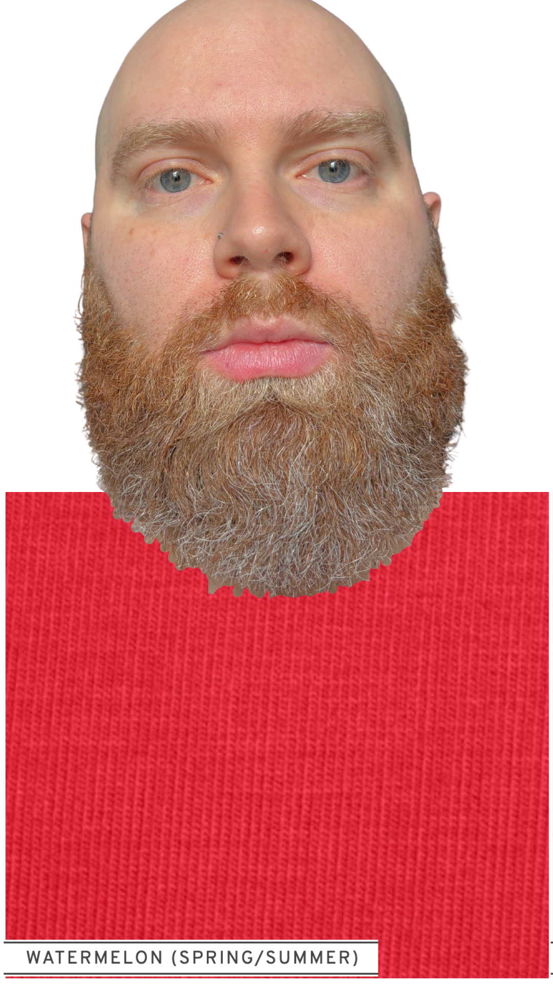
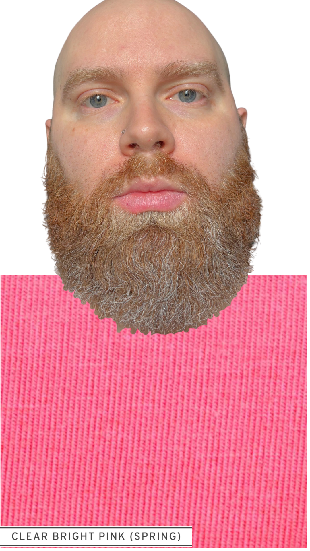
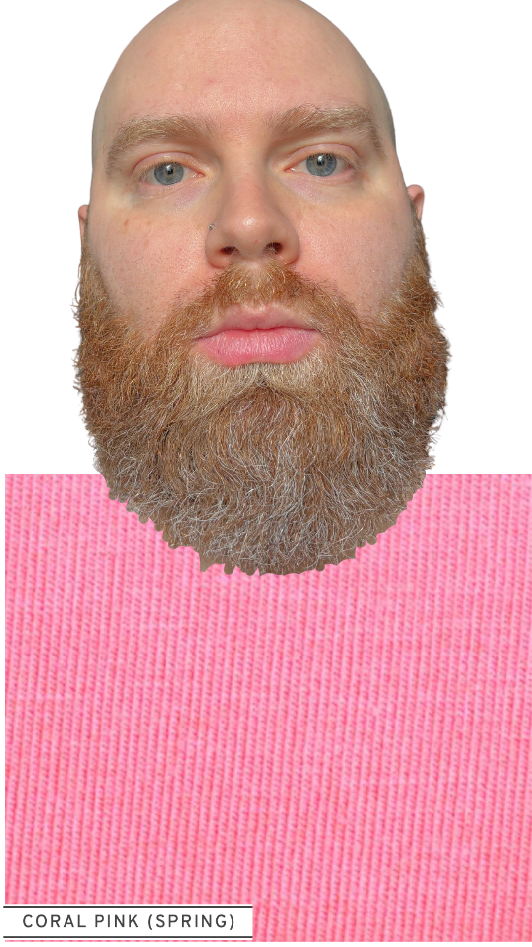
Just take a look at Sam in his “best of the best” Spring colors and tell me he doesn’t look like a million bucks!

Are you ready to come away with your own results like these? Get 15% off your ColorKit™ service for a very limited time!